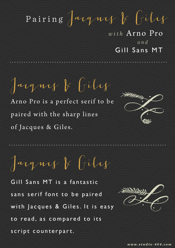
I spend a lot of time looking at fonts and anyone who knows me personally, always knows they can come to me with font or type-related questions. I get asked to pair fonts from friends a lot. It’s probably unhealthy. Normal people have that one friend who is really good at pairing clothes or pillows but I’m the friend that pairs fonts. Since it’s become an obsession a hobby, I’ve decided to take some time to find some of the more popular fonts I’ve seen going around and pair them up with friendly, easy to read alternatives. This may or may not become a series, who knows, but today it was fun to seek some companions for the ever-popular, Jacques & Giles, a calligraphy script from the Emily Lime foundry. Some of my favorite handwritten scripts come from letterer, Emily Conners, the artist behind Emily Lime Designs — including the self-titled font and Carolyna.
After seeing Jacques & Giles make its way among the blog world, I’ve often seen it paired fonts that are barely as legible as the script itself. More offensively, it’s often used in body copy, which is a big DO NOT in itself. With script fonts, it is important to consider it’s legibility when pairing it. Often times scripts are only paired with serifs to maintain the elegant feel, but don’t be afraid to find a sans serif or even an elegant slab serif to pair with your script choice. In this case, I took on Adobe’s Arno Pro and Monotype’s Gill Sans. While you may be thinking, I don’t recall seeing either in the Google webfont site, don’t fret. Arno Pro is available as webfont through Typekit and Gill Sans is available through Webtype.
In case you were thinking I was insane after doing price checks, I did stumble upon a few free options. Crimson Text is a great free alternative to Arno Pro. As inspired by Gill Sans, Cabin is a great alternative that you probably already have sitting in your font library.
Are there any fonts you’re finding impossible to pair? Are you looking for font variety in your pairs? Feel free to leave me your thoughts below!

I love pairing typefaces together. That’s one of my specialities. Unfortunately, the blogging world killed the Jacques Giles typeface for me so I vow to never use it again. But when it comes to pairing calligraphy type w. san serifs my go-tos tend to be Gotham HTF, Futura BT or Avenir.
Totally crying @ “the blogging world killed the Jacques Giles typeface”. SO true.
Hah i just love you!
I guess i’m not the only person with that unhealthy habit lol!
I love font quizzes.. not that i have found any, but i’ve been “studying” fonts for such a long time, sometimes when i watch tv or walk around, i like recognising the names of the font.. so crazy
We’ll be unhealthy type addicts together!
I LOVE that you are the go-to for pairing fonts, Angel!! I like it with the ones you picked, but I always prefer sans-serif, I’m sure you’ve noticed that! haha
Happy Monday, Angel!
I think most bloggers lean to sans serif fonts which is pretty interesting! Thanks for stopping by Victoria.
I love the Jacques & Giles font! You combos look really nice.
Thank you for stopping by Tanea!
Great font combos. I’ve had Jacques & Giles, as well as other of Emily’s fonts for a while. She’s such a great letterer. I think her fonts are great for many things, specially wedding-related designs.
Emily is pretty amazing!
Pretty! I love this pairing.
Thank you Liz for stopping by!
I love those fonts! I think font searching is so much fun 🙂 These pairings are so spot on too!
i love experimenting with new fonts but one of my challenges is pairing them together and would love to learn more about it. I think my favorite is #3 with the gill sans. 🙂
I think lots of people have trouble figuring out which fonts work together because fonts all have such unique features that can all seem trivial but I think things like, seeking out core letter composition, helps me decide which fonts work best. Typography is all so interesting!
This definitely should be a regular series! I love your pairing- I totally understand why your friends come to you!
Thank you so much Court. I’ll try to do another one soon!
That is some talent to be able to pair fonts together. I kind of just pair what I think goes (no science behind it). I definitely have an obsession with downloading new fonts everyday – it is starting to become an unhealthy habit 🙂
haha my pairing process is a little lengthy but sometimes even I just eyeball it. I think we should all own our type obsessions, even if they’re a tad bit unhealthy. 😉
If I had a penny for every time I saw Jacques & Giles paired with another hard to read font, I’d be rich 🙂 I’d love to learn more about your font pairing process! I usually just pair fonts via trial and error, but I’d love to hear if you have any tips or tricks!
Tell me about it! Scripts have been misused from quite some time now. I’d love to do a process post. Perhaps in the near future! Thanks for stopping by Allyssa. 🙂
Love this post. Thanks for sharing! Where did you get the flourishes you used? Are they your illustrations? Love them.
Kelly, they are from the font Frosted – http://www.myfonts.com/fonts/great-lakes-lettering/frosted/. Thank you so much for stopping by!
In the first panel of the image, what font are the words “with” and “and” written in?
Igor,
It’s Sentinel Light Italic – http://www.typography.com/fonts/sentinel/styles/
Thanks for the post, Angel! I’m so glad I found this. Using a mix of Jacques, Gill Sans MT and Century Schoolbook (free and the italic version was close enough for me to the Sentinel you used) for my wedding invitations.
please help me find the free similar font to jacques gilles
Liza