Today’s guest post is from the lovely Laura Huebner of Design Dotted, which is one of my favorite blogs. I have never taken into account that individuals could have their own typographic style. If I were to diagnose myself, I’d definitely say I am a modern slab-serif type of girl. (Hello, Sentinel!) Laura has some great things to say about how she finds her client’s typographic style. Thank you so much Laura for your awesome post!
One of the most challenging, albeit exciting, parts about the design process is selecting fonts and arranging typography for a project. It is the part of the design that tells you the most. Even those outside the design world have heard the horrors of using Comic Sans or the high status of Helvetica.
And here is why everyone should care about typography: typography tells you what a product, a brand, a website, or an event is saying without having to read the copy. Your typography instantly depicts something sophisticated, vintage, modern, child-friendly, edgy, calm, eccentric, etc. Using only one can seem too stark. Using too many can seem too unfocused. Using an unreadable font can spell disaster!
When working with new clients, I often administer what I call a “font test” – a way to gauge what sorts of typography they are drawn to. I can have them answer in a questionnaire that their style is totally “modern and sleek” or “vintage and romantic,” but when they see and subsequently identify the typefaces they are most attracted to, it often tells a more complete story.
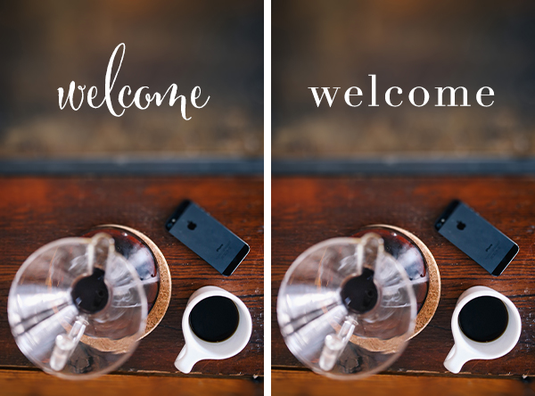
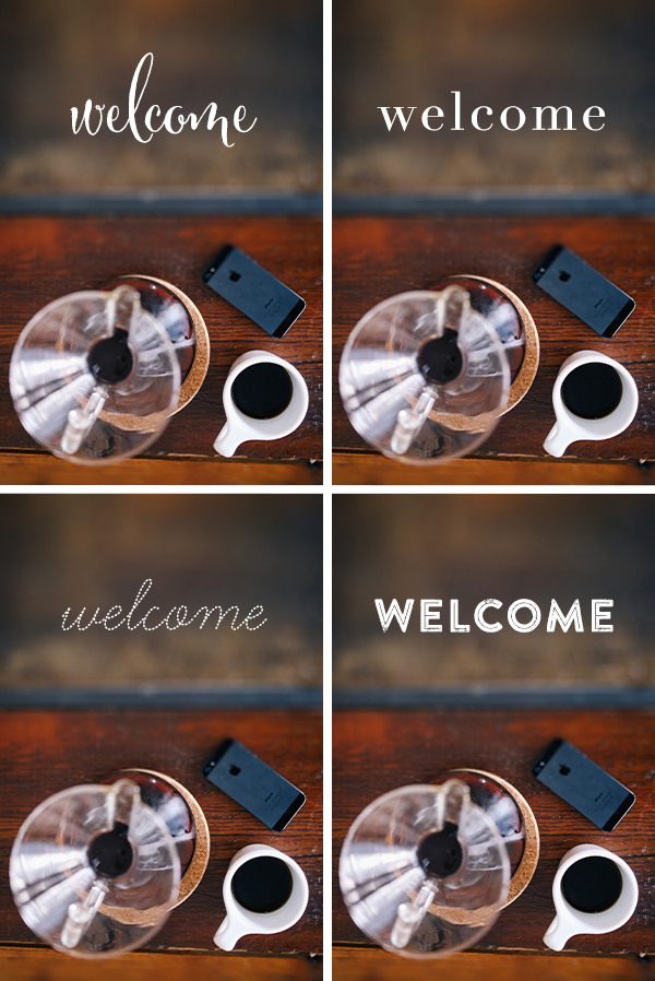
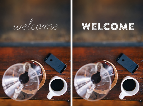
As you can see in these images, using the exact same photograph and only changing the typeface, each instantly depicts a different feeling. The script font elicits a classy, more feminine feeling. The serif font indicates sophistication. The dashed script font feels youthful with a friendly demeanor, and the block letters feel more bold and vintage-inspired.
As you think about the story your typographic selections tell, consider it an expression of style! After all, that is what great design is meant to do: tell a great story.
Fonts used (clockwise from top left): Cantoni Pro, Didot, Brandon Printed, Learning Curve Pro Dashed
photo via Death to Stock Photo
Connect with Laura: Website | Blog | Twitter | Pinterest | Instagram
| Etsy shop
Contact: designdotted@gmail.com

Love this post! I’m always thinking about type styles for clients but pinpointing my own is so hard- it’s one of the hard parts about completing my personal branding. I’m usually drawn to thinner fonts with sleek clean lines. My favorites are ostrich sans and quicksand!
Oh, absolutely. A font can tell loads about a person, a project, an event. Laura was so right in everything she said.
Terrific post!
Love this post about typography. 🙂 I would say I am a modern slab-serif type of girl haha
OOps *modern sans-serif
I think a lot of bloggers are modern sans-serif girls so you’re not too far off! I should come up with a list of my favorites. 🙂
This is such a fun post! I hadn’t quite thought about it before, but this almost seems like a personality test! I’m definitely drawn to a certain type of font — usually a bolder/blockier sans-serif like bebas neue. So what does that say about me? 🙂
There should definitely be a personality to font test!
Such great points Laura, I love this so much! I’m so all over the board though when it comes to favorites lol. I can definitely tell you what I don’t like though. I love handwritten and script fonts first and then probably slab serif. Serif fonts are usually lower on my list.
I’d love to know what you do for your “font test, ” is it anywhere on your own blog?
Thanks so much for having me, Angel, and thanks to everyone for your comments! Marianne, I haven’t done a post about my font test, but that’s a great idea for a future post!
I loved your post Laura! Thank you so much!
[…] Angel of the lovely Studio 404 above had me over on her blog this week – check out my guest post on typographic […]
You know what, I need to learn more about fonts. I know they are super important because sometimes I love a pictures and just when I add some text, I discover it looks better without the text ;(
I know what you mean. I also have a hard time with adding text to pictures, especially when the photography is beautiful. Perhaps there should be a best practices post 😉
Yes, I need to practice a lot, or looking for one I love and using it everywhere
This is such a fun post! I’m split between the script and the block letters – what does *that* say about me? haha
[…] (One of my favorite posts I’ve written was one about your personal typographic style over on Studio 404 awhile back!) We all have certain types that we are drawn to, but even our favorites aren’t […]