Today’s post is one of the upcoming guest posts in the next few months. I made an open call for guest posts at the beginning of the year and was blown away by the response. I’ll have some very talented ladies in the next few weeks sharing some great posts.
Today we have Laura Providence of The Native New Yawker and Party Over Hair. You might recall Laura’s New Year’s printable from the 12 Days of Christmas. Laura has been a very active member of the blog/design community and has released her 270-page Blog Action Planner which is a fantastic resource. I’m a huge fan of black and white, as you may know, so this post is perfect for the blog! Thank you so much Laura!
I’ve never been a fan of color.
When I was younger, I used to tell people my favorite color was purple. I was lying. I actually hated the color purple, along with pinks and anything that most girls my age loved.
I’ve always been attracted to earth tone hues. Navy. Beige. Olive. I live for these colors. My whole wardrobe proves this.
But when it comes to my design aesthetic, even my beloved earth tone hues get thrown out the window for my complete love of black & white.
I’m a minimalist. Nothing makes me happier than white space, black & white photography, Scandinavian interior design and rich black typography.
While in design school, I was always told to work in black & white before applying color. If it works in black & white.. it’ll work in color. The older I’m getting, the more I’m starting to abandon the latter rule. Sometimes.. screw color. If it works in black & white, it works.
With most of my designs, I try to go for simple, clean and timeless. Nothing screams all those things like the usage of little to no color.
When just limiting yourself to two colors, you’re now allowing your creative juices to flow in terms of ways to make your black & white identity stand out–whether it’s using bold, colorful photography or experiment with what paper stock you’ll print on.
Don’t believe me? Here are 7 amazing examples of black & white identities.
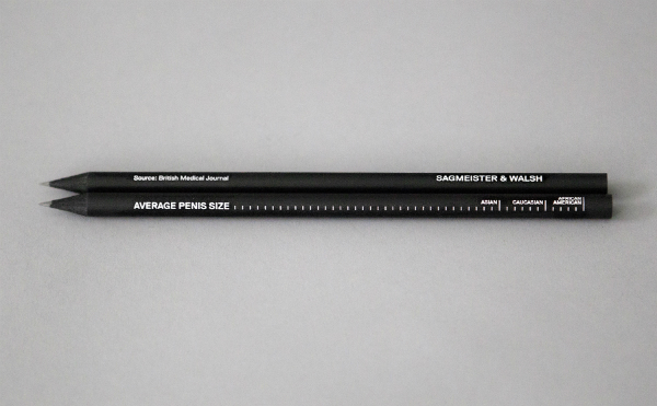
01. Sagmeister + Walsh, via Sagmeister + Walsh
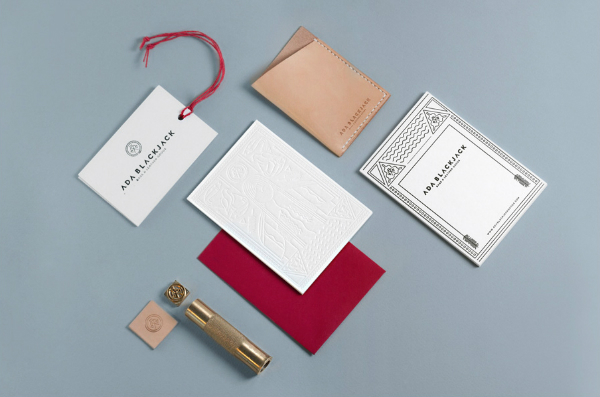
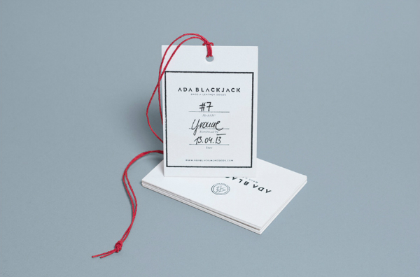
02. Ada Blackjack, via Tobias van Schneider
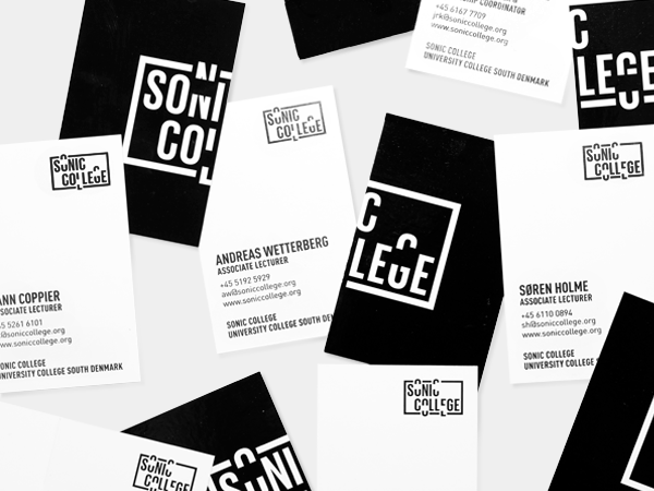
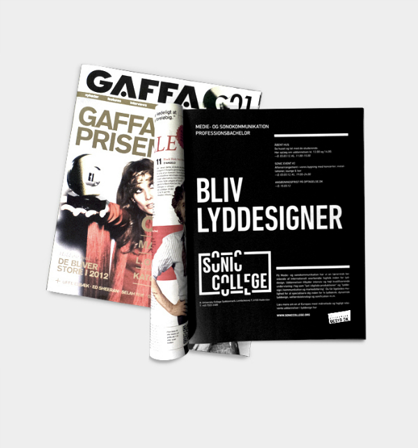
03. Sonic College, via Phong Phan & Daniel Stein
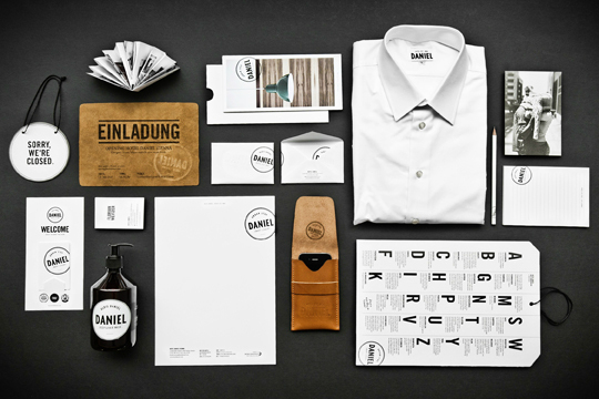
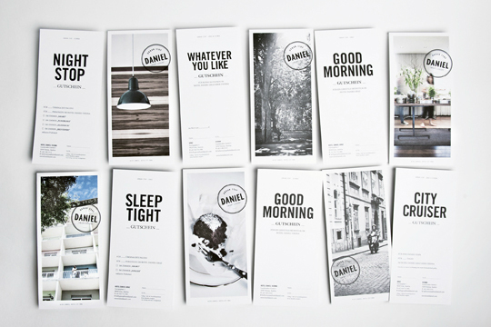
04. Hotel Daniel, via Moodley Brand Identity
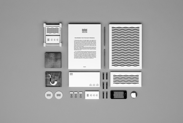
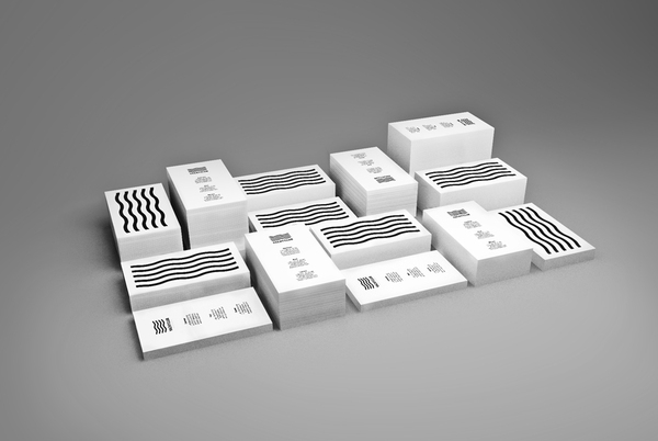
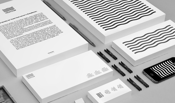
05. Yacht Club Bolesławiec, via Michal Bohdankiewicz
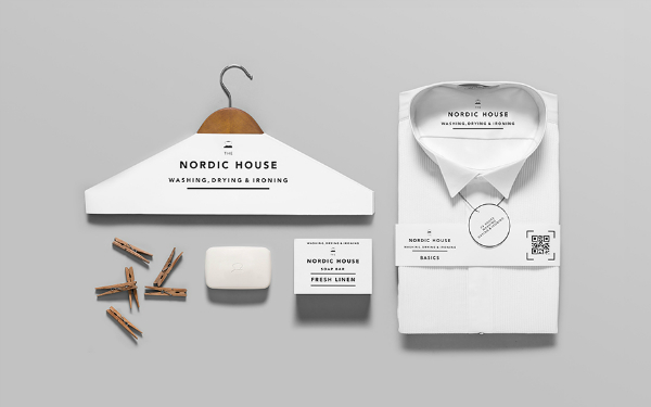
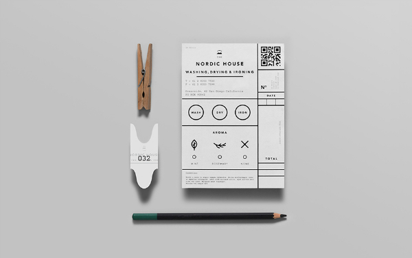
06. Nordic House, via Anagrama
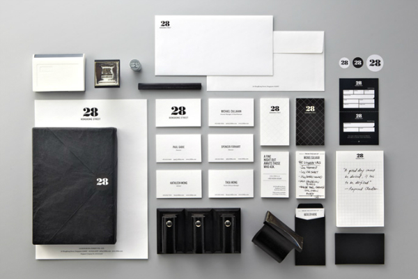
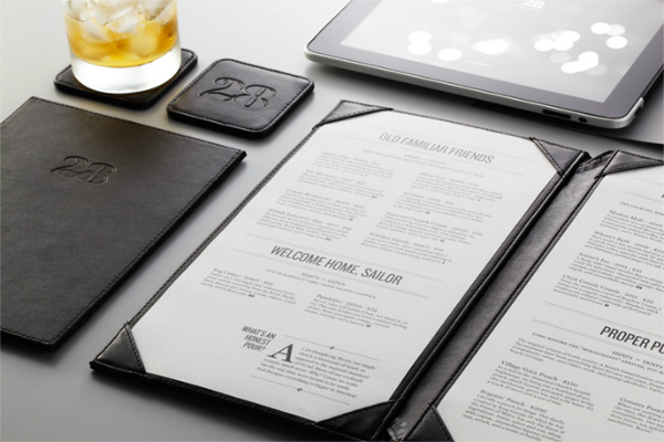
07. 28 Hong Kong Street via We Are Manic
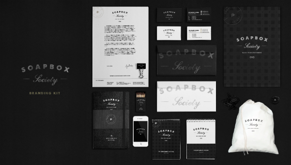
Bonus: Soapbox Society via Jeremy Vessey
Connect with Laura: Blog | Twitter | Google+ | Facebook | Pinterest




These black and white examples are beautiful, and make a statement without hurting my eyes. I can see why you love it so much. You’ve inspired me to pay closer attention to design and details. Limiting yourself to black and white resonates with me in the creative writing department; you just have to let those creative juices flow in your own manner that speaks to you. Thank you for the inspiration!
Akshara I love this comparison. It’s beautifully written which is why you’re a fantastic creative writer. 🙂
Really into the Yacht Club one.
It’s definitely one of my favorites. Thank you for stopping by Matthew.
Love the Yacht Club and Nordic House! Great roundup of designs.
They’re all such great finds! Thank you for stopping by Dani. 🙂
Oh these are beautiful!! I always love a nice, simple, black and white design.
Same here! Thank you so much Laicie 😀
Once again, thank you for having me on your blog today. Glad everyone enjoyed the B&W inspiration! 🙂
So many great comments! Way to go!
Oh gosh so good I think that colour can be used in the right way but sometimes it’s just so not needed! I love doing straight black and white logos. These examples are so awesome!
I’m learning to love color but I’m still a sucker for a good black and white identity design.
I love the idea of just using black and white. Some of my favorite logos I create I feel are ruined when I add color, yikes! Love these identities! Thanks for sharing, Laura!
I know, it’s hard to add color, especially when seeing beauties like these.
I personally love color but im loving the black and white comeback too! Great roundup Angel!
Black and white always has such a special space in my heart. Thank you Marianne!