We’ve successfully made it to another Friday. I don’t know about you but my week was not without its challenges. However, Friday is a day to reflect on inspiration and prepare yourself to coast through the weekend. Perhaps that’s just me!
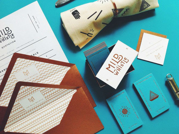
The combinations of the bright turquoise and smooth gold in the Mild Whistle identity design is one of the things I enjoy most about it. The lined envelopes are such a nice touch and the logotype itself is swoon-worthy.
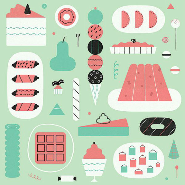
I really think the concept for Snacks Quarterly is pretty neat. As an Internet publication focused on snacks, Snacks Quaterly puts together a variety of work from different artists about their favorite snacks or snacking in general. The above is a piece from illustrator Jing Wei which showcases her favorite snacks in a very fun color palette. How often do you see illustrated waffles?
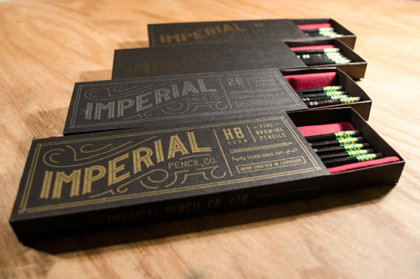
I showcase a lot of student projects on this roundup and you can probably see why. The above packaging design for fictional company, Imperial Pencil Co, was created by Winston Scully. The custom lettering is great and the final result showcases it very well.
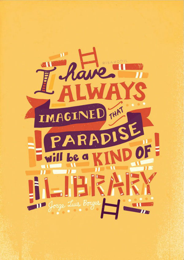
I have been unknowingly collecting the work of Risa Rodil on my Pinterest for a few weeks now. Her illustrations and lettering have really been right up my aesthetic alley. While this piece was part of a nice collection of “Quotes & Quickness“, I just needed to sneak Risa’s work on the blog.
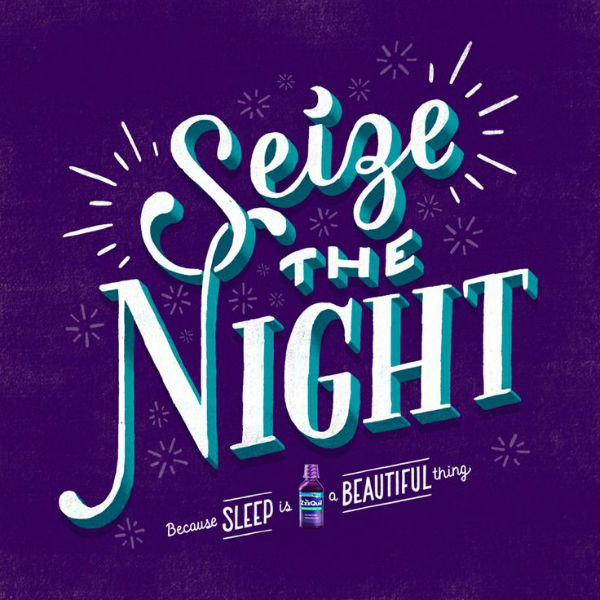
If someone told me years ago, I’d be blogging about Nyquil, I probably would’ve laughed in their face. Regardless, this lettering by Lauren Hom for the aforementioned brand’s ZzzQuil has made it onto this list. Who knew Nyquil purple could be put to good use?
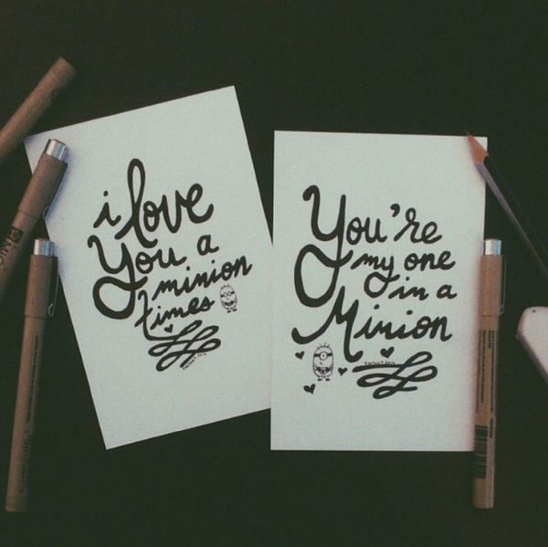
Jenn was awesome by putting together a list of ten hand letterers to follow on Instagram. Above is the work of Synthia Truong who I’m currently adoring. The list includes names like Sean McCabe, Jessica Hische, and Zachary Smith so if you’re lacking lettering inspiration on Instagram, you should go have a look.
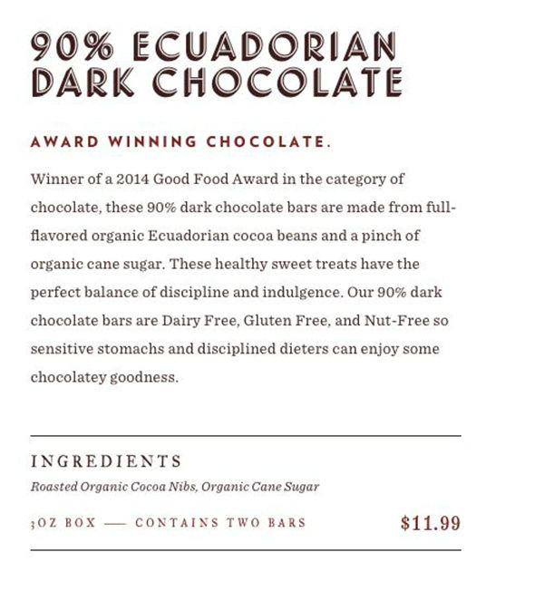
As a huge fan of Cloud Typography, I loved this showcase of the Videri Chocolate Factory website on the Hoefler & Co blog. Designed and developed by local Orlando agency, Purple Rock Scissors, the site features several HFJ (H&C?) fonts from Landmark to Verlag. As I work on redesigning this space, I’m very inspired to see how other designers use the webfonts.
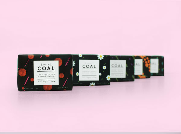
To help showcase more beautiful student work, the packaging for COAL is very refreshing. Designed by Sanuk Kim of FIT, COAL is an organic personal/beauty care product using charcoal. The packaging is intriguing and not on-trend with most organic/natural packaging design which makes it perfect for this week’s list.
This didn’t make last week’s list but I was positive to include it into this week. Jennet Liaw’s hand lettering is again inspiring and new to me. My lettering style is very flowy so I’m all in appreciation with letterers who can make letters…look like legible letters.
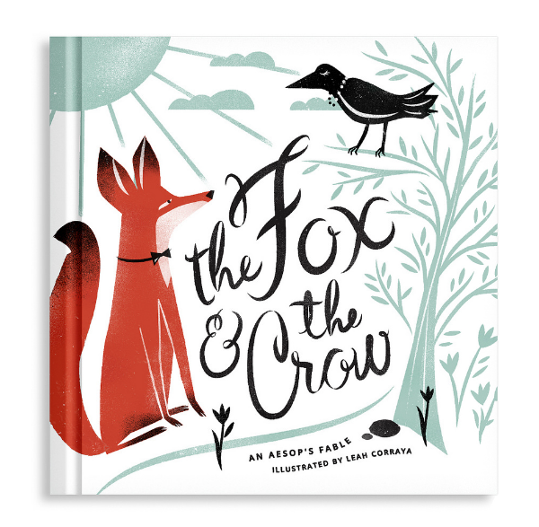
Knowing local designers is great so I’m incredibly happy to share Leah’s work here on the blog. Her latest was a proposed book cover illustration for The Fox & The Crow. I love the composition and arrangement of each element but I can’t get over how cute the fox’s feet are.


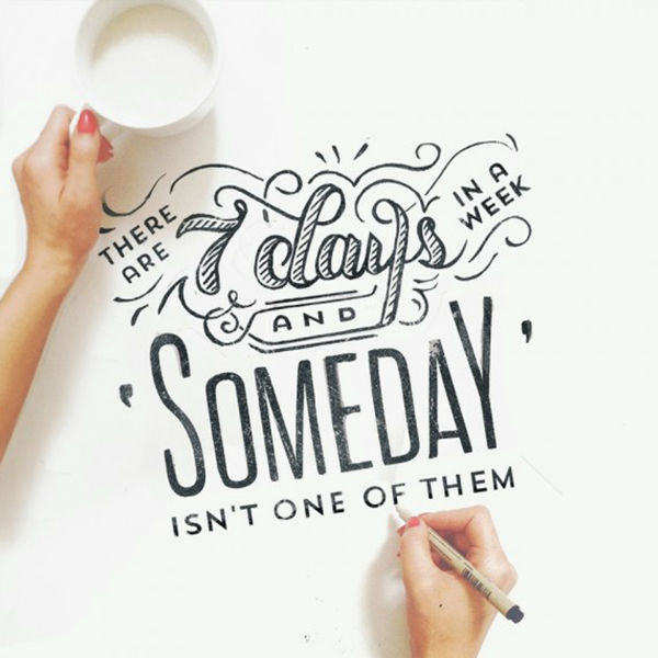



Thanks to you, I’m becoming obsessed with lettering and just how beautiful it looks. I love the “There are 7 days in a week and Someday is not one of them.” Ugh, perfection, much? Great post, as always <3
I love that lettering piece. I can only dream of being that amazing.
Thanks Angel! OMG snacks quarterly…I’m obsessed already. Videri is near our house; if/when I work home from work I walk right past it. They are a cool little shop and have gotten a ton of press since they opened. I’ll stop in every once in a while but I’m personally partial to another local chocolate Escazu 🙂
http://www.escazuchocolates.com/
How cool! I can’t believe there are so many chocolate shops near you. I can’t think of one nearby me.
I found out about Snack Quarterly this week too & love love the idea. I wanna draw up something for it 🙂
Lovely link loves, Angel!
Katrina Sophia Blog
I’m glad I’m not the only one in love with Snack Quarterly. Thanks Katrina!
I loved everything. But my mind got stuck on that Imperial Pencil Co work. It’s mind blowing good! I’ll drool over it a bit more…
And yet another great round-up. I pinned the Mild & Whistle cards earlier this week. Amazing color. Thanks for sharing! Hope you have a wonderful weekend.
I hope you’ve had a lovely weekend!
Winston Scully’s Imperial Pencil Co design is gorgeous! Before I realized that it wasn’t a real product I was ready to buy a few boxes for myself and friends!
I agree, that Nyquil lettering is gorgeous!
I love those One in a Minion cards! 🙂
I thought the same of the pencils! I was very surprised to learn it was student project. Hope you are well friend!
I love the design work you share here! The coal packaging is so pretty- it totally makes me want to buy those products.
Thank you Nnenna! Good packaging can sometimes be the sign of a great product.