This January has been one of the most formidable months of my adult life. With only seven days left, I want to reflect on some amazing things I came across this week. The things I post here are only a small portion of inspiration. I’m sharing all of the time via Facebook and on the newsletter. Here are some amazing things I found this week and they’re all beautiful.
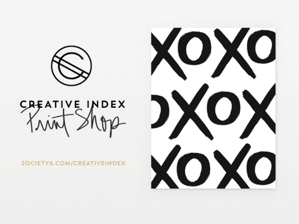
Speaking of fantastic paper shop launches, Jessica of Creative Index launched her Society6 print shop this week! I can’t get enough of her XO print which is perfect for the black and white lovers who need more letters in their lives. Way to go Jessica!
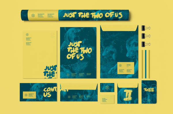
I don’t know if I could ever have a brand that is so colorful but the people of Twee Studio have a fantastic yellow and teal brand. The branding is so well done on their print packaging. I really love the envelope design with the wrapped Contact Us. Brushed lettering is such a strong element in design right now.
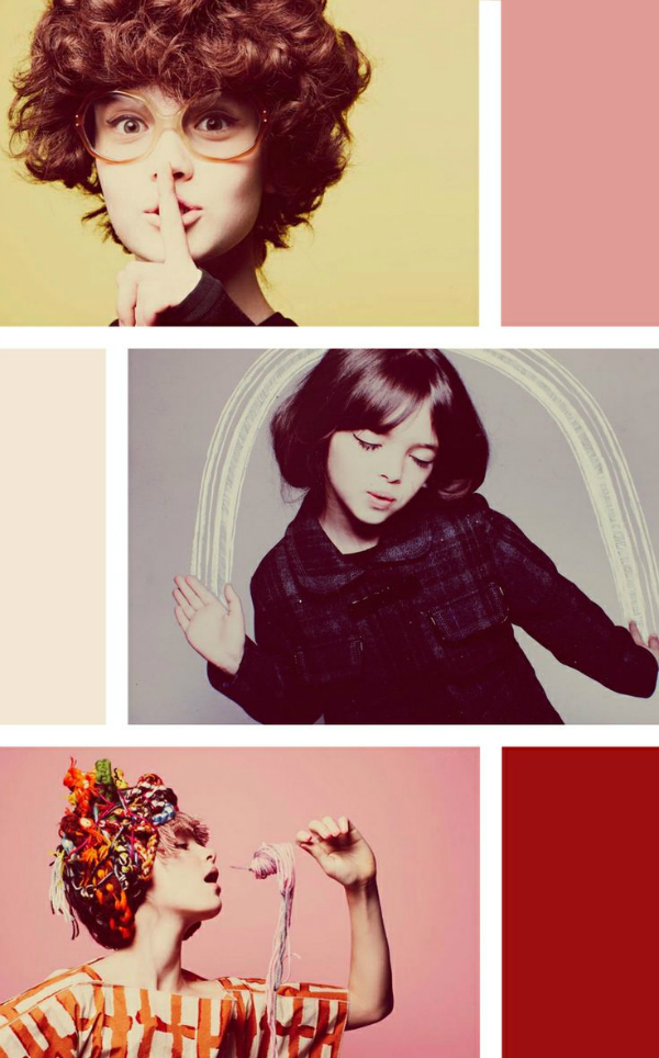
Jessie shared the colorful photography from a kid’s editorial shoot by Anna Palma. Love the soft colors in each shot and the fun styling of the kids. I’m sure this was an exciting shoot to collaborate on and I wish I could have been on at least one of the sets.
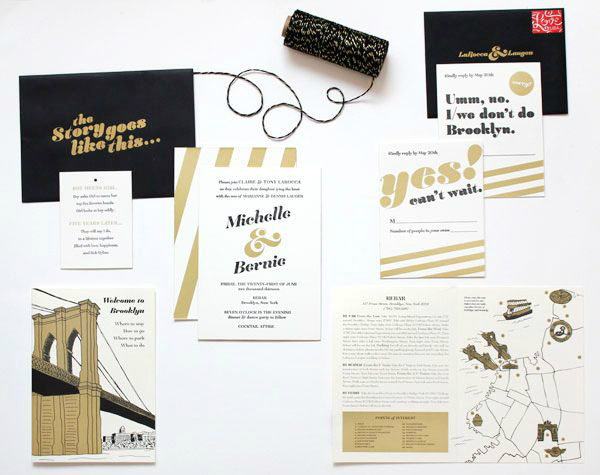
I am so in love with these black and gold Brooklyn invitations posted on Oh So Beautiful Paper this week. From the beautiful line drawing of the Brooklyn Bridge to that beautiful gold ampersand, each element has its own unique contribution to the invitation suite. I have a really big invitation book sitting on my desk at home and I can’t wait to spend some time looking through it.
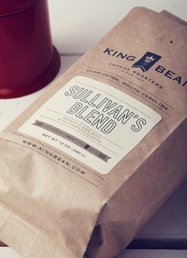
Coffee and tea packaging have to be two of my favorite types of packaging in the packaging design world. The design for the King Bean Coffee Roaster’s packaging is simple and extremely well done. The dotted line borders and the outlined texts for the labels are my favorite elements of this design. I can’t get enough!
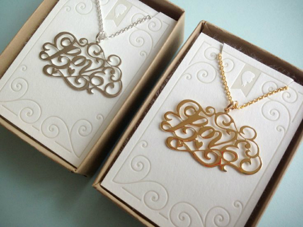
If you get the newsletter, you saw my link for some Jessica Hische work last week. This week, Jessica’s collaboration with Caja jewelry is just in time for Valentine’s Day. I rarely wear jewelry, especially necklaces, but I can put that aside for this beautiful piece. I’m not sorry for my lettering crushes and I’ll talk about Jessica Hische and Mary Kate McDevitt as much as I want.
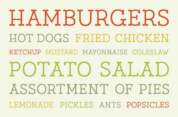
After stumbling upon the beautiful portfolio of Jaime Van Wart, I absolutely adored her custom typeface, Relish. I admire designers who can keep things so well put-together and within their own branding. Maybe one day I can be so well put-together. A girl can dream!
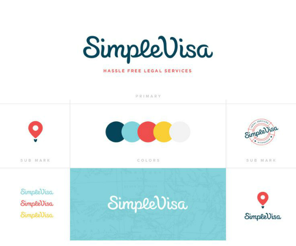
Firstly, let’s just talk about how beautiful the Rook site design is. Secondly, their branding for SimpleVisa is fantastic. The sub mark utilizing the map pin is probably my favorite element in this branding. Everyone loves a versatile brand design.
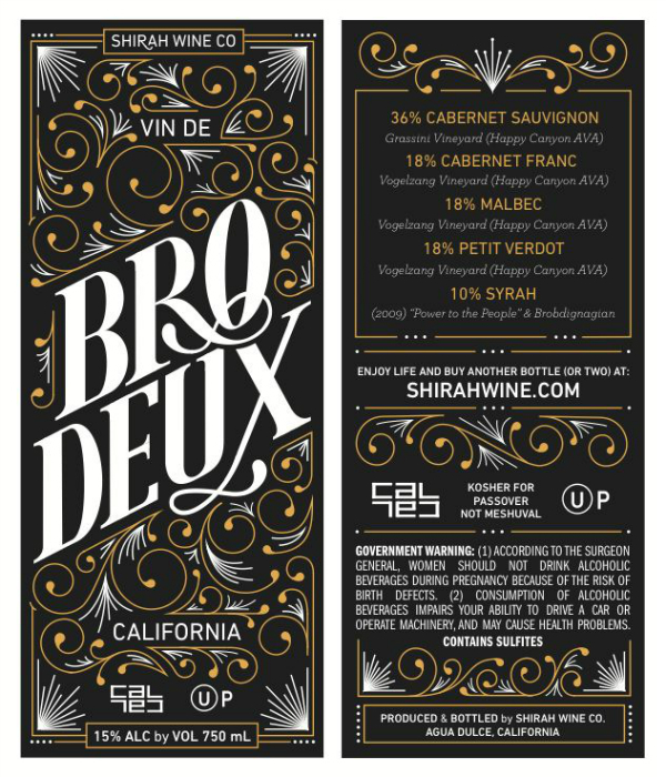
While this is not the final label for Bro.Deux Wine, I prefer this darker version designed by Anna Roplao for Shiraz Wine Company. Anna has a portfolio full of amazing lettering projects and this isn’t an exception. Check out those flourishes. Fantastic!
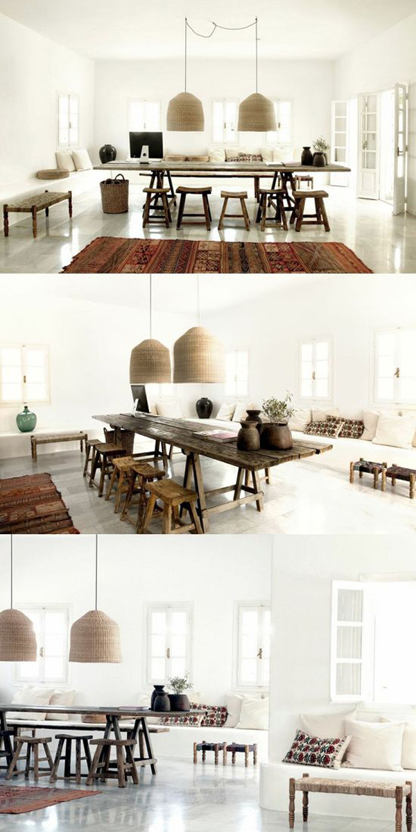
Friends, I’ll end this post with the beautiful interior styling of the San Giorgio Hotel in Mykonos, Greece. It’s such a gorgeous hotel with lots of light, perfect for Greece. I love the handcrafted furniture and the use of multiple textures in these rooms. Most of all, I just want a vacation. 😛





Such a lovely round-up. I’m loving the San Giorgio Hotel. Absolutely amazing. Hope you have a lovely, wonderful weekend! 🙂
Creative Index print shop is just brilliant! The invitation is pretty too! Well, I am loving everything on here actually 🙂 great finds x
Katrina Sophia Blog
Gorgeous design is the best way to end the week!
These are some pretty great links! I’m loving the invitations and coffee packaging!
And thanks so much for the shout out! xx
No problem Jess!