TGIF! I want to extend a huge thank you to everyone who entered the Lady Poppins Print Giveaway. I’ve had a busy week and hopefully I can share some of what I’m working on with you. I’m pretty much done with Studio-404’s design which is exciting. Now I’m handing off the pieces to my partner-in-crime who will help me with the development since I’m a little swamped with design projects. This week’s inspiration was in abundance and I can’t wait to share it with you.
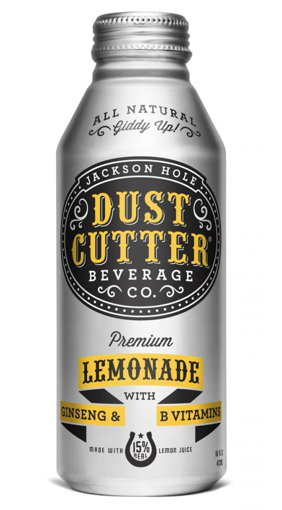
Lemonade has never looked so edgy. I adore this bottle design by Cultivate for Jackson Hole Dust Cutter Beverage’s Lemonade. The type choices are divine.
I’ve been head of marketing for my church for the past two years and I cannot say I’ve created anything this wonderful yet. I love this poster for the Bellevue Health Fair by Christ Community Church. The illustrations and colors are divine.
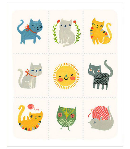
I’m always a fan of cute Etsy shops. How adorable is this print by PetitReviv? I most definitely can’t pass up great illustrations of cats. I mean, they are cats.
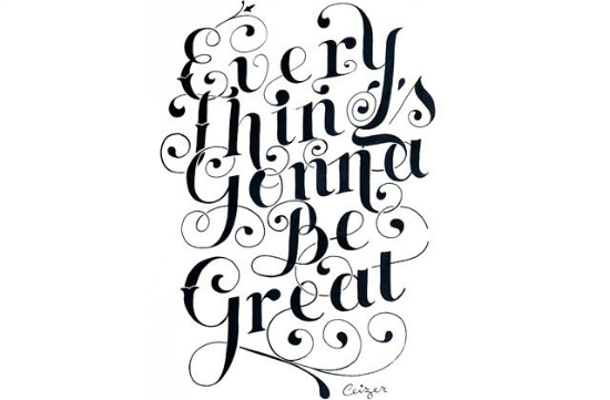
Peter Ceizer is one the latest typographers to bring gorgeous lettering into the fashion world. Fashionista posted a fun interview with Peter about his history, his love for lettering, and his journey to work with Colette.
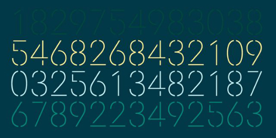
I can’t say that I’ve always been a fan of stencil typefaces but Doctrine does stencil right. The breaks in the characters are in the right places with the right amount of space. Now if I can figure out an excuse to purchase, I’ll be a happy designer.
Isn’t this gorgeous? Ann of Grit and Wit shared her latest project featuring the rebranding of Natalie Seeboth Photography. I can’t get enough of the color palette. The new aesthetic definitely is in line with Natalie’s photography style which is so important when branding photographers.
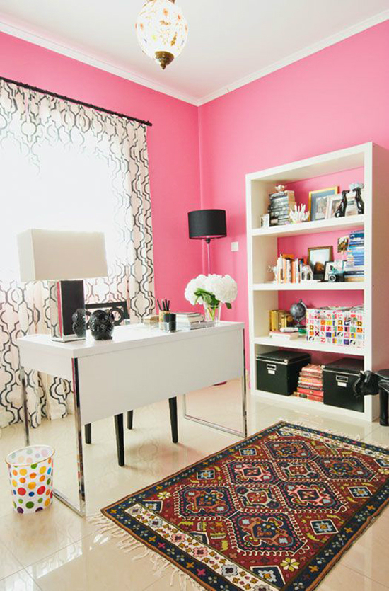
I will probably (no promises!) shut up about moving into my office after this. However, I adore this office styled by designer Caitlin Wilson. I’m not sure if I could pull of hot pink walls but I’m loving all of the pattern choices. If only I could be so bold.
So in case you thought your Instagram photos were amazing, Andrew Gallo shot a series of gorgeous photos in Iceland with his iPhone, including the one above. I know editing has a lot to do with pictures but it still takes some type of talent I would imagine to get so much detail in one shot with a phone. You have to see the rest!
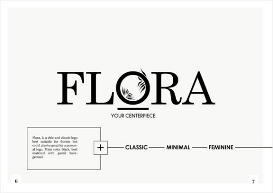
Corina of Cocorrina is doing amazing things. She just launched her jewelry line and two amazing lookbooks, one for the aforementioned jewelry line and the second for her logo shop. I love the sample logo above which is a great example of Corina’s design aesthetic, minimal and classic.
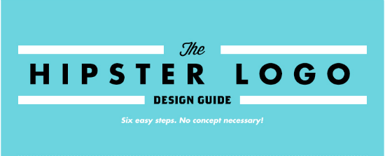
If you ever needed instructions on how to add a little more hipster into your branding life, there is now a Hipster Logo Design Guide which makes me laugh so much. I think I lost it at the badges which is only the beginning of the hilarity.
Be sure to stay tuned tomorrow for the announcement of the winner! Enjoy your weekend.





That Hipster Logo Guide was hilarious. I shared it with so many people this week. And, damn I need to get better with my iphone pictures because those people Andrew took are amazing! Hope you have a wonderful weekend! 🙂
Laura