

I can’t believe it’s that time of week again. I was anticipating having to cancel this week because I haven’t had any time to read my blogs but apparently I did more reading than I thought! The ten items were quick and easy to find so I hope you enjoy them as much as I do!
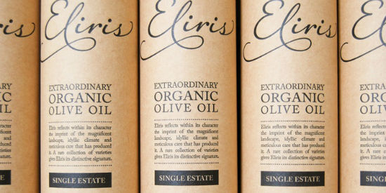
I adore this packaging design for Eliris Greek Olive Oil. The picture above is a snapshot of the actual packaging the bottle comes in which is modern, clean, and catches the buyer’s attention. I would love to see Eliris in my local market.

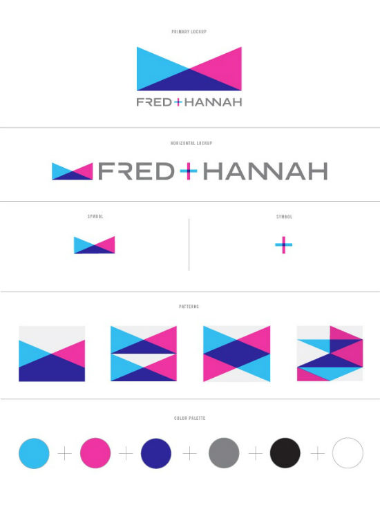
Shauna of Nubby Twiglet shared her latest branding project for Fred and Hannah, a couple photography duo in Tasmania (how cool!). I love the use of the cyan and magenta (which I’m sure keeps their print collateral flawlessly printed) in their branding. I also love how Shauna allowed herself creative use of the type instead of just using the standard typeface. It’s a great inspiration for my upcoming branding projects.
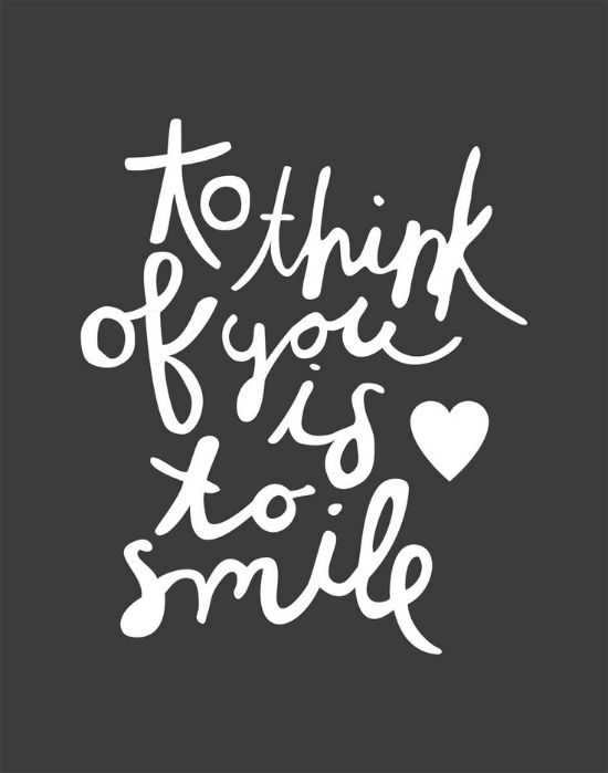
Breanna Rose shared with us a gorgeous print she did for a client. The client, in return, printed a few copies of the print and is now selling it on her Etsy shop. I’m not sure if Breanna is would want to open a print shop of her own but she would do an amazing job.
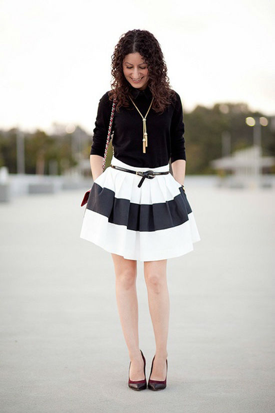
I don’t always browse fashion blogs; but when I find one I love, I can’t wait to talk about it. Kelly of Alterations Needed does a great job representing my ideal career wardrobe. I love her look above featuring a black and white striped Rachel Zoe skirt. Now I’m a huge fan of Kelly’s blog and am looking forward to enjoying many of her new looks.
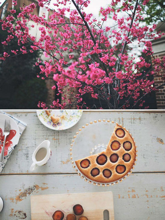
Victoria of SF Girl By Bay featured the photography of Olivia Rae James on her blog this week. Olivia’s photography is amazing! I fought back the urge to feature her on a post (and I may some day in the future). Until then, make sure you check out Victoria’s post because it’s filled with photography goodness.
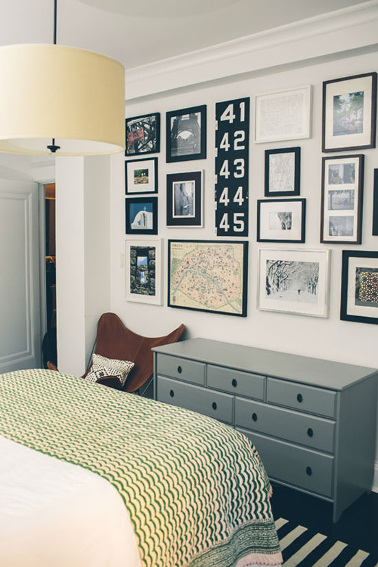
I love this bedroom of the home of Kiera Kushlan featured on Design*Sponge this week. Kiera’s home is my dream home! It’s filled with stripes and black and white along with some great art work. Maybe someday I can turn my apartment into something similar.
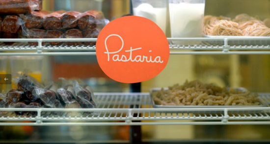
I love this simple branding for Pastaria which is, as you could have guessed, an Italian restaurant located in St. Louis. The design is modern and clean which is very different from what you would normally see at an Italian restaurant It was refreshing to see the branding go in the opposite direction of the typical, old family-style restaurants.
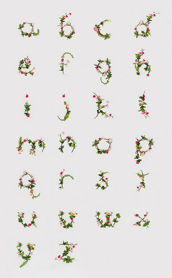
Eva shared this great floral alphabet by Ann Lee this week. The gorgeous floral typography was hand crafted and photographed by Ann although it could easily pass as being illustrated. I love when type goes beyond its “boundaries” and Ann did a great job with this project.
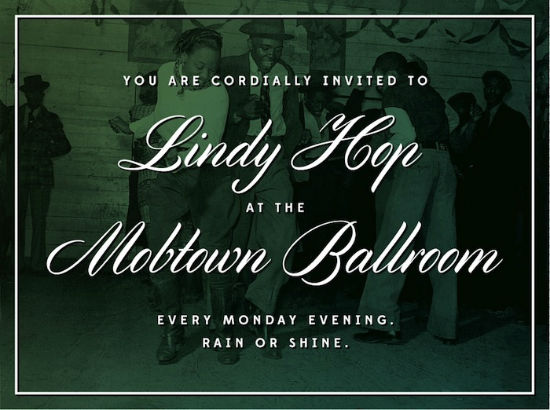
The above is showcasing a new free script by font, Cylburn. Cylburn was created by Dai Flodes a hand-letterer from Baltimore. I really love the above image, designed by Andy Mangold. I haven’t fallen for a free font in a while so I’m happy to be saving on my excessive font spending.
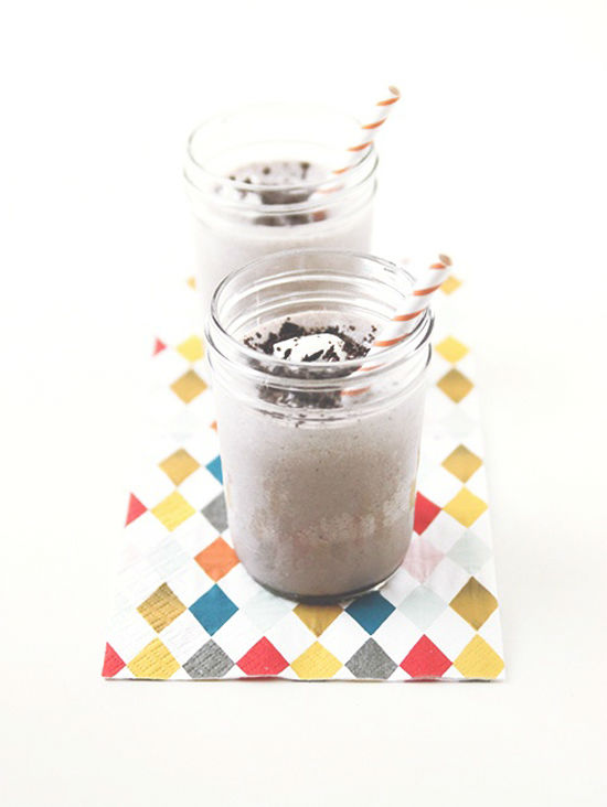
This cookies and cream milkshake posted on The Faux Martha made my afternoon. As I am working to experience a healthier lifestyle, I can’t help but be swayed by the delicious milkshake above. TREAT YO SELF.
I hope you have a great weekend! I have some posts lined up next week but if you’re interested in guest blogging, let me know! I need a few posts while I’m out in Jacksonville.

Brat Generator Online makes it easy to create brat-style text visuals instantly.
Ai Photo Enhancer is a fast and easy AI-powered photo enhancement tool.
HEIC to JPG is a free online tool that allows anyone to quickly and easily convert HEIC images to JPG format.
AI Image Editor Pro offers an advanced AI-powered photo editing experience.
I always enjoy these curated link roundups—there’s always something unexpected to discover, like the clever packaging for Eliris or the fresh branding for Pastaria. In a similar spirit of exploring new perspectives, I recently came across an interesting tool that uses AI to read palm lines from a photo, offering insights into personality and potential life paths. It’s a fun, modern twist on an ancient practice and a great conversation starter. If you’re curious about how your own palm readings might align with your traits, you can try it for yourself at AI palm reading insights. It’s definitely worth a look during your next browsing session.
Love these weekly link roundups—there’s always a fresh mix of design and branding inspiration to discover. On a similar note of finding useful creative tools, I recently started using Audio Enhancer Ai to clean up the audio on my podcast episodes and voice recordings. It strips background noise and boosts clarity right in the browser, which is a huge time-saver for content creators.
Such a great mix of design inspiration here – the Eliris olive oil packaging and Ann Lee floral alphabet are gorgeous. Whenever a client sends me .mov files from a shoot for mood references, I pull the audio with MOV to MP3 so I can listen while I work. Keep these roundups coming!
The Eliris Greek Olive Oil packaging really struck me with its clean, modern aesthetic. It’s a great example of how simple design can be incredibly effective and memorable. I also found the branding project for Fred and Hannah fascinating, particularly the creative use of color and typography. It’s inspiring to see designers pushing boundaries with those elements. Speaking of design inspiration, I’ve been experimenting with AI for interior design visuals, and the results can be surprisingly nuanced. You might find some interesting comparisons on AI Interior Lab if you’re curious about how different styles interpret the same space.
That Eliris Greek Olive Oil packaging is indeed striking! The clean lines and modern aesthetic really make it stand out. It’s a great example of how thoughtful design can elevate a product. I also appreciated your point about Shauna’s branding for Fred and Hannah – the bold use of cyan and magenta, along with the creative typography, is a fantastic combination. It reminds me of how important it is to let type breathe and have personality, something I’ve been exploring in my own design work recently. I wrote about a similar approach on FrontWars.io and found that even small tweaks can make a huge difference. The fashion section was a nice touch too; I’m always looking for inspiration for a polished work wardrobe.
This roundup is such a great mix – the Eliris olive oil packaging and Olivia Rae James photography especially caught my eye. I love seeing typography, prints and interiors all side by side like this. For my own mood boards I have been turning still frames into short video loops with photo to video ai free to see how the shots would actually move. Thanks for putting these links together!
That Eliris Greek Olive Oil packaging is *chef’s kiss*! I’m always drawn to brands that manage to be both clean and striking. It makes you want to pick it up, doesn’t it? And speaking of unique branding, the way Shauna played with typography for Fred and Hannah is so smart. It really elevates the whole look beyond just a logo. It reminds me a bit of how we approach creating personalized songs at Song For You – taking someone’s story and giving it a unique, memorable audio “brand.” It’s all about capturing that essence in a creative way.
This week’s lineup is such a great mix of packaging, photography, and brand identity work — Fred and Hannah’s branding and Olivia Rae James’s portraits especially stood out to me. Lately I’ve been leaning on Bernini AI to mock up quick motion references when I’m pitching visual concepts, and it pairs nicely with the kind of moodboard energy in this roundup. Thanks for the consistent inspiration!
The Eliris Greek Olive Oil packaging really caught my eye too – that clean, modern design is so effective. It’s amazing how much good packaging can influence a purchase decision, even for something as common as olive oil. I also found myself drawn to the branding project for Fred and Hannah; the use of cyan and magenta is striking, and I agree that the creative typography is a fantastic touch. It’s a reminder of how much personality can be injected into branding. I often think about how these design principles apply to other areas, like organizing information. I wrote about a similar approach to clarity and impact on NTE Codes Hub and found that thoughtful presentation makes a huge difference.
That Eliris Greek Olive Oil packaging really caught my eye too! It’s so sleek and modern, definitely something that would make me pause in the grocery aisle. It’s a great example of how strong visual design can elevate a product. I also loved the branding for Fred and Hannah – the use of color and playful typography is fantastic. It makes me think about how important it is to have a cohesive visual identity across all platforms.
It actually reminds me of some of the AI-driven design tools I’ve been experimenting with lately. For example, I’ve been using [AI Interior Lab](https://aiinteriorlab.com) to visualize different design concepts for spaces, and it’s amazing
That Eliris Greek Olive Oil packaging is *chef’s kiss*! Seriously, I’m always drawn to designs that are both clean and striking – it makes you want to pick it up, even if you don’t need olive oil. It’s that instant visual appeal that really matters.
Speaking of visual appeal, I’m always impressed by how much a good branding project can elevate someone’s presence. The Fred and Hannah photography duo example really highlights that. It’s fascinating how much thought goes into every detail, from the color palette to the typography.
It makes me think about how important it is for all kinds of professionals to have a strong visual identity, not just photographers. If you’re looking to polish up your own professional look, I came across this tool called HeadshotAI that helps create really sharp AI headshots from a single selfie. It’s a neat way to get a consistent, professional look for profiles and branding. What do you think is the most crucial element in a strong visual identity today?
Love this roundup of design and photography inspiration! The Eliris packaging and Fred and Hannah branding pieces really stood out to me. I’ve been using Voe 3.1 to turn still design shots into short video clips for portfolio reels and it pairs beautifully with curated inspiration like this.
That Eliris Greek Olive Oil packaging really does stand out – the clean lines and modern aesthetic are definitely appealing. It makes me think about how important good design is for even everyday items. Speaking of design and attention to detail, I recently wrote about a similar approach on AnyPassportPhoto and found that ensuring every element meets precise specifications, like photo dimensions, can make a huge difference in the final product’s success. It’s fascinating how a strong visual identity can influence perception.
That Eliris Greek Olive Oil packaging is certainly striking! The clean lines and modern aesthetic really do make it stand out. It makes me wonder how much of a brand’s success hinges on that initial visual appeal. I actually wrote about a similar approach to brand identity for sbti personality test and found that a strong visual can significantly influence perception, even before someone engages with the product itself. The Fred and Hannah branding also caught my eye; the use of those specific colors and the creative typography feels very intentional and impactful. It’s great to see designers pushing boundaries like that.
The Eliris Greek Olive Oil packaging definitely caught my eye – that minimalist, clean design is so effective. It makes me think about how presentation can really elevate a product, much like how a well-designed room can transform a space. I’ve been experimenting with different visual strategies for interior design concepts, and seeing strong branding like this is always a good reminder. It’s inspiring how much impact thoughtful design has, whether it’s for olive oil or for suggesting new room layouts on roomflip.pro. I also appreciated the mention of the photography duo’s branding; the creative type usage is a fantastic detail.
The Eliris Greek Olive Oil packaging really caught my eye – that clean, modern aesthetic is so appealing. It’s a great example of how design can elevate even everyday products. I also found the discussion on Shauna’s branding project for Fred and Hannah fascinating. Her creative use of typography is a smart move; it makes the branding feel so much more unique and memorable, which is something I constantly think about when creating guidelines for official photos. It’s a subtle detail, but it makes a big difference. I’ve been looking into similar design principles for making sure passport photos meet all the strict requirements, and it’s amazing how much thoughtful design can impact user experience.
That Eliris Greek Olive Oil packaging is really striking! The clean lines and minimalist aesthetic definitely make it stand out. I’m always drawn to designs that feel both modern and timeless, and this one hits that mark perfectly. It makes me think about how crucial strong visual identity is, not just for consumer goods but for creative services too. I wrote about a similar approach on Borderlands 4 toolkit and found that even in a game context, clear branding helps players navigate complex information. The Fred and Hannah branding with its bold color choices is also a great example of effective visual communication.
That Eliris Greek Olive Oil packaging design is particularly striking. The minimalist approach with that pop of color really does make it stand out on a shelf, and I can see why you’d want to pick it up. Speaking of design inspiration, I found the use of cyan and magenta in the Fred and Hannah branding especially clever; it’s a bold choice that clearly paid off. It reminds me of how strategic color choices can elevate a project, something I’ve explored a bit on Borderlands 4 toolkit when discussing visual elements in game design. It’s always great to see how different fields leverage design principles so effectively.
The Eliris Greek Olive Oil packaging really caught my eye too; that clean, modern aesthetic is so effective. It makes me wonder if more brands will move away from overly busy designs. I also found the branding for Fred and Hannah really interesting, especially the creative use of typography. It’s a good reminder that established fonts don’t always have to be used rigidly. I’ve been experimenting with similar design flexibility in some of my own projects, and I wrote about a similar approach on OrbitDash and found it really opened up the creative possibilities. It’s inspiring to see how others are pushing design boundaries.
The Eliris Greek Olive Oil packaging is definitely striking. That clean, modern design really does stand out, and I can see why you’d want to find it on shelves. It reminds me a bit of some of the sleek interfaces we aim for on interactive maps; clarity and immediate appeal are so important for user engagement. I also found the Fred and Hannah branding really well done. The use of those specific colors and the creative typography is a smart way to make a brand memorable, especially in a visually competitive market. It gives me ideas for how to present information clearly, almost like highlighting key locations on a map.
The Eliris Greek Olive Oil packaging really does stand out with that clean, modern aesthetic. It’s a great example of how thoughtful design can elevate even everyday products. I’m always on the lookout for visually appealing branding, much like the cyan and magenta used in the Fred and Hannah photography duo’s project you linked. That color combination is striking and, as you noted, practical for printing. Speaking of visual projects, I’ve been working on something similar with interactive maps, and finding the right visual elements is crucial. You can see some of my work on Subnautica 2 Map; it’s a different context, but the design principles resonate. It’s inspiring to see how different creatives are pushing boundaries in their respective fields.
That Eliris Greek Olive Oil packaging really does stand out – so clean and modern. It makes me think about how crucial first impressions are, not just for food products but for any design. It’s similar to how I approach tattoo design previews; seeing it before committing is key. Speaking of creative branding, the use of cyan and magenta for Fred and Hannah is brilliant. It’s a bold choice that definitely makes their work memorable, and a great reminder to push creative boundaries with typography. I also found the point about Breanna Rose’s print being sold on Etsy fascinating – sometimes a client collaboration can unexpectedly open up new avenues!
That Eliris Greek Olive Oil packaging really does stand out. The clean, modern aesthetic is exactly what draws me in, and I can definitely see how it would grab attention on a shelf. It’s a shame it’s not more widely available! I also really appreciated your point about Fred and Hannah’s branding; the use of cyan and magenta is a smart choice for print, and the creative typography adds such a unique touch. It’s a great example of how subtle choices can make a big impact. I’ve been thinking a lot about visual branding lately as I work on some personal projects, and this has given me some excellent ideas.
That Eliris Greek Olive Oil packaging is *chef’s kiss* modern and clean. I’m a sucker for good design that grabs you – it’s so crucial for making an initial impression, whether it’s for a product on a shelf or a service you’re offering. Speaking of making things accessible and user-friendly, I was just looking at how Spire ESS streamlines the process of sourcing and integrating various energy products, from residential batteries to EV chargers. It’s a similar vibe of simplifying complex things for a better user experience. Have you noticed how much easier things are when the setup is intuitive?
The Eliris Greek Olive Oil packaging really caught my eye too – that clean, modern aesthetic is so appealing. It makes you wonder what other design gems are out there that we haven’t seen yet. I also appreciated the mention of Shauna’s branding project for Fred and Hannah; the creative typography use is something I always look for when evaluating branding. It’s that attention to detail that elevates a design from good to memorable. I’ve been exploring different branding strategies myself, and have found some really interesting case studies on MW4 Hub that touch upon similar principles of visual identity and client collaboration.
That Eliris Greek Olive Oil packaging is seriously slick! I love when brands go for that clean, modern look – it just feels so premium. It totally makes me think about how important visual branding is, whether it’s for olive oil or something more… artistic.
Speaking of visual design, I was just checking out how creative Shauna got with the typography for Fred and Hannah. It’s inspiring to see that kind of freedom with fonts, rather than just sticking to the standard. It reminds me of how we approach design at InkBolt, where we take a single idea and explore different visual directions to find the best tattoo concept. You can play around with different styles and see how the core idea transforms.
The Eliris Greek Olive Oil packaging really stood out to me – that clean, modern design is so appealing, and I can see why you’d want to spot it in your local market. It’s a great example of how strong visual identity can make a product fly off the shelves. I also found the branding for Fred and Hannah super inspiring, particularly the bold color choices and creative typography. It reminds me of some of the design challenges I’ve tackled when tracking down rare Pokopia Crystals; sometimes you need a unique approach to make something truly memorable. It’s wonderful to see how these designers are pushing creative boundaries.
I also really appreciated the Eliris Greek Olive Oil packaging; that clean, modern aesthetic is so appealing, and it definitely makes you want to pick it up. Speaking of design inspiration, I found the way Shauna played with typography on the Fred and Hannah branding particularly clever. It adds so much personality beyond just sticking to a standard font. It reminds me a bit of how we approach designing clear guides for things like Pokopia Crystals – you want it to be functional but also visually engaging. The Breanna Rose print is lovely too; it’s always rewarding when a client sees that much potential in your work.
The Eliris Greek Olive Oil packaging really caught my eye too! That clean, modern design is so effective at standing out on a shelf. It’s a great example of how thoughtful design can elevate a product. I’m also intrigued by Shauna’s branding for Fred and Hannah – the use of bold colors and creative typography demonstrates a strong understanding of brand identity. It makes me think about how even in fields like real estate marketing, creative visual presentation is key. I actually wrote about a similar approach for creating impactful visuals on VirtualStagingAI, where we focus on transforming empty spaces into appealing listings. It’s fascinating to see these design principles applied across such different industries.
The Eliris Greek Olive Oil packaging really does stand out – that clean, modern aesthetic is so effective. It makes me wonder about the psychology behind packaging design and how much it truly influences our purchasing decisions, especially when you’re just browsing a crowded shelf.
I also found the Fred and Hannah branding particularly interesting. The bold use of cyan and magenta, as you pointed out, is striking, and the creative typography is a smart move. It’s a great example of how branding can feel both professional and personal. I’ve been exploring similar creative approaches myself, and I wrote about a personalized song gift idea on Song For You that also aims for a unique, memorable touch. It’s always inspiring to see how others are pushing creative boundaries.
The Eliris Greek Olive Oil packaging definitely stands out – that clean, modern look is so appealing, I can see why you’d want it on your grocery shelf. And Shauna’s branding for Fred and Hannah is fantastic; the limited color palette of cyan and magenta is striking, and the playful typography really gives it personality. It reminds me a bit of the kind of creative freedom I look for when developing brand hooks with an AI Jingle Maker. It’s inspiring to see how these elements can come together so effectively.
What a fantastic roundup! I especially loved seeing the Eliris Greek Olive Oil packaging—it truly is modern and eye-catching. And Shauna’s branding for Fred and Hannah sounds like a brilliant example of creative typography, definitely inspiring for future projects. It’s posts like these that really highlight the brilliant work circulating out there, and it reminds me to check out sites like Block Poster for more design inspiration. Keep sharing these gems!
The Eliris Greek Olive Oil packaging really stands out – that clean, modern design is precisely what makes a product pop on shelves. It’s a great example of how thoughtful design can elevate even something as commonplace as olive oil. Speaking of thoughtful design, the branding for Fred and Hannah is fantastic. Allowing creative freedom with typography, as Shauna did, is often overlooked but makes such a difference in the overall impact. I’ve found that a similar attention to detail in presentation can really benefit even niche topics, like the gardening guides I put together on GrowAGardenInfo. It’s inspiring to see how these different fields all benefit from strong visual identity.
The Eliris Greek Olive Oil packaging is indeed striking; that modern, clean aesthetic really does make it stand out. It’s amazing how a good design can elevate a product so much. Speaking of creative projects that catch the eye, I’ve been exploring some fascinating fan-made content lately, and I wrote about a similar approach on SOFTMONEY Games and found that user-generated creativity can be incredibly impactful. I also appreciate the mention of Shauna’s branding project for Fred and Hannah—the playful use of typography is a fantastic detail that adds so much personality. It’s inspiring to see designers taking those kinds of creative liberties.
The Eliris Greek Olive Oil packaging definitely stands out – that clean, modern aesthetic is so appealing. It makes you wonder about the power of good design to elevate even everyday products. I also really enjoyed the branding project for Fred and Hannah, especially the creative typography choices Shauna incorporated. It reminds me of how important it is to allow for that kind of artistic freedom in branding. It’s inspiring to see how designers are pushing boundaries. I wrote about a similar approach to creative freedom in game development on SOFTMONEY Games and found that embracing unique elements often leads to the most memorable results.
The Eliris Greek Olive Oil packaging is indeed striking – that clean, modern look really does make it stand out. It’s a good reminder that even everyday products can be elevated with thoughtful design. I also found the branding for Fred and Hannah photography particularly interesting, especially the bold use of cyan and magenta. It highlights how strategic color choices can create a memorable brand identity. I’ve been exploring similar principles in creating visually appealing presentations for design projects. For instance, when showcasing room transformations, the right color palette and typography are crucial for making a strong impact, much like the examples you’ve shared. It makes me wonder about the behind-the-scenes decisions that lead to such effective visual communication – things that can be easily tested and refined with tools like roomflip.pro.
That Eliris Greek Olive Oil packaging sounds fantastic! I love when branding manages to be both modern and clean while still feeling inviting. It’s a tough balance to strike. The Fred and Hannah branding also caught my eye; the use of cyan and magenta is a bold choice that really makes it pop, and I agree about the creative typography – it adds so much personality. It reminds me a bit of the approach we take when crafting personalized songs; we focus on weaving in unique details from a person’s story to make the final product truly special, much like how Shauna used type to reflect the photography duo’s brand. I’m always on the lookout for beautiful design inspiration.
That Eliris Greek Olive Oil packaging really does stand out – it’s so simple yet effective. I’m always drawn to designs that look clean and modern on the shelf. The way they used color and typography for Fred and Hannah’s photography duo branding is also fantastic; that vibrant cyan and magenta combo is especially striking and definitely makes them memorable. It makes me think about how important visual branding is, even in areas like online gaming where a strong aesthetic can really draw players in. I wrote about a similar approach to visual appeal on OrbitDash and found that even small design touches can make a big difference.
That Eliris Greek Olive Oil packaging really caught my eye too – the clean lines and modern aesthetic are fantastic for making a product stand out on the shelf. I also appreciated the mention of the Fred and Hannah photography branding; the creative typography is a smart move and definitely elevates their visual identity. It reminds me of how even small design choices can make a big impact. I wrote about a similar approach to branding and its importance for online presence on OrbitDash CC and found that consistency across elements is key. It’s great to see such diverse inspiration!
The Eliris Greek Olive Oil packaging definitely stands out! That modern, clean aesthetic is exactly what draws me in when I’m browsing for new products. I also found Shauna’s branding work for Fred and Hannah really inspiring, especially her playful approach with typography. It’s a great reminder that sticking to the basics isn’t always the most effective route for branding. Speaking of creative projects, I’ve been exploring different ways to organize and present design inspiration myself, and I recently wrote about a similar approach on OrbitDash CC and found it really helpful for keeping track of cool finds. Thanks for sharing these links!
The Eliris Greek Olive Oil packaging really caught my eye; that clean, modern aesthetic is so appealing and definitely stands out. It’s a great example of how strong design can elevate a product. I also found the branding project for Fred and Hannah particularly interesting, especially the creative use of typography. It reminds me of some of the challenges we tackle when designing virtual staging for real estate listings – balancing professional presentation with a touch of personality. Sometimes simple, bold choices can make a huge difference in how a space, or a brand, is perceived. I wrote about a similar approach on roomflip.pro and found that clear visual communication is key.
The Eliris Greek Olive Oil packaging definitely stands out—that clean, modern design is so effective. I also really appreciated the Fred and Hannah branding; the use of cyan and magenta is a smart choice for print, and it’s great to see Shauna playing with typography in such a creative way. It reminds me a bit of the design principles I’ve explored for Soft Money Arcade, where visual clarity and unique presentation are key. The idea of Breanna Rose’s print becoming a product on Etsy is fantastic; it’s always exciting when creative work finds a new life like that!
The Eliris Greek Olive Oil packaging really stands out. That clean, modern design is exactly what makes a product pop on the shelf, and I agree, it would be fantastic to see it in more stores. It’s interesting how sometimes the simplest designs are the most effective. Speaking of design inspiration, I also found the branding for Fred and Hannah to be quite striking, particularly their adventurous use of color and typography. It reminds me a bit of how different visual elements can come together in something as fun as Halloween Casual Games – a good blend of immediate appeal and subtle detail.
The Eliris Greek Olive Oil packaging really caught my eye – the clean, modern design is so appealing. It makes me think about how even simple products can stand out with good branding. It reminds me a bit of how I approach curating Halloween Casual Games; the goal is to make them accessible and fun at a glance. Shauna’s work for Fred and Hannah is also fantastic, especially her playful use of typography which adds so much personality. It’s a great reminder that breaking away from standard fonts can really elevate a project.
That Eliris Greek Olive Oil packaging is truly eye-catching! The clean, modern aesthetic really stands out, and I can see why you’d want to find it in your local market. It reminds me a bit of how important it is to have a strong visual identity for everything, even something as simple as a product label. I’ve been experimenting with how to present images effectively for different platforms, and tools like AI Image Extender have been a game-changer for maintaining consistency and appeal. The Fred and Hannah branding with the bold CYMK colors is also a fantastic example of creative typography use – a detail that makes all the difference.
The Eliris Greek Olive Oil packaging really caught my eye; that minimalist design is so striking. It makes me think about how much presentation matters, even for something as straightforward as olive oil. It reminds me of how important a good profile picture is, and I’ve been experimenting with tools like HeadshotAI for that. I also appreciated your point about Shauna’s creative type use for Fred and Hannah – it’s a great reminder that branding doesn’t have to be rigid. It’s inspiring to see how different designers are pushing boundaries with their work.
The Eliris Greek Olive Oil packaging really caught my eye – that modern, clean aesthetic is so appealing and definitely makes it stand out. It’s a great example of how strong design can elevate a product. I also found the branding project for Fred and Hannah really interesting, especially the creative use of typography. It reminded me of some experiments I’ve been doing with AI to generate unique visual styles for different applications; I wrote about a similar approach on AI Interior Lab and found that playing with type and color can dramatically change the overall feel of a design. It’s inspiring to see how other designers are pushing those boundaries.
That Eliris Greek Olive Oil packaging is seriously striking! I love how the clean, modern design just pops. It totally makes you want to pick it up, doesn’t it? It reminds me of how a slick interface can make a game instantly more appealing. Speaking of which, I’ve been spending some time over at OrbitDash lately – they’ve got a fantastic variety of free games, from arcade classics to some pretty intense racing titles. It’s a fun way to unwind after diving into design inspiration!
The Eliris Greek Olive Oil packaging really caught my eye too! That clean, modern aesthetic is so effective for grabbing attention on a shelf. It reminds me of how much visual presentation matters, whether it’s for olive oil or for showcasing homes. I actually wrote about a similar approach for virtual staging on roomflip.pro and found that a strong visual identity, even in a digital context, makes a huge difference. The Fred and Hannah branding with the cyan and magenta is also a fantastic example of creative typography use. It’s inspiring to see how these designers are pushing boundaries with their work.
That Eliris Greek Olive Oil packaging is really striking! The clean lines and modern aesthetic definitely make it stand out. It’s interesting how much thought goes into that first impression, even for something as commonplace as olive oil. Speaking of branding, Shauna’s work for Fred and Hannah is fantastic. The bold color choices and playful typography are so dynamic. It reminds me a bit of how we approach visual transformations on roomflip.pro – using distinct elements to create a memorable impact. I also appreciate the point about Breanna Rose’s print; it’s great when client work can lead to new opportunities like that.
That Eliris Greek Olive Oil packaging really does stand out – so clean and modern! It makes you wonder how many purchasing decisions are swayed by design alone. On a related note, I’ve been thinking a lot about how design impacts online presence too. I wrote about a similar approach to building a memorable online identity on ShrugMoji and found that even small details can make a huge difference in how a brand is perceived. The Fred and Hannah branding is also a fantastic example of that; the creative type usage is a real standout element.
That Eliris Greek Olive Oil packaging really does stand out! The clean design is so effective, and I can see how it would grab attention on a shelf. It’s a great example of how thoughtful branding can elevate a product. I also found the discussion around creative typography use in the Fred and Hannah branding project particularly interesting. Allowing for that kind of flexibility with type can really inject personality into a brand. I wrote about a similar approach involving dynamic visual elements and branding on Spire ESS and found it made a significant difference in engagement. It’s always inspiring to see how designers push boundaries.
That Eliris Greek Olive Oil packaging is seriously striking! I love how they’ve managed to make something so everyday feel so elevated and modern. It’s a great reminder that even practical items can benefit from thoughtful design. Speaking of thoughtful design, I was just playing around with MyInk.ai, and it’s fascinating how much creative control you can have over visual elements, even when you’re starting with a specific idea. It made me think about how many different avenues there are for visual expression, from product packaging to personal art. Have you ever found yourself inspired to create something visual after seeing a great design?
The Eliris Greek Olive Oil packaging really caught my eye too! That clean, modern aesthetic is so appealing, and I can definitely see why you’d want to find it on a shelf. It makes me think about how crucial initial visual impact is for products. Speaking of branding, the use of cyan and magenta for Fred and Hannah’s photography duo is a smart choice, not just for aesthetics but likely for print consistency. I’ve been exploring some creative ways to incorporate dynamic visuals into marketing materials myself. In fact, I recently wrote about a similar approach on EZ Reels and found that viewers respond really well to unique visual treatments. It’s inspiring to see designers like Shauna pushing creative boundaries with typography.
Always love your weekly roundups – the Eliris packaging and Fred and Hannah branding are gorgeous this week! When I am pulling reference clips together for client mood boards, I often run them through Unblur Video to clean up compression blur before I start working with the footage. Thanks for keeping these inspiring finds coming!
That packaging for Eliris Greek Olive Oil is indeed striking. The minimalist aesthetic really makes it stand out, and I can see why you’d want it on your shelves. It reminds me a bit of some of the clean design principles we see in user interfaces – a clear visual hierarchy that’s both functional and attractive. Speaking of design and branding, I saw a really interesting branding project for a photography duo recently on OrbitDash that used a similar bold color palette to Eliris, though in a very different context. It’s fascinating how aesthetics can translate across such diverse fields.
Love this week’s inspiration roundup — especially the Eliris olive oil packaging and Rachel Zoe striped skirt finds! I’ve been restoring some vintage design assets for a personal project, and video2x has been a lifesaver for upscaling low-res reference imagery into clean, shareable visuals. Thanks for putting these links together!
The Eliris Greek Olive Oil packaging really stood out – that clean, modern design is definitely eye-catching. It reminds me a bit of how we approach visualizing outdoor spaces; clear, uncluttered presentation makes a big difference when you’re trying to get a concept across. Speaking of visual projects, I found the branding for Fred and Hannah, with its bold color choices and creative typography, particularly inspiring. It makes me think about how much personality can be injected into even practical designs. I actually wrote about a similar approach to visual inspiration on AI Yard Planner and found that focusing on those distinct elements can really elevate a project. I’m curious to see if Breanna Rose ever considers opening her own print shop; her talent is undeniable!
The Eliris Greek Olive Oil packaging really stands out – that clean, modern design is so appealing. I also enjoyed seeing the branding project for Fred and Hannah; the use of cyan and magenta is striking, and the creative typography is a smart touch. It reminds me of how intentional design choices can elevate even the most practical applications. I’ve been exploring similar design principles myself, particularly when planning outdoor spaces. For instance, on AI Yard Planner, we focus on how visual elements and clear layouts can make complex landscape planning feel more accessible and inspiring. It’s fascinating to see how good design transcends different fields.
The Eliris Greek Olive Oil packaging really caught my eye – that clean, modern design is so effective at standing out. It’s a great example of how thoughtful packaging can elevate a product. I also appreciated the mention of Shauna’s branding for Fred and Hannah; the creative type usage is definitely inspiring. It reminds me of how even small design choices can make a big difference. I’ve been exploring different design inspirations myself, and I wrote about a similar approach to visual branding on KCD2Quest and found that focusing on unique elements really helps things stick. It’s always interesting to see how different creators tackle these challenges.
The Eliris Greek Olive Oil packaging is indeed striking; that clean design really pops. It’s a great example of how effective minimalist aesthetics can be in a crowded market. I also really enjoyed the photography branding for Fred and Hannah. The use of those specific colors is smart for print consistency, and I agree, the typographic treatment is a standout element that adds so much personality. It reminds me a bit of some of the creative direction we explore with InkBolt when generating tattoo concepts, playing with form and style to create something unique. The idea of Breanna Rose’s print becoming an Etsy item is fantastic, too – sometimes the best way to test the waters for a new venture is through existing platforms.
The Eliris Greek Olive Oil packaging design really caught my eye. That clean, modern aesthetic is exactly what brands should be aiming for to stand out on the shelf. It immediately makes me think about how important presentation is, whether it’s for food products or something like creative services. I actually wrote about a similar approach to visual branding on lily lovebraids and found that even small design choices can make a huge difference in how a product or service is perceived. Also, the photography branding for Fred and Hannah sounds fantastic – playing with typography is such a smart way to add personality!
The Eliris Greek Olive Oil packaging immediately caught my eye – that clean, modern aesthetic is so appealing. It makes me wonder how much packaging design impacts purchasing decisions, especially for something as common as olive oil. I also found the branding work for Fred and Hannah really inspiring, particularly the creative typography. It’s a good reminder that even within established brand guidelines, there’s room for artistic interpretation. I recently experimented with a similar approach when developing some new graphics for Abyss Roblox Codes and found that embracing a bit of creative freedom really made the content pop.
That Eliris Greek Olive Oil packaging really caught my eye too – so sleek and modern! It makes me think about how much presentation matters, not just in food but in *everything*. It’s like how I’ve been playing around with different ways to express myself online lately. I even stumbled onto this site, ShrugMoji.com, which has a ton of text emoticons and kaomojis. It’s surprisingly fun for adding a little extra flair to online conversations when words just don’t quite cut it. Do you ever feel like there’s a perfect emoticon for every mood?
The Eliris Greek Olive Oil packaging really caught my eye – that modern, clean aesthetic is exactly what makes a product stand out on the shelf. It’s a great example of how thoughtful design can elevate even a simple item. I also found the branding for Fred and Hannah’s photography duo particularly inspiring, especially the bold use of cyan and magenta. It reminds me of some of the color palettes I’ve been experimenting with recently, and how impactful those strategic choices can be. It’s interesting how often designers are encouraged to push creative boundaries with typography, much like how I encourage users to explore unique designs with myink ai.
The Eliris Greek Olive Oil packaging really caught my eye too – that modern, clean aesthetic is so effective. It makes me think about how presentation can completely change perception, even for something as common as olive oil. I’ve been exploring design tools myself and found that getting the initial concept right, much like the branding for Fred and Hannah with their bold color choices, is crucial. It’s inspiring to see how designers are playing with typography, as Shauna did. I wonder if Breanna Rose has considered offering her print designs directly; that Etsy shop success is a great sign!
The Eliris Greek Olive Oil packaging really caught my eye, too. That clean, modern aesthetic is so appealing, and it’s a smart move to make it stand out on a shelf. I’m always impressed when brands prioritize design like that. Also, the Fred and Hannah branding with the cyan and magenta is fantastic! It’s a bold choice but it clearly makes them memorable. It reminds me a bit of how we approach generating diverse design options at InkBolt; offering distinct visual directions can really highlight a brand’s personality. When it comes to fashion, that striped Rachel Zoe skirt is a classic and Kelly definitely rocks it for a work-appropriate look.
That Eliris Greek Olive Oil packaging is indeed striking! The clean lines and modern aesthetic really make it stand out. It’s a great example of how thoughtful design can elevate a product, making it instantly more appealing on the shelf. I also appreciated the shout-out to Shauna’s work for Fred and Hannah; the bold use of cyan and magenta is fantastic, and I agree about the creative typography—it adds so much personality. It’s inspiring to see how designers are playing with type these days. I wrote about a similar approach to creative branding on InkBolt and found that unexpected typographic choices can really make a project memorable.
That Eliris Greek Olive Oil packaging is striking! The minimalist design really makes it stand out. I also found the branding project for Fred and Hannah particularly interesting, especially the creative typography use. It reminds me of some design principles I explored when building out interactive maps for games, where clarity and visual appeal are paramount – you can see some of that at KCD2Quest. It’s always inspiring to see how designers blend functionality with aesthetic. The idea of Breanna Rose’s print being sold on Etsy is a great testament to its quality; I wonder if she’ll pursue that further!
I really enjoyed this round-up – the Eliris olive oil packaging and Rachel Zoe stripes post both caught my eye. Photography inspiration like Olivia Rae James always gets me thinking about how to add a bit more motion to my own shots, which is why I have been experimenting with Bernini Video for short clips to pair with stills. Thanks for the weekly dose of inspiration!
Love the curated inspiration roundup — these links are perfect for my weekly design mood board. I usually grab screenshots for reference, and when they’re a little soft I’ve had great results running them through Unblur Image to sharpen the details. Thanks for putting this together!
I really enjoyed this week’s roundup—the Eliris olive oil packaging and the Pastaria branding are both so clean and modern, a refreshing take on their respective industries. As someone who works with visual content, I’m always on the lookout for tools that streamline creative workflows. Reference2Video seems like a great fit for turning inspiration into actual visuals, especially when you have reference media like the photography or design elements you’ve featured here. It could help bring some of these ideas to life in a new way.
reference to video
The packaging for Eliris Greek Olive Oil really caught my eye, and I kind of love that the blog featured ten different creative links in one post, from branding for a Tasmania photography duo to that floral alphabet by Ann Lee. Scrolling through this while sipping my morning coffee made my day a little brighter, have you seen the sailor piece wiki reference hidden in here?
Love these link roundups, always a few gems I would have completely missed. The mix here is perfect for a lazy Sunday afternoon of reading. Keep them coming!
A regular link roundup works especially well when the selection has a clear point of view, even if the individual finds are quick. The note about unexpectedly having read enough is relatable because reading often happens in fragments rather than in a planned block. Curation gives those fragments a second life: it helps readers discover a path through material they might otherwise miss, while also showing what held the editor’s attention that week.
The way she rounds up ten random finds from her week kind of feels like peeking into someone’s bookmarks during a coffee break – I’m a fan of the Pastaria branding and that free Cylburn font by Dai Flodes actually looks usable. Does anyone else fall for free fonts the way I fall for a good sailor piece in a design roundup?
I love how you curate such a diverse mix of design inspiration, from the Eliris olive oil packaging to the Pastaria branding—it’s refreshing to see modern takes on traditional industries. Speaking of discovering new tools, I recently found a source-linked directory for DeepSeek Plugins that helps me explore community-built extensions for my AI workflows. It’s a bit like your roundup but for developers—a curated space to compare and install useful plugins. Thanks for always sharing such thoughtful finds!
DeepSeek plugins
This roundup has such a strong visual thread, from Eliris’s clean olive-oil packaging and Pastaria’s unexpected modern identity to Ann Lee’s floral lettering. For designers exploring type and mood, Pitch Changer could also be useful for previewing music at different pitches and tempos while keeping audio local.
change song pitch online
This week’s link roundup is such a treat—I especially loved the Eliris olive oil packaging and the Fred and Hannah branding project. It’s funny how a simple visual can spark so much creative energy, and I found myself thinking about how much work goes into making something feel effortless. That same spirit of playful experimentation is why I’ve been enjoying Musefy – AI Music Generator lately. It feels like a natural extension of the same curiosity, letting you turn a random idea into a full song in minutes. I’m already planning to use it for a little background music project this weekend.
https://www.laskurikeskus.com
Laskurikeskus is a practical online calculator and conversion tool that helps users get quick, clear results for everyday planning, measurements, finance, and data tasks. Visit Laskurikeskus to explore the website and learn more.
Loved this roundup — the Eliris Greek Olive Oil packaging caught my eye too, that kind of clean, craft-friendly design is exactly what we chase at PixelBeads, where we turn photos into perler bead and pixel art patterns. Thanks for sharing these finds!
The Eliris Greek Olive Oil packaging really stood out to me too — modern, clean design that breaks away from the usual rustic olive oil look. It’s interesting how many of these links (like the Pastaria branding) share that same spirit of going against industry conventions.
This AI Couple Photo Generator is incredible! I used it to combine our photos into a realistic couple shot, and the results were spot on. Super easy to use and high-quality output. Highly recommend! ai photo couple
I always look forward to these link roundups and this one didn’t disappoint, especially the Eliris olive oil packaging and that floral alphabet by Ann Lee. I hadn’t come across Kelly’s blog before but her take on a career wardrobe sounds right up my alley, so I’ll be adding that to my reading list. By the way, when I want to check how a channel is doing I usually run it through ytbench.