I’m so sorry I missed an article and the newsletter yesterday. Things have been quite hectic! I’m changing some of my priorities around as we work with some great clients so I might be slowing down here just a bit. Sorry about my comments and replies slowing down on your blogs or via social media. I want to be involved as much as possible and I’ll try to create some more time to do that in the best way possible.
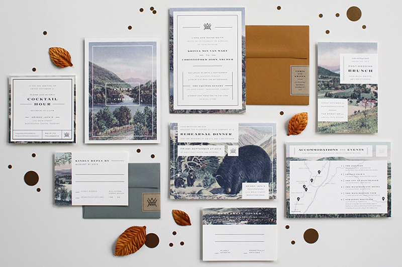
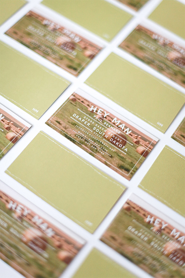
Today’s blog is focused on comparing two really great designs. One is by the wonderful Kelsey of Pinegate Road and the other is by Jaime of Ketchup and Mustard, which I found on Jessie’s blog! I really love both which are print designs featuring two very different scenes. This trend is becoming ever popular among stationery. Let’s take a look!
The lovely Kelsey shared these scenic business cards she designed for her parent’s neighbor. The cards feature a great photograph of the owner’s farm while utilizing a strong typographic layout. I really like how she paired her typefaces and still brought focus to the important information.
This Vermont wedding invitation suite is a a lot more involved than Kelsey’s business cards. With so many diferent pieces to choose from, it’s hard not to love this design. Each piece seems to focus on a different element in a different scene which is great. I’ve gushed over how much I love Jaime’s work before and she did an amazing job with this suite.
I love the borders in both pieces and I’ve been playing with borders in more of my print work as well. These are both extremely inspiration and I’m so happy to share them with you.





Eeek, thanks for the shout out Angel! I’m blown away by Jaime’s set — I’m giving this to her, hands-down! Hehe. I’m a sucker for all those rectangles and borders over beautiful imagery, and it’s great to see it work in a cohesive way even though each piece is set up differently.
Angel, these are gorgeous! Hard to pick favourite!
I really love the typography on Kelsey’s work. On the other hand, I love the layout + beautiful photos Jaime used. So…if I have to choose, probably that would be Jaime’s. But, really, they both are so talented! 🙂
I saw Kelsey’s post yesterday and absolutely loved the business cards, but I love the feel and imagery of the invitation suite by Jamie. Oh, this is so hard, but I am going to go with Jamie’s. Both are great though!
I don’t think I could choose a favorite! Both are very unique in their own way. But I do love that designers are following different styles and not sticking to one trend. Very visually appealing for the eye! Thanks for spotlighting these 🙂
I’m so glad you loved both Sarah! They’re both so well done. 🙂
LOVE the wedding stationery set! I love that it’s not really a traditional type of paper goods for a wedding. It looks more fitting for a brand. Maybe that’s the style they were going for. Genius!
I love unique stationery sets for weddings. It really challenges the designer and it allows for future couples to think outside the box!
Wow, what a fantastic idea! This is really, really good for people who focus on working local. Love it!!!
Thanks Kelly!
Love the wedding invite set! I love the vintage look it has! This is so cool, thanks for sharing!
Thank you for stopping by Mariah!
these are all so gorgeous!
Agreed! 🙂 Thanks Fran!