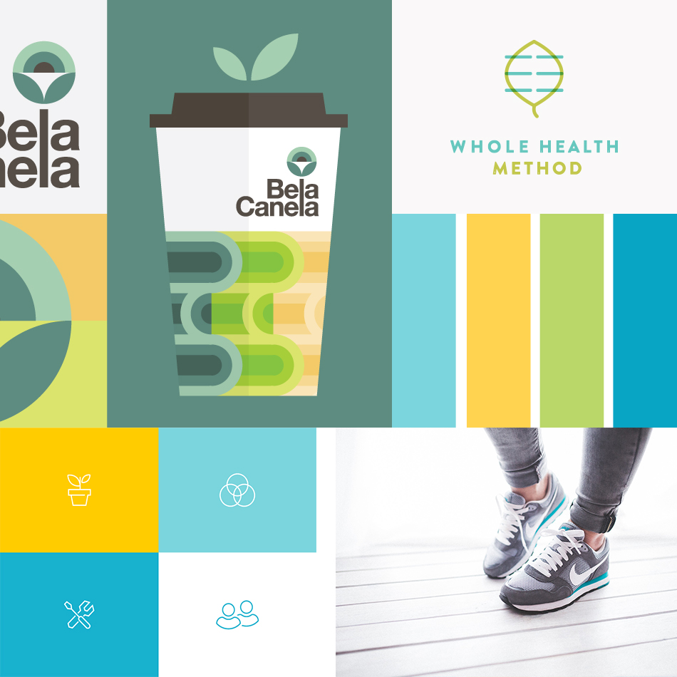
Today, I’m starting to make headway on a new project and I finally got the moodboards together. It’s a project for myself and being a designer means I’m never satisfied. I really have to crunch time in the next few months to get this pulled together but my brain is split between two very different styles.
While I spend time trying to figure out what I want, here are the two ideas I have in mind!
Sources
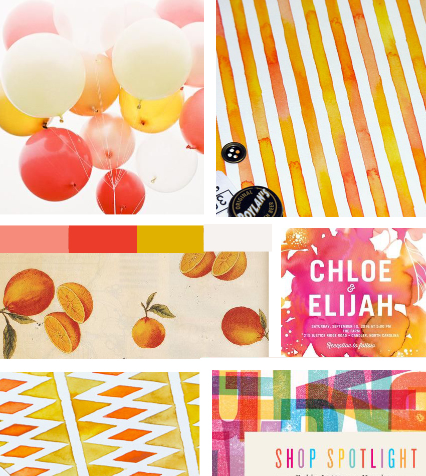
Bright Moodboard: Balloons | Watercolor Patterns | Peaches | Watercolor Wedding Invite | Bright Letters
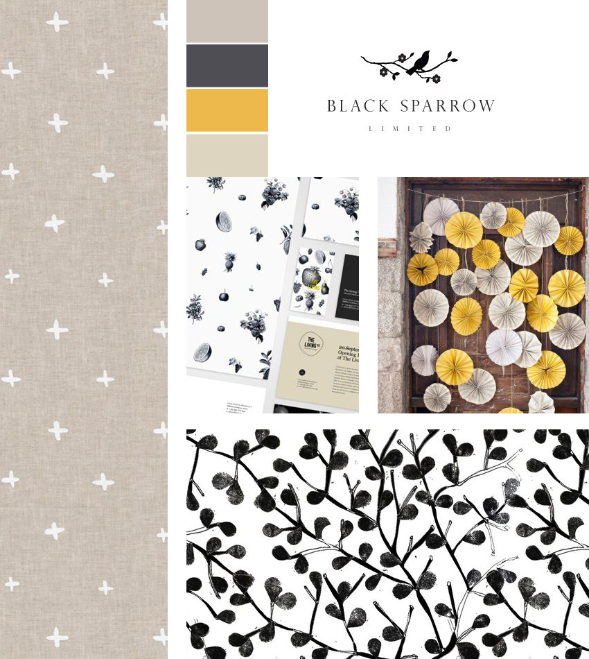
Classic Moodboard: Cross Pattern | Black Sparrow Logo | The Living Co | Wedding Photo | Black & White Pattern
Which is your favorite?

Love the black sparrow moodboard best 🙂
BLEURGH – http://www.bleurghnow.com
I’m leaning more towards that one as well! Thank you so much for stopping by. 🙂
Great moodboards!
This may be the nighttime, sweet summer air talking, but that colorful moodboard is drawing me in! I’m normally much more a fan of the minimal, and I love the classic, but those vibrant colors carry so much positive energy + light!!
I’ve been drawn to the summer colors as well but I think it’s all of my summer fantasy thoughts.
The neutral one please 🙂 Love the patterns you mixed in there!
They were such great finds it was hard not to! I do think the neutral one is more up my speed!
These are both great! The neutral/classic one is my favorite (love those colors & patterns!), but the colorful one is SO fun and vibrant!
Thank you for your kind words Brittany! 🙂
Well I love color so I am definitely a fan of the colorful one.
Plus I think the minimal and simple is so over used, I know it feels more “safe” but why not venture outside of the box and see what happens. I am noticing more and more color in design these days and I for one am loving it. Color makes people happy! 🙂
I don’t know what this is for though and if it’s for products then the color palette should speak to the products. If it’s not for products then I still say take a risk and go with the color, it will pop and standout so much more!
Oh I agree about neutral being over-saturated. I think doing it differently makes a world of the difference. I love the colorful palette so much so it will definitely work towards another project but not so much this one. I hope you’re doing lovely! 🙂
I’m so down for the bright colors but I also love a classic black and white based color palette. Maybe you could try mixing the two and create a black and white based color palette with a couple colors (or more) from the bright moodboard to add that pop! I find that bright color palettes grounded in that classic black and white have more longevity- at least for me. It also depends on the brand as well. Good luck, and I can’t wait to see what this project is!
haha I think I’ve recovered from my bright phase and am leaning more towards the neutral palette but the bright palette may be a fun project down the line. I love how you work with colors! Thank you Kia!
I like them both…I lean towards the classic though. Hope you are doing well!