I know this is a day late but I think later is better than never sometimes. I have some really great things to share with you from this week. I hope you’re all having an amazing weekend as I will be spending the day on the coast. Enjoy!
I adore fun branding projects and the Helsinki Food Company is one of my favorites from the year. I’m not sure why I haven’t shared this earlier but this week Blog Milk reminded me how much I loved this project. It’s just full of fun details that you have to visit the post to see.
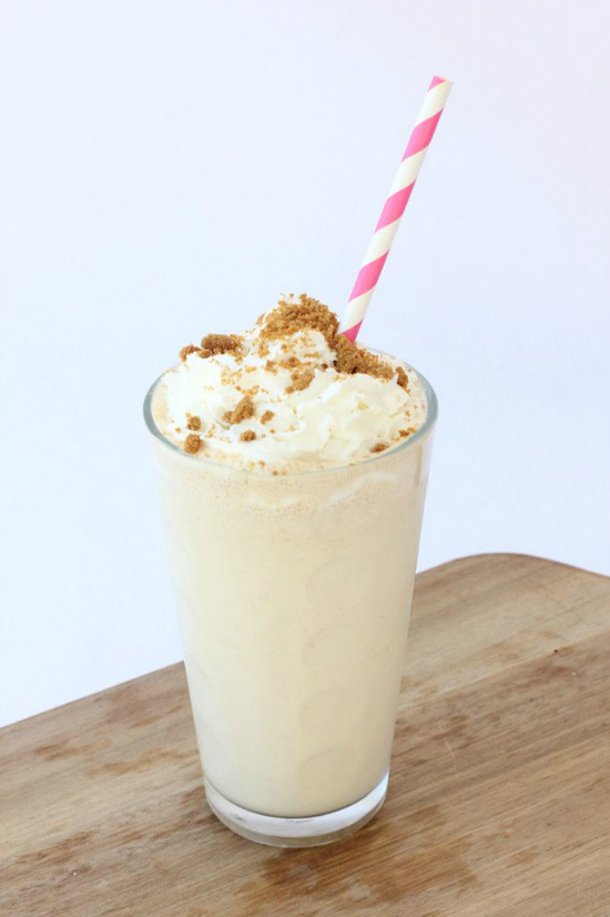
I never think about Biscoff cookies when I’m not on an airplane but they make great bases for easy dessert options (probably thanks to Biscoff spread). I love this recipe for a Biscoff milkshake posted on Best Friends for Frosting this week. I can’t wait to give it a try.
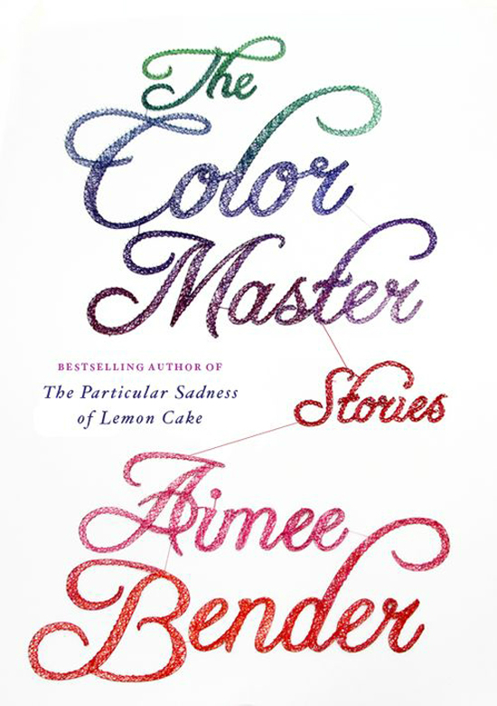
How great is the type on this book cover by Dominique Falla? I love the gradient and in case you were wondering, yes that is string. It’s pretty awesome.
This week FoundryCo added a lot of fun projects to their portfolio. My favorite has to be the branding project above. I love the simplicity and the focus on lines. It’s not the normal tea branding but it looks great.
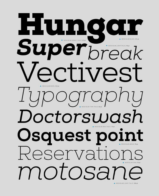
I’m pretty sure I haven’t proclaimed my love for Nexa Slab here before. If I have, I’m sorry but not sorry that I’m talking about it twice. I love seeing the different weights in slab serifs and Nexa Slab gets pretty heavy.
This couple is the cutest. Jason Mize is slowly becoming my favorite Floridian photographer. I love the way he captured Raeylz and Chris in Dade City, which is not a place I thought of when it came to great scenery. Love the area, their cute vintage outfits, and the final product. Everything looks amazing combined and that’s what I love about seeing portrait sessions. Ideas I would think were quirky or strange always come across in a fantastic way with the right photographer.
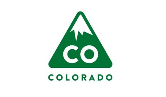
There were a couple of proposed logos for the state of Colorado showcased on the Denver Egotist this week. This one definitely was my favorite of the two. I could see so many fun campaigns coming from this branding. I’d be totally ok with a Florida re-branding.
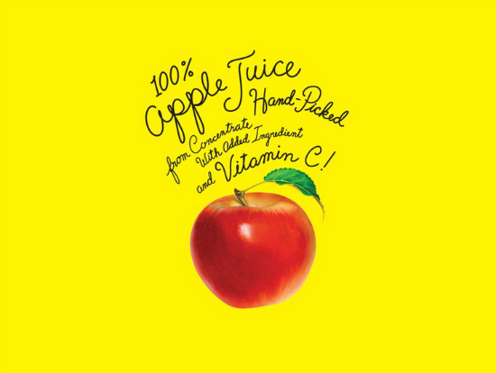
The type designer Timothy Goodman did for Mott’s is incredible. This was my favorite from the work he did for the apple sauce company. It has the whimsy to attract kids but catches my eye for the simplicity and focus on the benefits of the product.
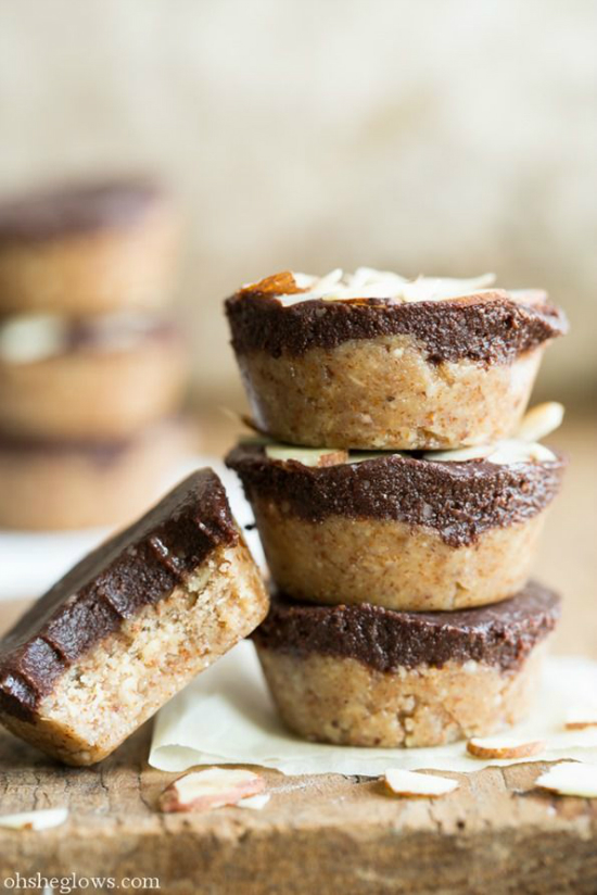
Is there a such thing as a healthy Reese’s alternative? I think we can get as close as possible with this raw almond butter cup recipe. I love when my favorite things come together in a fun compromise.
So this is probably not what you think of when you envision MS Paint from Windows 95. A 97 year-old man has created gorgeous works of pointillism art using MS Paint. I am really hindering myself from making really bad Windows 8 jokes but I was very inspired by what was created using a program that’s probably older than some of my readers. (That’s a scary thought!)
I really thank you for putting up with my late shenanigans. As I finalize the design and go into development for Studio-404, I’ve become more busy. I’m focusing on my clients a lot more which is taking me away from social media a bit. However, Monday will be a fun day on the blog so be sure to tune in. Have a great weekend!




Love that Helsinki Food Company logo! It’s so streamlined and great. Same with the tea company. Can’t believe he did that entire book cover with string, that’s so awesome! So excited to see your upcoming changes too 🙂
Kristyn @ Milk + Crown’s latest post: modesty and men
Thank you for stopping by Kristyn! 😀
Love that book cover design with the string lettering, it’s so stunning! I’m a big fan of handmade design at the moment 🙂
sally’s latest post: graduation