TGIF! This week has been great. I’m working on a new project, setting up new systems, finalizing old work, and trying to finish the design for Studio 404. We’re extremely excited with some of the new features we’ll be offering as we’ve invested in some quality companies who offer great services. How has your week been? Mine is full of inspiration as usual and I’m here to round up some of the fun things that happened this week around the web.
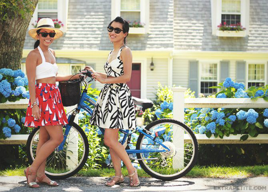
I loved the patterns on this two-piece set by Khatu that Jean of Extra Petite shared this week. I know I totally shouldn’t be reading a petite fashion blog (I’m 5’10) but Jean really puts work into tailoring her outfits and she’s adorable.
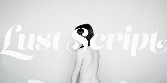
Lust Script is amazing. I don’t think I need to do any extra convincing. It might be $89 but it’s so worth it.
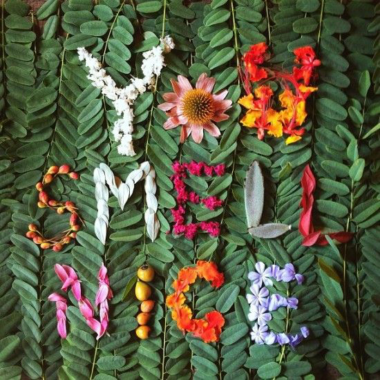
Bri of Design Love Fest shared these gorgeous Nature Love Letters this week. I am always in awe of floral type. I love that Emily event put in work to make the background looks great.
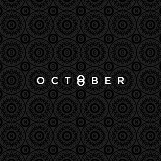
There were quite a few great branding projects I saw this week but this has been my favorite. Design Work Life showcased the work of One Plus One design and this project was by far my favorite in their portfolio. The custom pattern is what stands out the most to me. I love brand consistency.
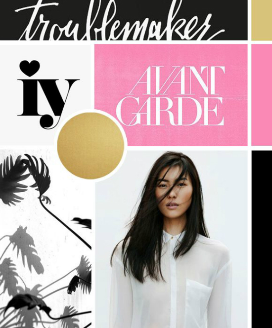
I know that some people aren’t fond of the moodboard trend but Corina’s moodboards are so well put together. As designers I think moodboards sometimes serve a purpose in bringing a visual element to your clients. This has been my favorite of Corina’s mainly for the colors and type choices. Such bold type choices. I’m looking forward to this project for sure.
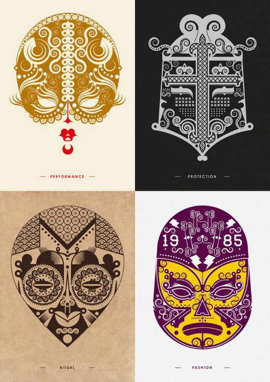
Aren’t these divine? Johnny Wan did an amazing job creating self-promo mask prints. There are just gorgeous swirls and flourishes that make me a happy designer. So inspiring!
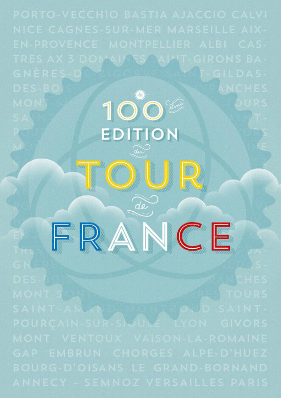
I’ve been a very big fan of Veerle Peters since the beginning of my design career. She’s an amazing designer and illustrator who is always willing to share how she creates the amazing things she does. This week she shared these gorgeous Tour de France prints and a few tips on how she created the textured background. A girl can’t go wrong with Trend Sans, that’s for sure.
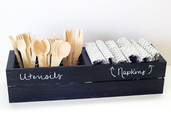
This DIY chalkboard crate project by Sarah (who is a complete sweetheart) of Sarah Hearts is right up my alley. It’s easy to do and black and white. I can’t wait to give this one a try.
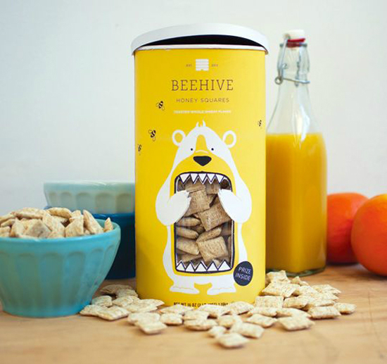
My cereal of choice does not come in such cute packaging. Student, Lucy Kuhn, designed gorgeous packaging for Beehive Honey Squares. Fun packaging that gets the point across.
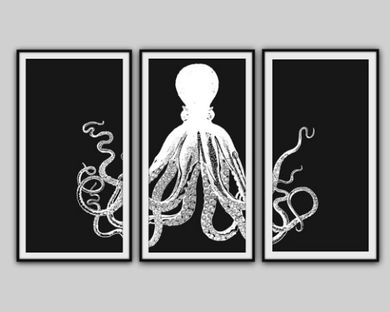
Yes, this is an octopus print. Long story short, Melissa of Truly Chic Inspirations wrote a fun post about her obsession with owls. I shared with her that I was slightly obsessed with octopuses (octopi?) and a few days later, this shop was in my inbox. Outside of nautical themed prints, BySamantha offers great inexpensive prints.
I hope you all have a wonderful week. Be sure to check me out over on Sunshine Bloggers as I continue the Blogging 101 series and look for the Blogging 101 July Roundup here on Monday.



First, thank you for putting me onto Extra Petite. Standing at a proud 5’0, I’m always looking for more petite fashion bloggers! And yes, now I’m going to have to purchase that Lush Script in the future. I want it so bad.
I also pinned the One Plus One designs this week. Loved their aesthetic! Great weekly round up. Looking forward to seeing your Blogging 101 Round-up! 🙂
Laura
L. Providence’s latest post: fab fridays | 01