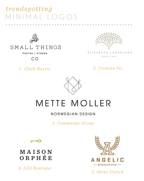
As you all know, I pretty much live and breathe branding which means I spend a lot of time looking at the logo aspect of a company’s brand. While logo trends are hardly ever new, it’s nice to see old trends make their way back around. Lately, more and more minimal logos have been popping up which is pretty exciting. I like the focus on good type and utilizing logomarks that are recognizable but not gaudy. The Elisabeth Landeloos branding and Maison Orphée branding projects have been my favorites for a while.
Small Things – Clark Harris | Elisabeth Landeloo – Creneau Int. | Mette Møller – Commando Group | Maison Orphée – LG2 Boutique | Angelic Bakehouse – Shine United


I feel like minimal has just been catching on in all fields of design lately – and I love it. Less but better!
http://lasaloperie.blogspot.com
I agree! The more minimal the better in my opinion. Thanks for stopping by Isa!
For months now I’ve been telling everyone who looks me for logo design that I focus on Typography-based logos, exactly because they look much cleaner and minimalist.
Also love that Elisabeth Landeloo logo!
Yes, it’s easier to translate and usually time-less. I do believe in the power of a well-designed logomark but good type has to also accommodate to complete the package.
Minimal is definitely the way to go and my favorite design aesthetic! These are such great logos, especially the top right!
I could stare at the Elisabeth Landeloo logo all day. So pretty! Thank you Jessica <3
My heart just melts for those.. pretty little things.. so simple and yet so magnificent!
Minimal logos always remind me of you! 🙂 Thank you dear <3
i love all of these logos – but then again i too am a sucker for all things minimal!
Minimal is the best way to go! 🙂