It’s President’s Day which was a perfect day to post the year’s first This or That post. Both of these designs are using very graphic, black and white packaging. More graphic and bold packaging designs are popping up in contrast to the solid, minimal style that has been so popular for the past year. I’m excited to see where this trend goes and if any brands will be re-designing their packaging anytime soon.

The Uzuri Makeup classic packaging uses various elements in a standard black and white approach. The elements in each design allows for a different effect in each piece of the packaging. Not only are the patterns creating a unique design, but they are allowing for movement and texture to take place.
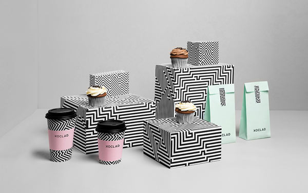
As a pastry and confectionery shop, Xoclad uses one black and white pattern in multiple angles to create a solidified branding design on its packaging. Paired with the pastel pink and mint green, the pop of color allows for minimal focal point with the sans-serif logotype.
I’m leaning a bit towards Xoclad on this one.


I agree, I love Xoclad’s way of hinting the pop of pink and mint color!
It’s such a small but striking detail for me. 🙂
AH, what great finds! I love that these use an all-over pattern that almost mimics a solid in it’s use. These both will definitely be swimming in my head as inspiration for future projects. If I had to pick, I’m going with the Uzuri. I love the classic type choice, with the modern rectangle application for the brand elements. So much modern/classic mixing and matching going on!
These are both so bold! I’m not usually drawn to black and white, but something about Uzuri’s packaging really draws me in…I think it’s the way it appears to be ‘moving’, if you know what I mean. Thanks for sharing these!
The “moving” effect is so awesome. Kudos to their designers for creating something so unique.
I absolutely love Xoclad’s packaging as well! The pattern isn’t too overbearing, and is livened by those soft green and pink hues… Thanks for sharing this patterned packaging! Happy Monday 🙂
It’s always fun to find things that are similar but so different. Thank you Kevin!
Definitely the Xoclad-I love the pop of color and the clean lines. The Uzuri design is a bit too busy, almost seems out of focus in a way.
I definitely think the out of focus was intentional but it’s so distracting. Uzuri’s season packaging is fantastic, super colorful. You should definitely take a look if you haven’t already. 🙂
I love the second one, Xoclad. And the pastel touches give to the packing that perfect extra detail.
You definitely can’t stay away from color. 🙂
Oh my gosh! I saw the Xoclad stuff on Pinterest recently! I find it so interesting how the black and white line work looks with the full colored pieces. The Uzuri throws me off a little because it looks like the lines move as I scroll, haha! But that’s cool, too!!
I’m glad great design is floating around the internet. It’s too good to pass up!
Xoclad, for sure! I love the structure & sharp edges. Reminds me of a maze!
Same! It’s just very solid.
I’d say Xoclad as well. Uzuri’s pattern makes it hard to look at, at least for me.
I like how Xoclad included some color as well. I like their paper bags the most. They are so simple yet the tape makes them more interesting!