Hello! I’m all over the place but this week, I’m happy to have something to share here. The very lovely Kita Bryant of Kokoa Magazine is sharing some insight on what goes into a logo. Kita is also a designer who works with clients under Focus Dezigns. Logos are an important part of the branding process and helps brings an identity to your company. I’m excited to share Kita’s thoughts here and I hope you enjoy them as well!
What makes your logo stand out?Everyone has a different aspect of what a logo is. My definition of a logo is something that someone sees and identifies with before they actually know what the business sells or what services they provide. I recognize logos before I even know the names of certain businesses. Think of it as a child who knows the McDonalds arch but doesn’t know what McDonald’s is or what they even sell. That is how I relate to logos. It represents a business and people get to know your business by what your logo represents. Let’s discuss some parts of the logo that people should focus on.
1. Color
Color is important. Certain colors have meanings. For instance my logo for Kokoa Magazine is orange and blue. Blue means trust, loyalty, and wisdom. My magazine gives you articles you can trust and we are loyal to our core fans and readers. We also teach by what we have learned and that is wisdom. Orange represents enthusiasm, fascination, happiness, creativity, determination, attraction, success, encouragement, and stimulation. All of the above represents what Kokoa tries to give to our readers. Colors should be chosen not only for meaning purposes but for purposes that convey your overall scheme of things. You don’t want a color that will turn people off but you want a color that will be unique and different to make you stand out. Try to find something in between and always stick to that color throughout all of your marketing materials and on your website.
2. Versatility
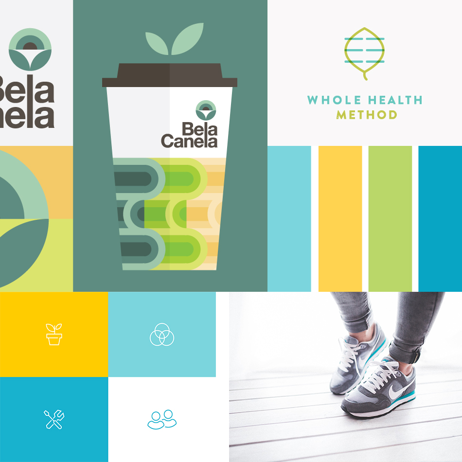
You want a logo that will reach across all platforms. For instance if you take photos you want your logo to be placed on every picture that you take. You don’t want a lime green logo on a picture that takes away from the picture you want something that can go everywhere on anything. You want something that can go on brochures, something that can be placed on business cards, and something that can be changed without changing the entire logo. Have a logo that prints well on things also. You want to make sure you check out printing costs for colors. I did a logo for someone who wanted 5 different colors. After we went to the shirt shop and she found out how much it would cost we had to tone it down. Of course I don’t argue with customers but I could have told her that in the beginning get something with no more than 3 colors and stick to it especially when wanting to factor in printing.
3. Appropriate
You want something appropriate and something that goes with the time. If you have a salon you don’t want a logo that has flowers in it. What do flowers have to do with cutting your hair or styling your hair? You have confused the consumer. Don‘t confuse people and don’t do something that is out of date. Pepsi changes their logo every so often but if you look at it its subtle changes nothing extreme or that takes away from the original logo. Think of your business name and how you can make sure the name matches the logo in every way.
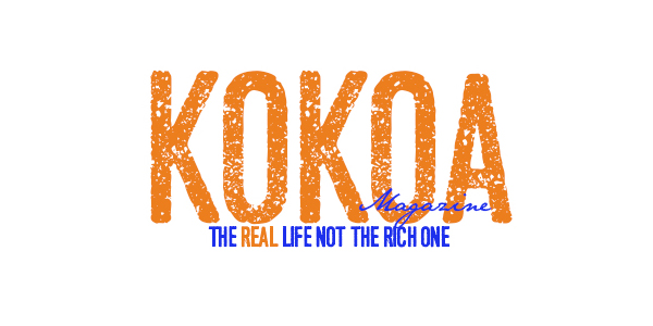 Last but not least make sure your logo tells a story. My logo for my magazine which is below tells a story.
The story is that life is not perfect and it’s scratched on the surface. My Kokoa looks scratched and it’s not perfect. My magazine is about the real life people live and the ups and downs we face it’s scratched and not perfect so that is the story behind my logo.
Connect with Kita: Kokoa Magazine | Focus Dezigns | Facebook | Google+ | Instagram | Pinterest | Twitter



Versatility is key! Great post from you, Kita.
Great article, and love the online magazine! Adding it to my blog feed. 🙂
Thank you Dondrea! Kita is a fantastic writer with plenty to offer. 🙂