Happy Monday! I had a crazy week last week. After successfully launching this space, I came down with a bout of food poisoning that I’m still recovering from today. Every time I feel I’m better, I get extremely knocked down. I did spend yesterday celebrating my first ever Friendsgiving with Meli and Charisma. I’m always so grateful for my blog friends and I’ll be sharing some more about that via the newsletter. This is WordCamp Orlando week and I’m really looking forward to my first conference talk and content workshop. If you’re in the area, I recommend grabbing the last few tickets so you can learn something new about WordPress, blogging, and how to give back to the local community.
Today, I wanted to share with you an in-depth look at the brand refresh which I’ve been slowly integrating into this space over the past six months or so. After rebranding to Studio 404, I was always unhappy with how busy the logo was and how hard it was to break down the elements. The brand colors were a bit harsh and with a focus on flat UI, softer colors are easier for users to navigate. Let’s take a look at how the core identity design has changed.
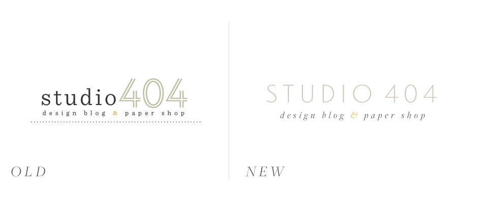
As you can see, the old logo focused on Hoefler & Co’s slab-serif, Sentinel, which I still adore. It also used the outline font from the typeface Landmark. There was a focus on the dotted line element which I used frequently through the images here on the blog. the colors were just a bit harsher and bolder. The new logo features Landmark as the primary typeface paired with Freight Display, a typeface I learned about from Jessica Hische. The colors are a softer take on the original brand colors, which you may remember from this classic moodboard. I think they fit the brand perfectly and allow for a classic timeless look across both platforms.
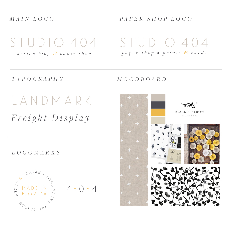
I am extremely happy with the way everything has turned out. I adore the focus on the italicized ampersand in both brand options. You know how much I love ampersands. I’m not sure I will need to refresh this brand identity any time soon which makes me extremely happy. I’m also excited to see it grow and expand into different mediums and I hope you follow me along for this journey.

Looks great Angel! I absolutely love the mix of fonts and your moodboard inspiration!
Thank you so much for your kind words Lindsay! <3
I LOVE the new branding! It’s fresh and modern. The logomarks are beautiful.
xoxo,
Bianca
http://www.ellebstyles.com
Thank you Bianca!
Angel sorry to hear about the food poisoning, hope you feel better soon. Love the new layout an logo, it’s very clean.
Siobhan
http://www.befreeproject.com
I’m feeling much better now! It was definitely an experience. Thank you Siobhan! <3
Love all the updates to the brand. The site really came out great! 🙂
Thank you so much friend! 🙂
Love the new look, especially the ampersand. Gorgeous!
Thank you Carmia!
Ohhh.. love the mustard color and the patterns in your moodboard!! 🙂
Thank you so much Krishna! 🙂