
Welcome back! At least, hello again. I’ve been noticeably absent from this space and today is the reason why. After two years, I’m launching the redesign of Studio 404! This has been in the pipeline for a whole year from wireframes to final push live. I’m so excited to talk about the site and some of the things that have been updated for the better. I have been unbelievably busy this year, busier than I originally planned. It’s wonderful but this redesign has been pushed back by six months due to all of the client work we’ve been doing. There was some goals I had in mind for this space which I couldn’t have done with the first iteration.
After blogging for six years, rebranding, and shifting focus for another two years, you can see why this place was in need of a revamp. One of the biggest things I want to focus on is genuine content, uplifting other creatives (as I always have), and making Studio 404 Paper the focal point. There are so many blogs in the design blog space and I needed to take a step back and evaluate what I’m offering. I am loving the trends of e-courses and infoprenuers as there is so much to learn but this space will continue to offer the design-centric focus it always had. Now that I’m in a rhythm of being a work-at-home mom (guys, seriously how weird.), I can contribute so much more here. I still want to talk about having a business that I share with my husband (full-time!) and how we make that work. I also want to talk about illustrators I’ve been in love with. I enjoy having a place that allows me to do both.
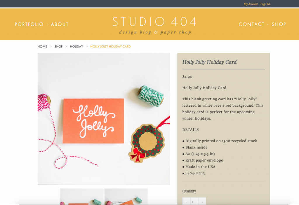
Shop Studio 404 Paper
One of the biggest changes to the site is the addition of the Studio 404 Paper Shop.After spending a year on Etsy, I was ready to move to an e-commerce solution on my site. As much as I love Etsy and their features, I felt I needed more freedom to grow my paper line and other products. After chatting with my husband and doing lots of research, we decided to take on WooCommerce with is a fantastic e-commerce solution for WordPress. The thought of managing an actual e-commerce site was overwhelming but after reading documentation, it’s been easier than I thought. Eventually, I will shut down the Etsy shop and sale exclusively here and in retail spaces. I’m so excited to have a space here for my shop.
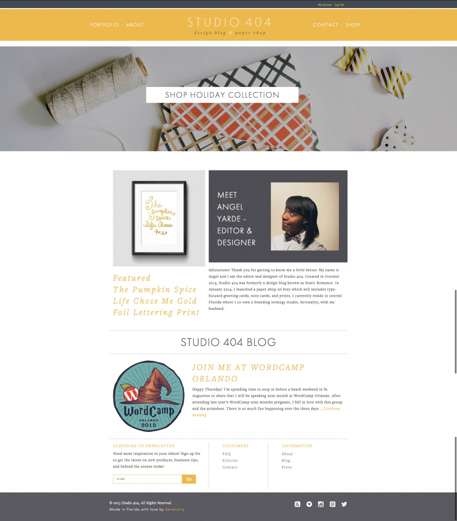
New Homepage
With the addition of the shop, I knew I had to put the blog on its separate page. I’d done this once before years ago and had no qualms about it. Five years ago, I lost sleep over it! I added a featured shop item highlight, as well as the latest blog post, and an amazing new footer. I’ve always had such trouble designing footers but this footer fits perfectly and allows for extra navigation. I did opt to move the blog from the top menu and we’ll see how I feel about that decision in a few weeks.
Updated Pages
Every page has been updated. There are some new pages in relation to the shop space. As time goes on, I’ll have more time to fix the content as I want to. No worries! I know there is a lot of work to be done in this space today and in the future. David did an amazing job and developing everything in my vision. We’ll be collaborating more on projects together and as I get back into part-ime front-end development, I’ll be learning a lot from him.
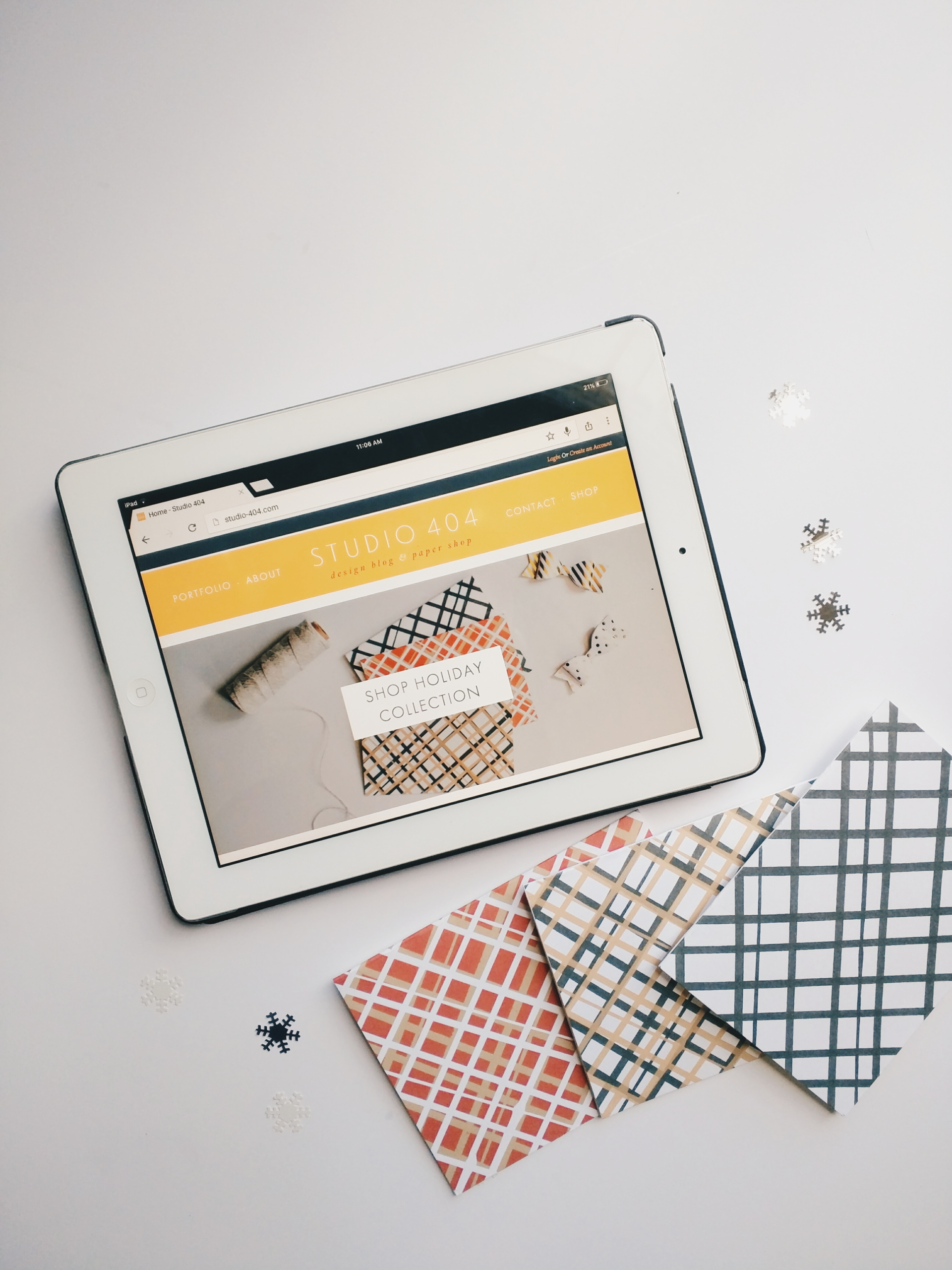
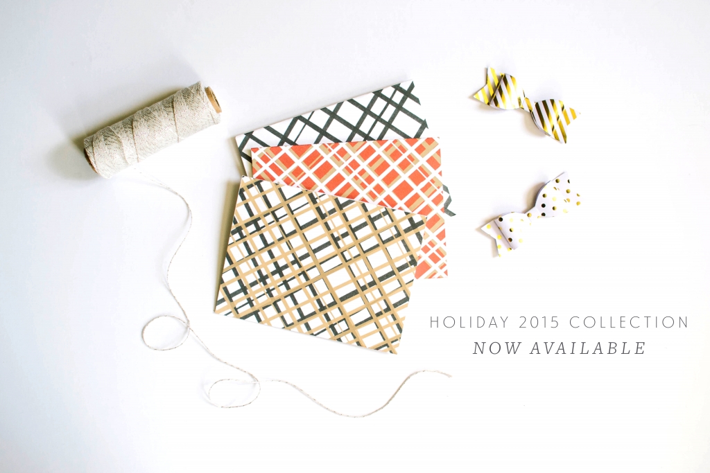
I’m also very excited to announce that the beginning of Studio 404 Paper’s 2015 Holiday Collection is available today. While it’s currently a few cards, I’m really excited about the direction of this year’s collection. I’ll be adding much more next week but this collection will be available on the site to shop exclusively. To kick things off, you can save 15% off the holiday collection with the coupon code ALLTHEPLAID. Happy shopping and long live Studio 404!



Congrats! It looks great!
Thank you so much Allyssa <3
Oh, everything looks lovely, Angie! I love it how the change was soft but beautifully done. I don’t feel like in a whole different place. In fact, I feel like I’m Studio 404 and everything is much easier to see, explore, navigate. LOVE it! ♥
You’re the absolute sweetest. Thank you Kelly! <3
Congrats love! Site looks awesome!! I only just noticed, the link to your blog is only at the bottom in the footer area. I initially was looking at the top menu, maybe perhaps add a quick link to it in the menu that has the login/create account? Other than that, everything else is easy to find and navigate.
Hi dear! That is very intentional for the moment and I explained why in the blog 🙂 Currently doing some live UX testing so to speak.
Love it! Congrats and all the best with the new shop x
Thank you so much Nicola! <3
Congrats Angel! Going through a redesign earlier in the year, I know how hard it is to make room for your own (cough, unpaid, cough) work 😉 It looks great, and I can’t wait to keep updated with all that you’re doing around here!
There is absolutely no room lol but it pays off! Thank you so much Kelsey. <3
I’m loving the new look! Congrats on the next phase of your business. Wish you much success! Looking forward upcoming content you share about working for yourself full-time! 🙂
Thank you Laura! I’ve slowly been adding updates here in case you’re wanting to read more! https://studio-404.com/category/business Hope you are well dear!
Yaay congrats! Looks great – I’m about to relaunch my site as well – it always takes longer than you think that’s for sure! 🙂
Thank you friend! It really does take a long time to do anything for yourself. I can’t wait to see what your new site looks like.