Happy Friday! I’m so excited to return to Links I Love this week with some things that have caught my eye. Some of them are really just things that I really thought were awesome that I don’t normally show here but maybe you’ll agree!
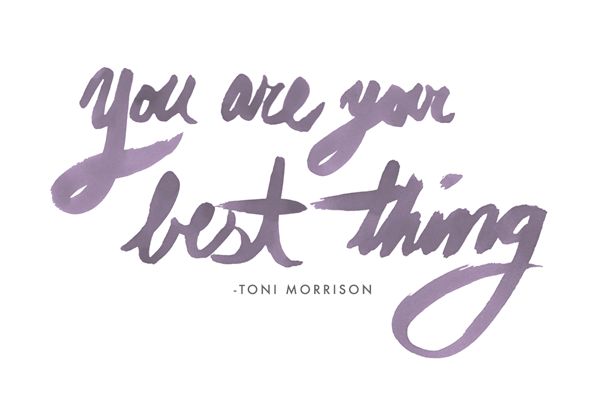
I really love the illustration work of Brittany Holloway Brown. She creates beautiful watercolor illustrations and she’s been on my radar for a while. It’s been a few months since I’ve visited her portfolio so seeing her lettering work reminded me to add her to this list ASAP.
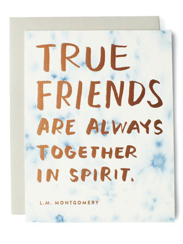
Even though I own a paper shop of my own, I’m always so enamored by the work of other paper companies. Sycamore Street Press has been a long-time favorite and I really admire their latest addition of friendship cards. Cards seem to follow trends so when I see something different, I get excited.
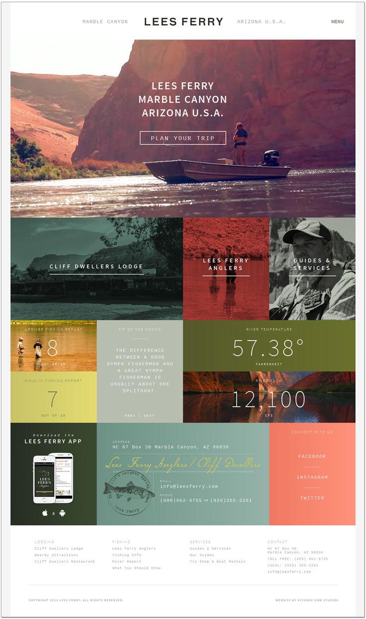
Do I need to explain why this is amazing? The muted tones of the Lees Ferry design are definitely inspiring, especially for the upcoming fall season. There are so many small elements that make this a great design so be sure to check out the full site.
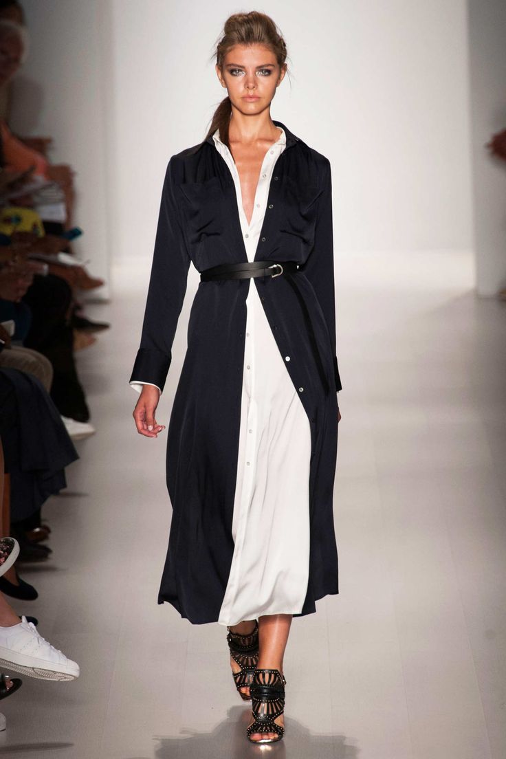
I always look to NY Fashion Week to be inspired and drool over my dream wardrobe. If your closet is as full of black clothes as mine is, you’ll love Marissa Webb’s RTW S/S 2015 collection. I’m already dreaming of a spring full of flowy, long dresses.
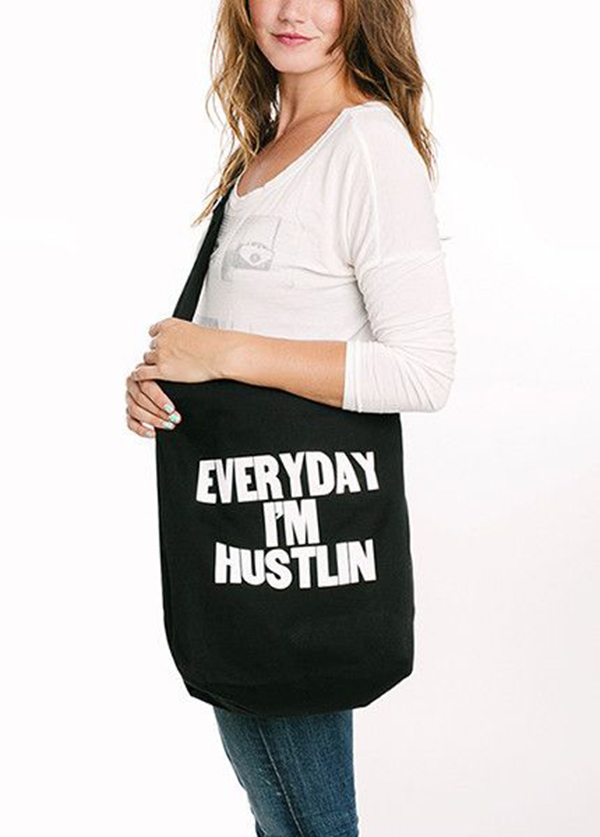
I don’t think this Everyday I’m Hustlin tote by Paper Jam Press needs any explanation either. I just want it because of reasons.
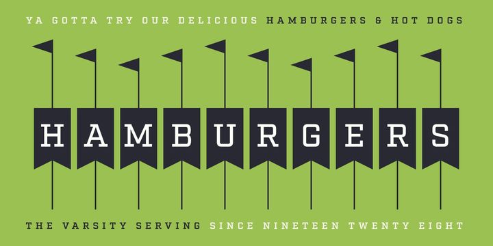
Fort Factory finally released their latest slab-serif, Factoria. There’s nothing to dislike about this typeface. It’s just a nice, clean slab-serif that has great tiny elements to it. I love the angle on the serif for the R which is one of those small things that stand out to me.
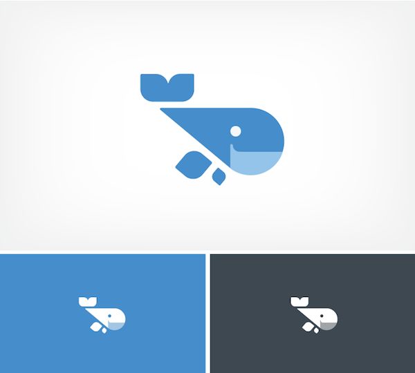
Loving the branding for Datarank which features the cutest whale illustration ever. I love seeing animal illustrations used in branding and Datarank’s branding has so many great elements.
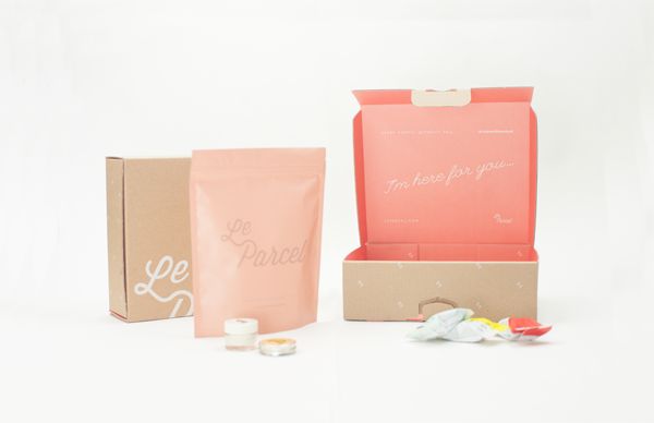
Courtney shared the 2015 packaging for Le Parcel by Seven Fifty Five on her blog this week. The colors, type, and pattern work wonderfully together to create clean, packaging. Le Parcel is a monthly subscription service for women during their time of the month and the packaging alone makes me want to sign up.
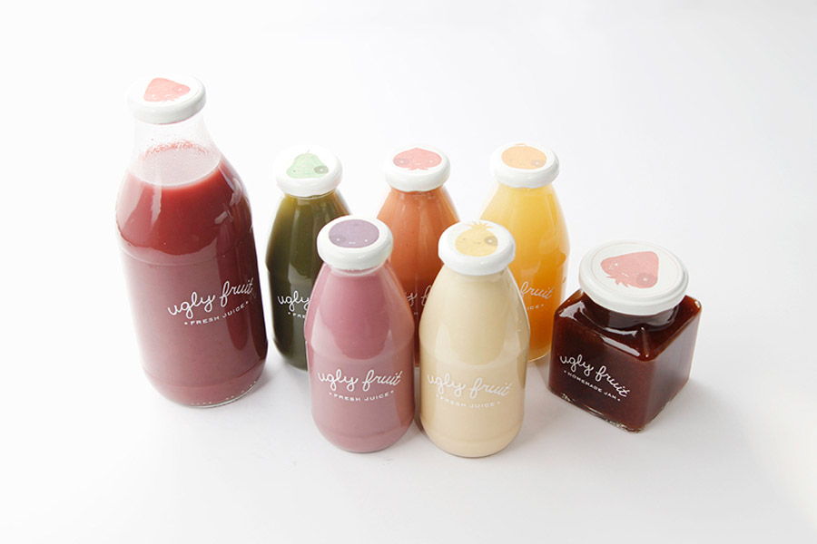
Thew new branding and packaging for Ugly Fruits is simplistic and it works. For a brand with a name like Ugly Fruits, I can imagine coming up with packaging could be a challenge. Mirim Seo clearly took this challenge head on and made something gorgeous.
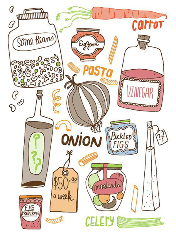
I stumbled across the portfolio of illustrator Kate Bingaman Burt this week. Her portfolio is full of amazing illustrations. Kate has illustrated so many different things from surface patterns to book covers. Spend some time this weekend admiring Kate’s portfolio like I have.
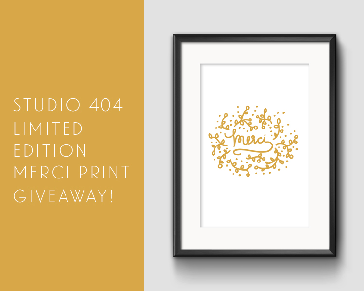
Don’t forget to enter the Limited Edition Merci Print Giveaway! I’ll be announcing the winner next Thursday!




Thanks for sharing these links, Angel! Nice to see some fresh new designs I haven’t seen before.
I kinda got stuck on the awesome trio of Lees Ferris design, NY Fashion Week and the hustlin bag! ♥
Love love Lees Ferris’ website, I got sucked in! Yes I agree, Factoria is such a gorgeous font. Kate Bingaman-Burt’s work are amazing! Her surname is crazy as well, in good way course 🙂
Katrina Sophia