It’s Friday and I’m excited to share some amazing inspiring things with you. I’ve been re-inspired by some great chats with other business owners and it’s really given me vigor for the upcoming week. This week’s inspiration is about great photography and some fun lettering so let’s get started.
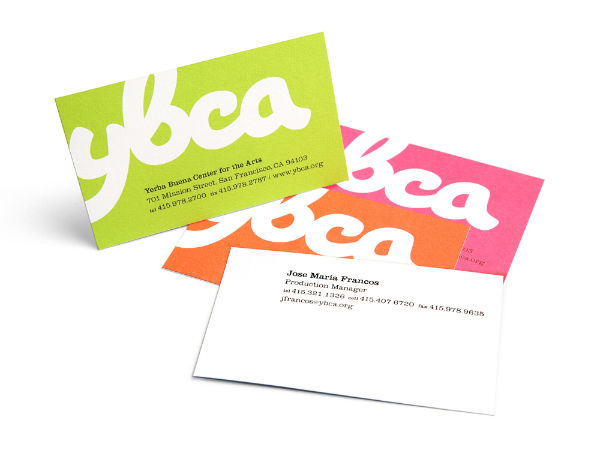
I’m in the process of redesigning business cards for my business and my blog and the Yerba Center of the Arts has beautiful cards. I love the bright colors and the simplicity of each card. The placement of the information on these cards is really unique which caught my eye. I love the idea of having different versions of business cards and this was a perfect example.
Rashi shared some beautiful facades in New York via her blog last week. I really love the look of the buildings in places like New York. There are so many design elements to draw inspiration from. From the textures, type, and colors—it’s hard not to be inspired.
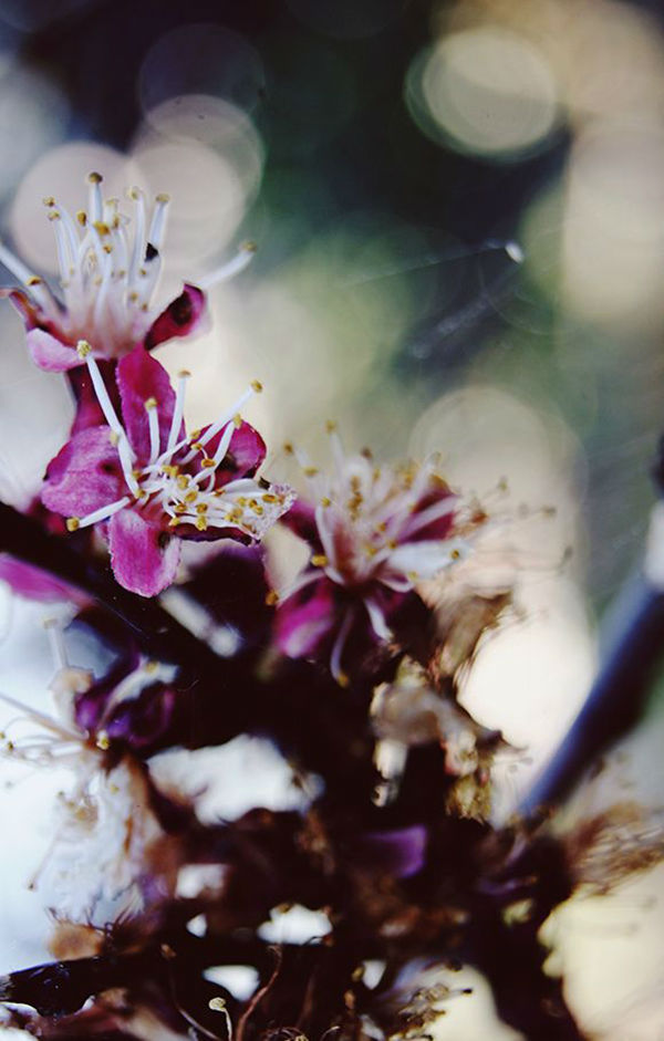
This photograph by Corina is one of many she shared in her “Beautiful Adventures” post. While the weather is fantastic, I’ve been trying to get outside and enjoy as much of nature before it’s unbearably hot. Corina’s post is full of natural beauty including a short video.
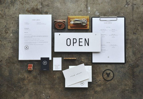
The identity and collateral design for Your Local by Plus63 Design Co. is absolutely wonderful. I love the minimal feel and the simplistic logomark. I love type-based identity and restaurants are usually the best place to be experimental with type.
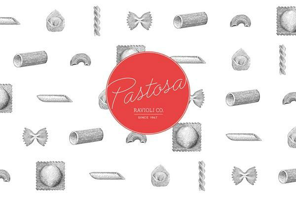
The design for Pastosa’s branding is also on my inspiration list this week. I am always in love with classic illustrations and what’s not to love about sketched pasta? The pop of red is perfect for this brand. There are much more examples of the design on We and The Color so be sure to go check out the full post.
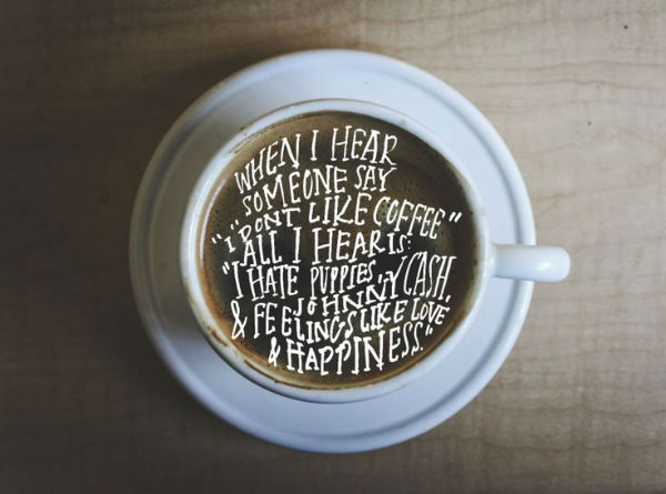
The lettering of designer Caroline Sleeper caught my eye this week. Her portfolio is full of inspiration but I specifically fell in love with this above piece. I’ve been indulging in a lot of coffee this week so this definitely caught my eye.
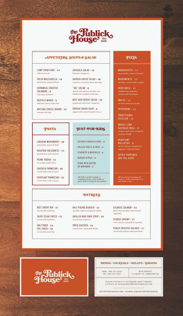
Jen is such a fantastic designer which is why I made room for more restaurant branding on this list. Her redesign of The Publick House is in complete contrast of the Your Local project. This design is retro, once again using fun type, with more focus on color. Jen’s story about how she got the project is also pretty neat so you should view the full post.
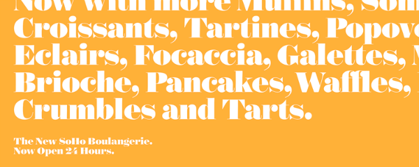
Formerly Hoefler & Frere-Jones, Hoefler & Co. announced a new serif typeface this week called Surveyor. Of course I adore everything about it, especially the heavier weights. I can’t wait to add it to my collection, especially since I’m all about supporting premium typefaces.
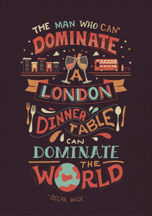
As there’s always room for great lettering, the work of Risa Rodil is extremely inspiring. Her lettering style reminds me very much of Mary Kate McDevitt (who I can’t wait to see at Creative South in a few weeks!). I love her usage of bright colors and elements to bring her lettering pieces together. So inspiring!
I’ve also been inspired by the illustration of Eirian Chapman. She uses great color palettes and patterns which are hard to ignore. Great illustrators are always so inspiring and I’m glad to come across Eirian’s work.
I still have a few spots for guest posters in the upcoming quarter so definitely get in touch if you’re interested!






Thanks for the shout out Angel, you’re so sweet!
Thanks Jen! 🙂
Oh my gosh. My heart is swooning over those New York storefronts. Great picks here! Hope you have a fantastic weekend! xx
Aren’t they glorious? Thank you Sarah!
wow those are very beautiful! I especially love the business cards! its really eye catching! Great post, thank you. really inspiring
Great round-up. I really love the Facades of NYC. Living here, I take for granted all the beautiful architecture that surrounds us — but Rashi has opened my eyes. She makes me want to challenge myself to start documenting my city more, it’s truly a beautiful place.
Loving the Publick House branding. I’m working with a lot of restaurants this year, so I’m always looking for great restaurant brands for inspiration.
Yaaaass to the new typeface from Hoefler & Co. Looks like I’ll be adding it to my collection as well.
Enjoy your weekend!
Where I live tries to recreate facades of places like NYC and New England townhomes so I really take advantage of seeing the real things when I travel. Hope you had a lovely weekend!
I really like the last two pieces. You are so right the colors on the Chapman piece really catches your eye!
Thank you Mariah!
love your links! i shall be getting in touch for an Inspired Interview in the near future for your etsy shop 🙂
-KT
I’m so excited! Thanks Katie! 🙂
Got to love coffee and the J man.
Buckets & Spades
These are such great design finds! I love your aesthetic, always!
Thanks so much for the shout out! I’d love to send you a print of the coffee lettering – send me your address at csleeperask@gmail.com
Caroline, wow thank you so so much! I will shoot you over an e-mail <3