Happy first Friday of December! I’m excited to be sharing here today. I spent last night connecting with some of my favorite local blogger ladies at Sarah’s Meet & Make event. It was tons of fun and I’m glad I get to connect more with bloggers locally. If you’re ever in central Florida, feel free to tweet me up and we’ll go out for a coffee chat. I love hearing other blogger’s perspectives and it’s awesome to know I’m not alone spending too much time online. I have so many fun links to share with you today so let’s get started.
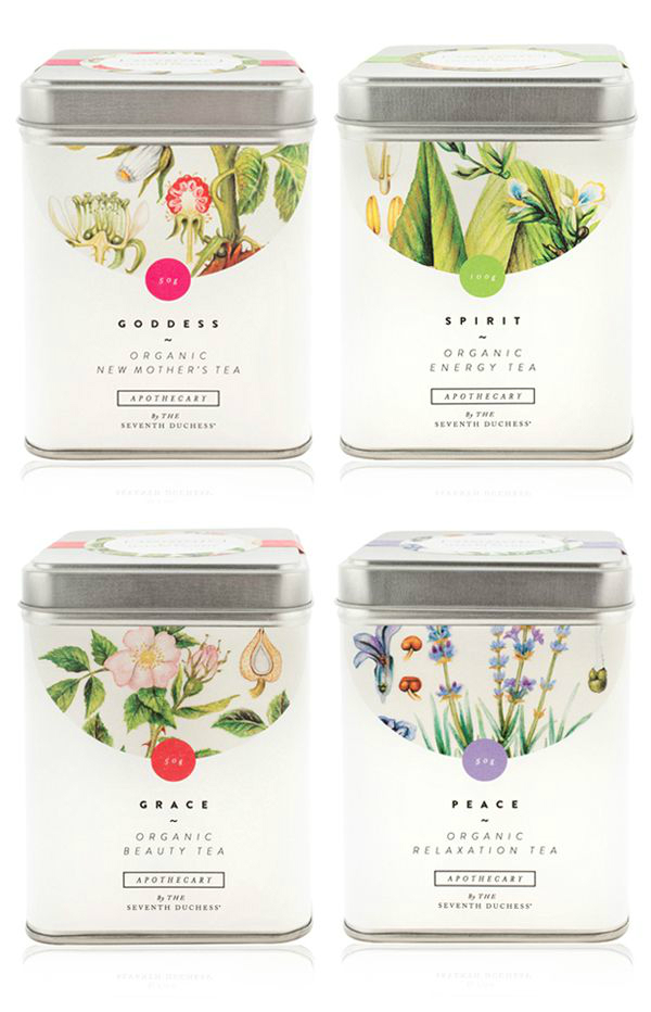
My blog and designer friend, Hyemi, posted this amazing roundup of beautiful packaging design yesterday. I have been searching for packaging inspiration lately and this post couldn’t come soon enough.
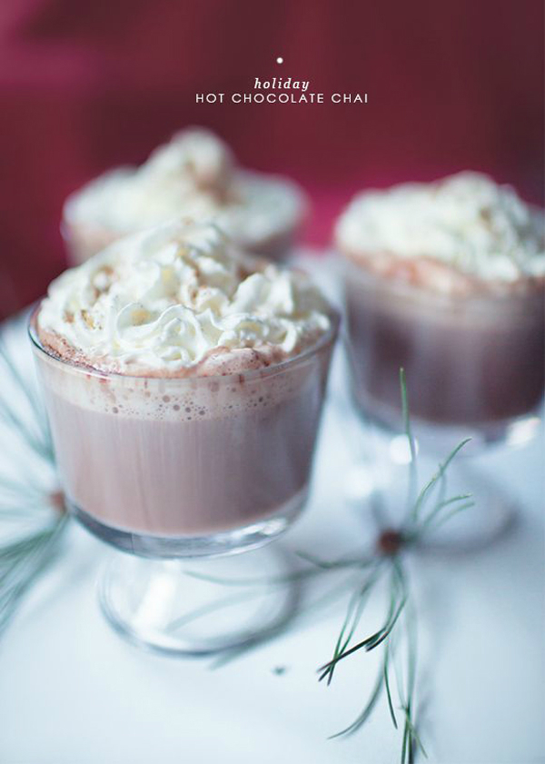
Lauren Witter of Owl & Anchor Studios shared this wonderful hot chocolate chai recipe yesterday on Corina’s blog. I’m obsessed with chocolate chai tea lattes at Starbucks so I’m really excited to try this recipe out. It would be perfect for a holiday gathering or a winter dinner party.
Megan and Mike Gilger announced the launch of their project, the Obaby app. It’s was a pretty amazing collaborative effort from some of my favorite illustrators, including Kyle Steed, Karli Ingersoll, and Kelsey Cronkhite. The app is full of fun lettering that users can add to their family photos. I love the branding and it’s extremely inspiring for projects I’m currently planning out for next year.
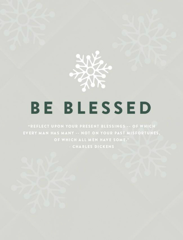
My husband/business-partner is embarking on a 24 Days of Design challenge and I’ve been enjoying seeing what he comes up with. I love the month of December as so many of my favorite bloggers/designers are challenging themselves to post every day and it’s awesome. This design from Wednesday has been my favorite of his thus far.
I came across Lauren Hom’s 22 Thoughts from a 22 Year Old talk this week. I was really inspired by everything she chatted about as being a young designer. The whole post is a presentation from a conference Lauren spoke at. If you don’t know Lauren, she’s behind the Daily Dishonesty blog so I’m sure you’ve come across her work before. Anyway, being a young entreprenuer, I encourage all twenty-somethings to go check the post out and realize you’re doing your best.
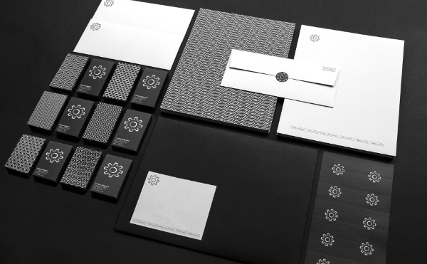
Not even twenty-four hours after watching Jessica Walsh’s Like Knows Like documentary, Sagmeister & Walsh shared the new identity for the Function project. I’m a big fan of dark business cards so I really enjoyed seeing how the logomark looks printed. You should definitely check out the rest of the project including the website and the video.
I am getting in the holiday decorating mood so I adore this Scandinavian home. As I plan our major decorating projects for our space next year, I’ve been really into Scandinavian decorating. This dining room is right up my alley with the aesthetic I’m going for and hopefully I can create something beautiful.
Illustrators Mikaela Lilhops and Daniela Olejnikova put together an excellent series of illustrations of popular cities and their famous landmarks. The posters are bright and colorful which is always outside of my typical style. As I’m developing my own illustration style, I’m hoping to get into a good color aesthetic. There are posters of New York, Tokyo, and a few others so you should check out the full list.
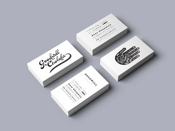
I’m not sorry for sharing two black and white identity projects because they are equally amazing. The Goodwill India branding designed by Mexican-designer Diego Leyva is extremely wonderful. The hand logo mark and the custom type is wonderful.
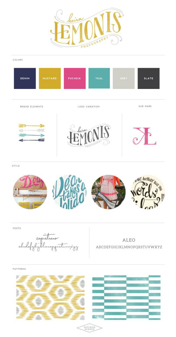
I’ve adore the work of Angela of Saffron Avenue. She makes amazing logos for her client demographic and the Keira Lemonis Photography logo is no exception. From the patterns to the lettering, I think the branding goes together exceptionally well. Also, I’m a bit impartial to mustard yellow used in branding.
So this is it for the week! Have a wonderful week and take some time to go through this wonderful archive of the late Nelson Mandela. He’s just so inspiring and his speeches are wonderful.





Thank you Angel for the shout out!!
No problem Angela!
Angel, you’ve put so many awesome links, that’s hard to start choosing the ones to visit!
This tea packaging is so lovely. Obaby’s branding colors (and logo) are lovely! And that black and white branding kit is to die for!!!!
Black and white branding is my favorite. Hope you had a fantastic weekend!
I’m loooving that tea packaging–it’s so lovely and perfect. And that hot chocolate chai recipe. Those dark business cards look incredible–they make such a great statement. Another awesome round-up, Angel!
Thank you so much Tana!
Ah I’m in love with the tea packaging! So beautiful
London illustration = PERFECT. Makes me so nostalgic!! Excellent roundup, as usual 🙂
Those tea tins are perfection! And I love the branding for Keira Lemonis is adorable 🙂 Great round-up!
the o baby app is quite gorgeous and i really adore all of the fonts that they offer for laying over photos! makes me wish i had a use for it but it will be a while until i do 🙂
Thank you for the featuring my post!
Loving all the round up links! I’ve been fan of Lauren Hom’s hand-lettering for long time! her lecture came to as so inspiring and so real.
Of course my friend!
I loved reading through Lauren Hom’s talk! Thanks for sharing!!
[…] Photo credit: {David Yarde} via {Studio 404} […]