Friends! It’s the weekend. I’ve had the most lovely of weeks reconnecting, designing, and working. I’ve worked harder than I have in a long time and I am exhausted. I have no regrets! I still have so much inspiration. I am working on stationery lines and prints for the shop. I’m actually doing what I’ve always wanted to do which is exciting! I hope you’re having a great week. Here are a few of my favorites from the week.
I can only wish there were amazing human body apps when I was a kid. Kelli Anderson did the detailed illustration for the Tinybop Human Body app for kids. This image is just a snapshot of all of the work Kelli put into these illustrations. She stated it took a lot of time in her announcement post, but I can only imagine the time it took.
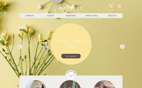
The web design and development for Earthborn paints is gorgeous. While very simple, the site’s content is displayed in a clean grid that utilizes excellent user experience. I would love to meet the user experience architect on this project. Not to mention Earthborn has really great paint colors for all of those DIYs you’re seeing on Pinterest.
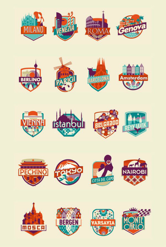
Does anyone else have a “to-see-before-I-die” list? In case you don’t, Federica Bonfanti has illustrated his recommendations in a fun print available for purchase. While the illustrations are modern, the color palette reminds me a lot of the 80s. I love that each city has a unique badge and typeface to attribute to its uniqueness.
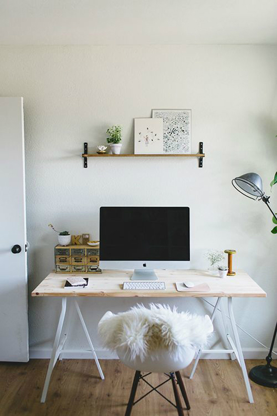
While I’m showing love for Kelli Anderson, Kelli Murray’s gorgeous home was featured on Design*Sponge this week. I love this shot of her desk, simple and to the point. While I’d love to have such a minimal work space, I have too many roles right now. I can only dream of a small cute desk.
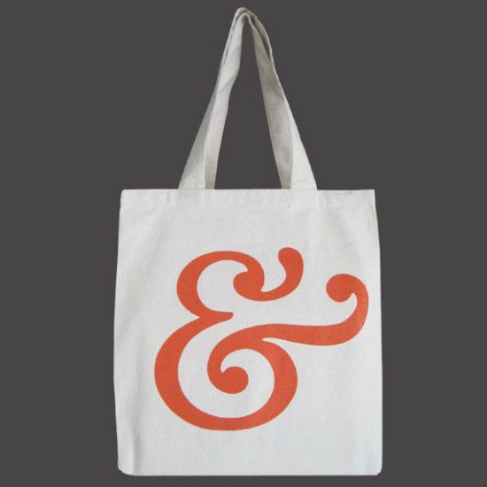
Ampersand tote warning! Fran of Freeborboleta posted a great list of ampersand merchandise this week, attracting my wallet to her blog. A girl can never have too many ampersands right?
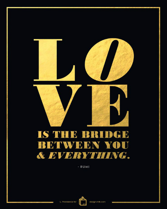
This is what happens when you combine Laura of The Native New Yawker and Design Milk. I love it! I’ve been embracing the gold foil trend myself so it’s neat to see it here. I love this more than Ben Affleck loves being Batman.
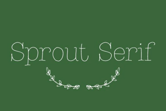
I rarely find a handwritten style font that I really enjoy but Sprout Serif is the cutest. Look at those serifs! This gorgeous font is only $5 at Creative Marketplace so you should pick it up ASAP.
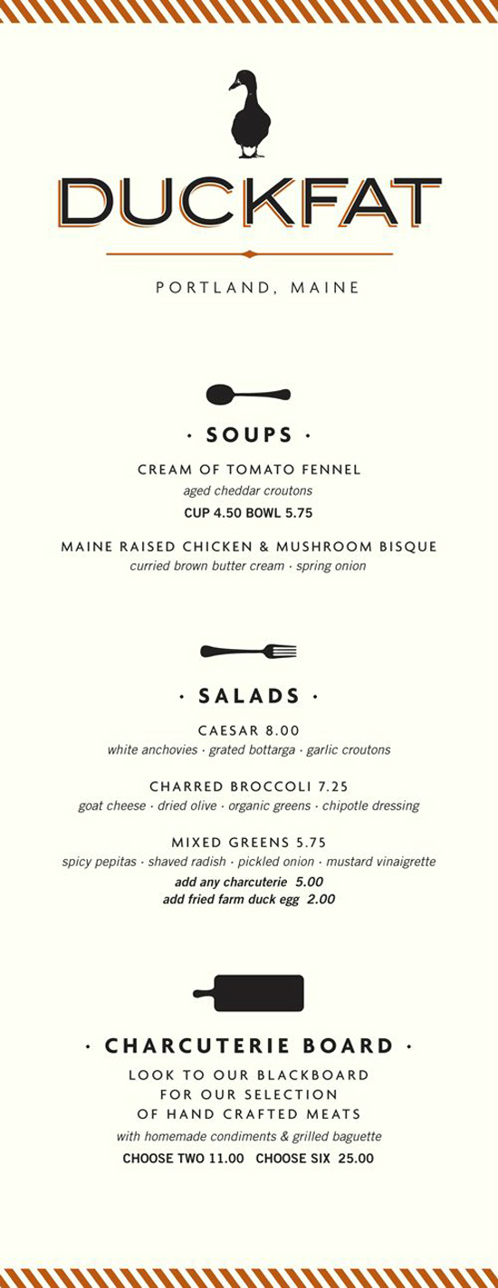
I am really inspired by the clean layout and composition of the Duckfat menu. The alignment of everything is great. The spacing is perfect. It’s the right inspiration when it comes to laying out text which can be difficult at times.
Yes, this is the work of Max Wanger. I couldn’t help but share these gorgeous photos and wonderful interview with Max that Holly shared on Decor8 this week. Max is an amazing creative and very inspiring. I really encourage you to take some time to read the post.
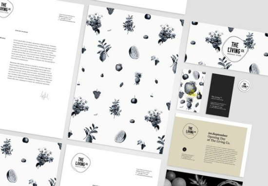
While I love playing with color, black and white brands are amazing. I love the patterns and the consistency of The Living Co. I can’t get enough of nature-inspired illustrations.
I hope you have a wonderful weekend! I’ll be super busy with fun events but I look forward to chatting on Monday.





i adore that app! i am thinking that my little cousins would love it too. they are like mini curiosity curators. I’m a sucker for the Duckfat menu as well – it’s just my style. Happy weekend!
Yelle’s latest post: Welcome to Austin
Wow! This week is an exceptional one for inspiring (and just plan gorgeous) finds! You rock, Angel. I feel so out of the loop sometimes because I work..all..the..time. So I look forward to your Friday posts, so much! You help keep me updated. 🙂
LOVE that children’s app, wow. I just can’t get over how brilliant that is. Beautifully designed and just amazing!
Also — I am just swooning over Kelli’s home. wow <3
Latrina’s latest post: A little bit of “spring cleaning” this month
I know the feeling of working all of the time. Not sure how I have time to blog!
Thank you for featuring my design! I’m SO loving the The Living Co. branding identity.
L. Providence’s latest post: 3 ways to spice up your blog post design