Happy Friday! It’s time again for a round up of inspiring links for the week. This week has been extremely busy for me but a good one. I finished one of my favorite print projects thus far and enjoyed some great business events. How was your week? Let’s get to it.
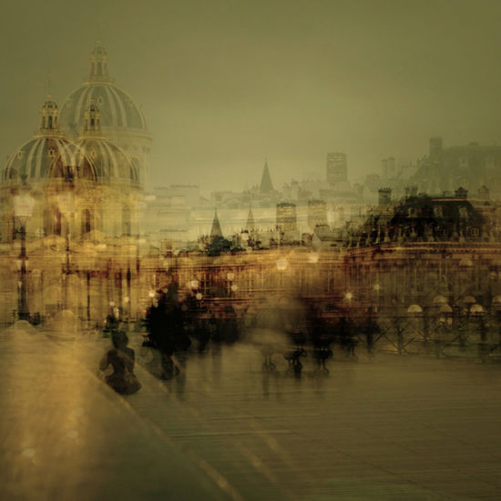
Monica of hola!design shared amazing Parisian photography by Stephanie Jung this week. I love how Stephanie styled her multiple exposures. I’ve never tried multiple exposure photography before but I would love to see if I could come up with something neat.
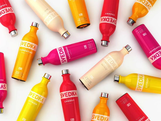
I love the colors used for the packaging design of the Svedka Flavored Vodka bottles. Although I was in a Spring mood, I’m so ready for summer and these bottles remind me of all of the fun citrus drinks I can enjoy while it’s hotter than necessary here in Orlando.
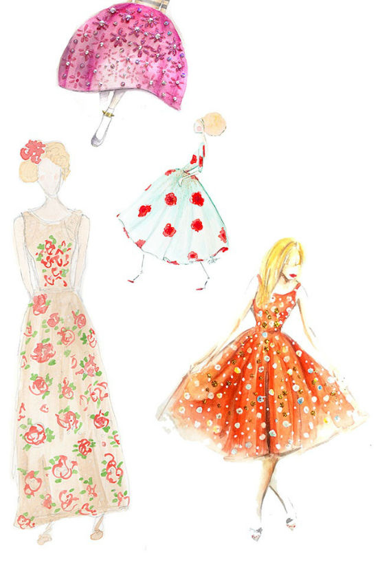
The sketches above are sketches from students of Katie’s Paperfashion Skillshare class. Yes, I said students. No, I couldn’t believe these weren’t done by seasoned illustrators either. I clearly don’t have such illustration talent but Katie’s students did an amazing job. I love that more creatives are utilizing Skillshare and not being afraid to share their techniques.
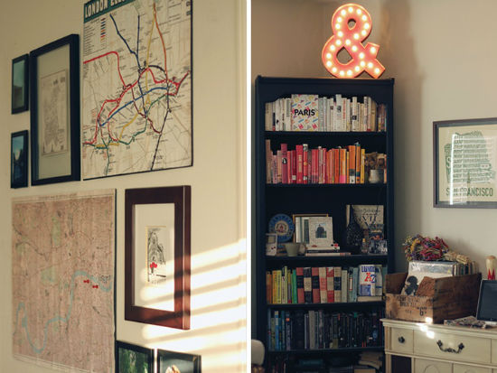
Jay of Jay Adores shared the amazing apartment of her friends Lauren and David. I haven’t wanted to live in a place so badly since I left the loft we stayed at while in Jacksonville. Lauren did an amazing job combining masculine and feminine elements to decorate their Oakland apartment. I love all of the small details Lauren collected. I wish I had such decorating talent.
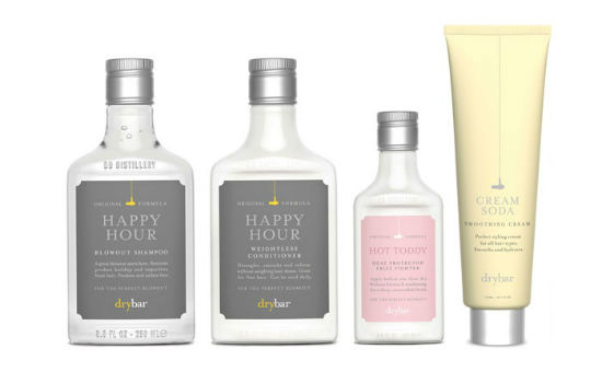
I won’t get punished for featuring to product designs right? I love the pastel tones and typography used on the Drybar packaging. All of the packaging has a great airy feel which is perfect when it comes to beauty products.
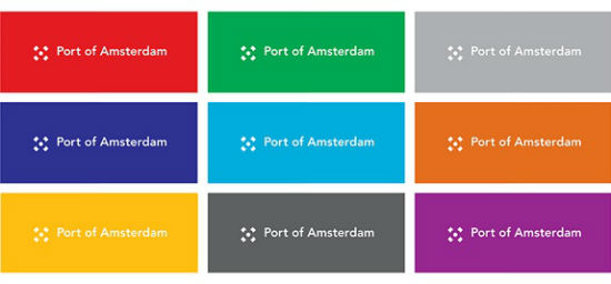
I adore the new Port of Amsterdamn branding. The logo mark is extremely simple and flexible. I loved seeing how they incorporated in other areas of the branding.
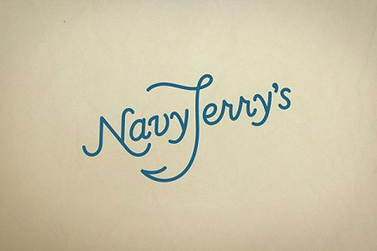
Speaking of fun branding, check out the above for Navy Jerry’s a bar in Helinski. The anchor in the J makes me happier than it probably should. It’s a great type logo for sure.
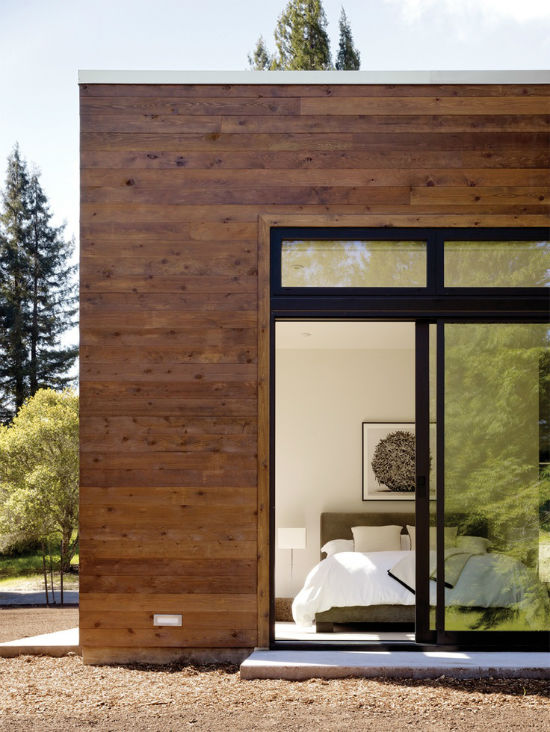
Like Alex of Dreams and Jeans, I would love to live in this gorgeous house in Sonoma, California. Now if only I could pick this house up and put it somewhere in my neighborhood.
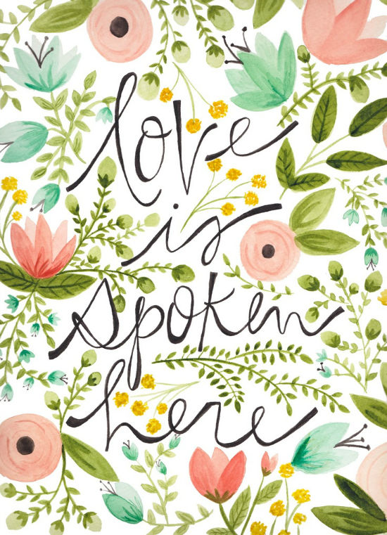
I adore the above print done for PS I Adore You last month. I know I’m a little late in posting it but the colors and type had to be shared somewhere. The print was done to help support childhood cancer but I don’t think it’s available for purchase any more. It can always be admired online I guess!
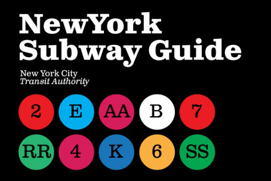
I needed an excuse to purchase another slab-serif. I adore this take on Clarendon, Clarendon Text by Canada Type. This typeface is a remake which offers a clearer visibility to the fonts that the classic font, a feature the classic font didn’t always achieve. I’ll let you know how I like it when I add it to my collection.
I hope you have a great weekend!



I love these links, so good! I can’t believe these illustrations were done by students either, makes me want to take this course as well! And I also really love the pictures of Paris!
Have a good Sunday,
Hanna
Hanna’s latest post: weekend essentials no. 2
Thank you for your comment Hanna! 🙂