TGIF! I’m so excited for this weekend. It came quickly (which is a good thing sometimes) but I hope to enjoy the small things this Mother’s Day Weekend. For instance, tonight we are finally seeing Iron Man 3 and I’m stoked about it. Do you have any weekend plans? I have quite a list this week and I’m excited to share so let’s get to it.
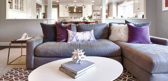
I love this home styled by Kriste Michelini. The royal purple runs throughout the home which I enjoy. This picture is only a small snapshot so be sure to visit Desire to Inspire for the rest of the pictures.
I love the new Bishop of London branding! The red and white is extremely regal and modern compared to the old logo. The lines make the text definitely stand out a lot more.
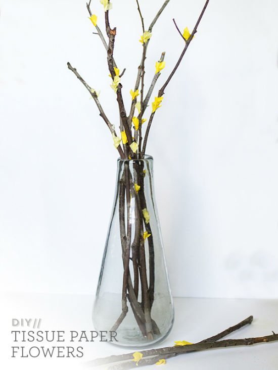
Local Orlando-blogger Sarah of Sarah Hearts posted this great DIY Tissue Paper Flower Branch tutorial based on those infamous flower branches we see at West Elm and other places. I’m looking forward to trying this DIY because it’s super easy and would save me a ton of money.
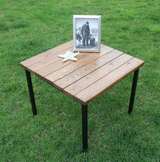
I adore seeing what other people can create from IKEA furniture. The hack above is from the Fjellse Slats which you would usually use on a bed. Who would’ve thought you could create a cool looking industrial table?
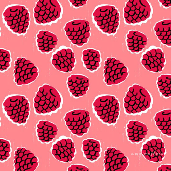
How could you not be in the mood for summer with these gorgeous bright summery patterns illustrated by Amy Walters? The patterns are fun and feature different fruits. I’m definitely inspired to work on something for the upcoming season.
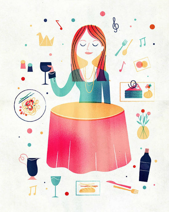
Speaking of fun illustrations for the summer, how great is this Simplifood project? Alyssa of Tech Love Design featured the project on her blog this week and I absolutely adore it. Who can complain about illustrations of food?
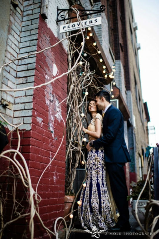
I took a break from posting engagement photos in my roundup but I couldn’t resist this couple. Z Molu Photography captured the essence of their happiest moments in New York City. There are great photos of the couple with the cherry blossoms so be sure to check out the whole post on Rubies and Ribbons.
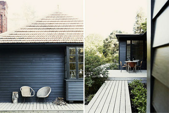
This is only a small snapshot of the Black Forest House that Victoria of SF Girl By Bay featured this week. I love the dark exterior which contrasts with the white interior of the home. Such a great house!
I adore this illustration for Oprah Magazine by Sol Linero. I don’t see this type of illustration very often so I’m quite inspired by it. The colors remind me of Miami Vice which get’s me inspired by for a color palette project I have up my sleeve.
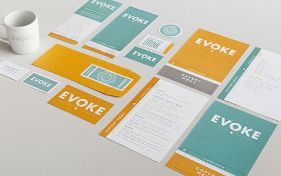
I’m ending with this inspiring type-focused Cafe Evoke branding. I’m sure you’ve seen it before as it is popular among the design community but I can’t get enough of it. I love the colors!
I hope you have a great weekend!





Thanks so much for including my flower branches! Love the summer illustrations. You always have great weekly round-ups!
Sarah Hearts’s latest post: Blood Orange Prosecco
[…] for more cool stuff like this. Also leave me your thoughts, comments and questions in the box below.Now this is the last part (part 3) in my 3 part miniseries “how to grow your blog”. At this poin…the off-page promotion. I talked about setting up some automated promotional stuff to give you […]