The weekend is finally here! I can’t believe all of the love I received on my birthday yesterday from friends and family. (I woke up to an onslaught of texts, missed calls) I was lucky to get some photos of myself to update here. I almost never take photos of myself so it was good to change things up a bit. Let’s get started on this week’s post as there is plenty to talk about.
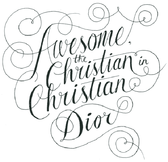
I don’t think you have to enjoy rap music to be inspired by the luxury rap type project by Luke Skimmer. Luke is posting a different hand-lettered rap lyric which must include mention of a luxury fashion brand. The project is pretty unique but I loved Luke’s take on Kanye West’s Stronger above. How inspiring!
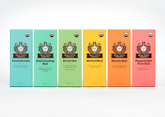
The colors from the Moon Valley Organics packaging design is just what I needed during this rainy week. The logo reminds me of brands from the 70’s with it’s use of illustrations and a terrific slab-serif.
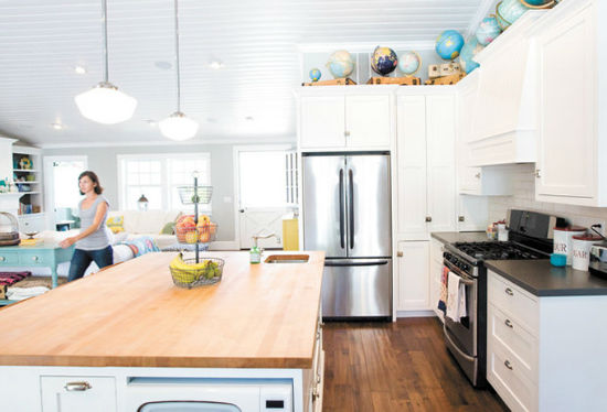
I love the bright and open kitchen of Lindsey Cheney. While the kitchen space isn’t very large, compared with an open floor plan, it looks right at home. Lindsey has a great home filled with fun ideas and very kid-friendly for her daughters.
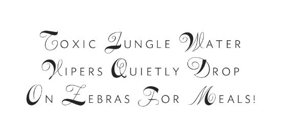 I would love to add the above font, VIP, to my collection. (I probably will, let’s be serious it’s only $13!) The combination of the script and the sans-serif put would be perfect for event invitations. Looking forward to using this in the future.
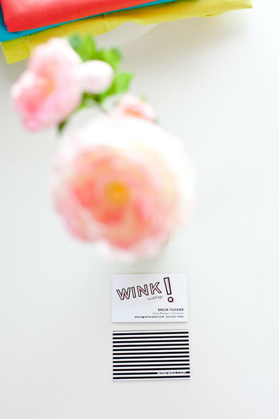
Joanna Waterfall shared her work on the branding and web design for WINK! Weddings. I loved seeing Joanna’s various logo mock-ups as compared to the final product. It was great to read about how easy it was to work with the client, which makes any project ten times easier.
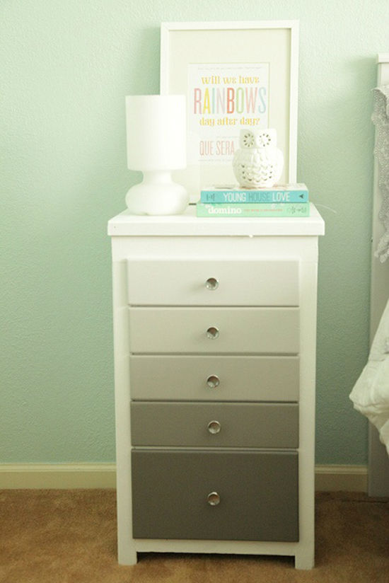
Christina of Lovely Interiors shared her gorgeous DIY ombre nightstand for her guest bedroom. This entire DIY cost her less than $50 and seemed to be a quick, easy project. I would love to work on nightstands for my bedroom and this has me inspired!
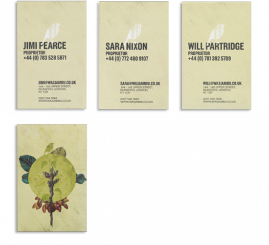
Above is just a small snipped of what was done for the Wax Jambu branding. The branding consists of various collage-type illustrations paired with a slight grunge effect. I really enjoyed how different this was from all of the branding projects I’ve seen lately.
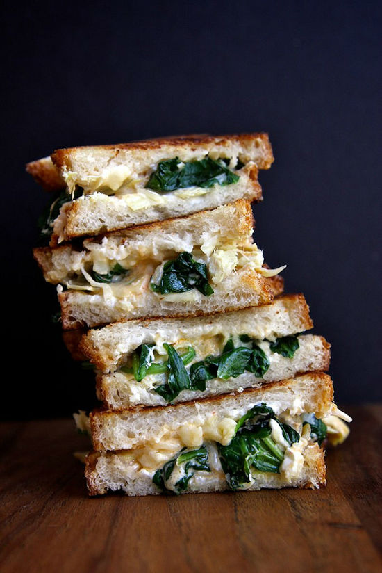
The above is a spinach artichoke grilled cheese sandwich. I cannot wait to try this recipe out as it looks delicious and features all of my favorite foods.
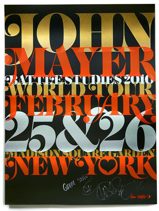
House Industries shared the poster above that they worked on for John Mayer. I love the colors and the overlapping text which scream concert poster. It also encompasses the classic House Industries look which I can never get enough of.
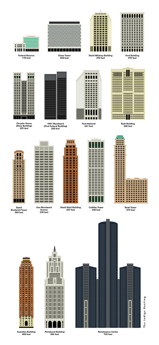
The above Detroit Building Chart was designed by Erin Jang of Indigo Bunting. As we know how much I love illustrations of architecture, I couldn’t get enough of this chart. I would love to see this done for more large cities (Atlanta…) and perhaps available to purchase as a print.
Have a great weekend! I would love to make it to the beach myself but who knows what may happen.



nice round up!
Thank you for your comment Lo!