TGIF! I started my day out in Daytona Beach doing a very early morning favor. Now I’m back here in Orlando and working to the sound of a much-needed Friday playlist via Spotify. There was plenty to be inspired by this week so let’s get started.
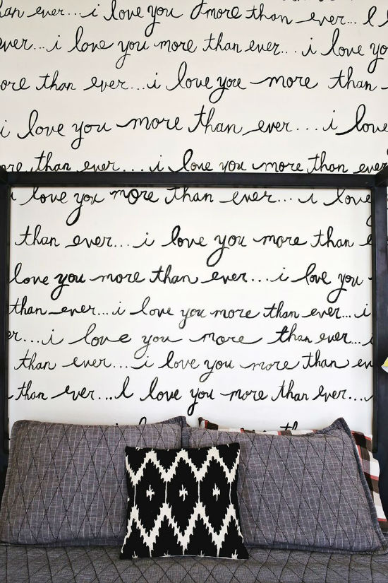
How great is this DIY project? Elsie of A Beautiful Mess shared her fun hand-written statement wall project. Why pay hundreds of dollars for handwritten wallpaper when you can just write it out yourself? I love the contrast of the black and white in her bedroom. Be sure to visit the blog to see more pictures.
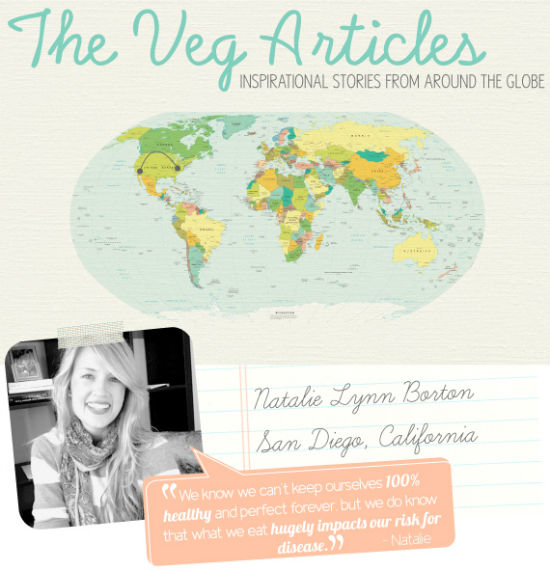
I love the VEG articles feature on Going Home To Roost. I enjoy reading the stories of others who have made the active decision to go vegetarian or vegan. (While I cry in the corner and attempt!) This week’s post featured the story of blogger Natalie Borton and her husband. They went from eating Whataburger to a complete vegan lifestyle. How inspirational!
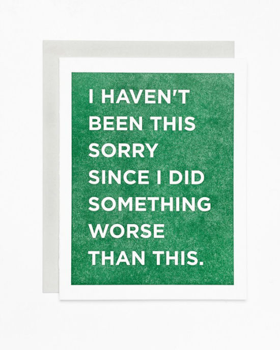
This apology card by Sycamore Street Press gave me a fit of the cough-giggles. I love the bold type and the even funnier message.
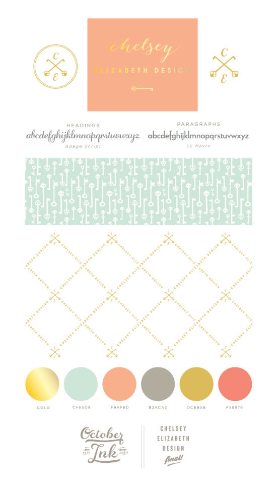
I adore this branding of Chelsey Elizabeth Design by October Ink. It features such a great color palette and awesome usage of key elements (literally) in the patterns.
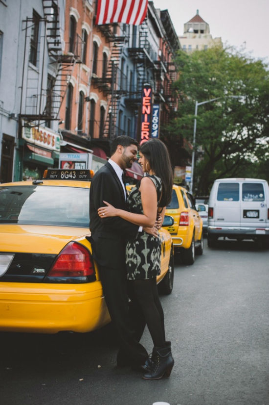
This image is one of my favorites of the Chellise Michael engagement shoot posted on Rubies and Ribbon this week. The couple is super adorable. Chellise did a great job of keeping them as the focus among the hustle and bustle of New York City.
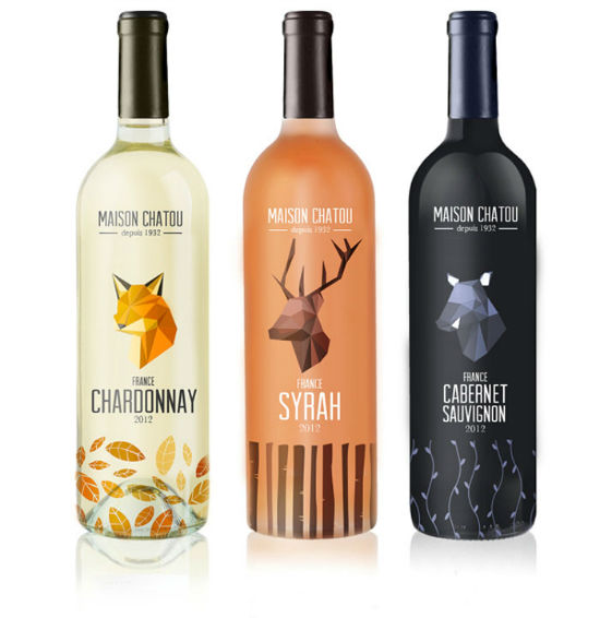
How can you not adore these geometric-inspired wine bottle designs by Maison Chatou? I like the nature theme being tied together with the botanical elements on the bottom of the glasses. I also think the type choice is great.
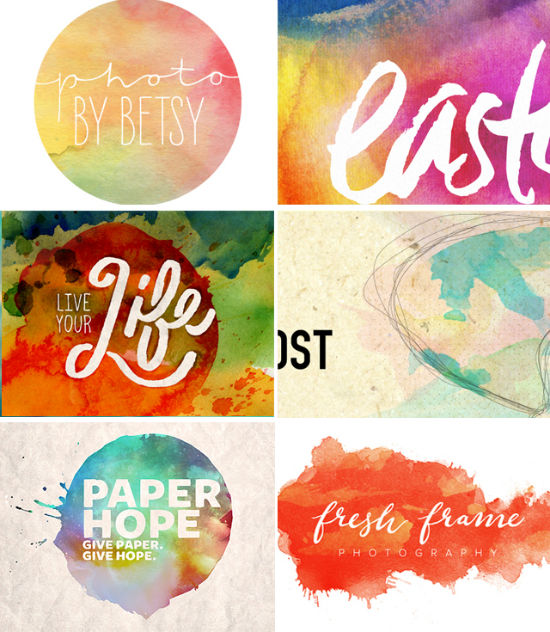
Brittany of Swell-Studios shared this gorgeous Easter watercolor mood board as part of her inspiration for an Easter project for her church. As someone who has done quite a few Easter marketing promos, it’s not always easy moving past crosses, lilies, and eggs. I love the idea of watercolors being used for spring events and this is great inspiration for me!
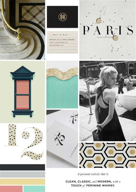
I may be on a mood board kick so I apologize! Rashi of Bucket of Squash (FYI – I really admire this girl as a designer. She makes choices that I would make in type and colors so I’m a little biased but I enjoy her aesthetic eye!) shared this mood board for a two-part website project for the same brand. She wrote a great post about her approach to what would be a difficult project for some. This is my favorite of the two featuring clean, classic, and modern with a touch of feminine whimsy.
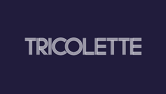
I’m inspired by this type-focused branding for Tricolette by KentLyons. The colors they used for the branding are rich as compared to the flat pastels that I have been seeing for a lot of branding projects. I would definitely check out the post to see more of the print collateral. It’s great!
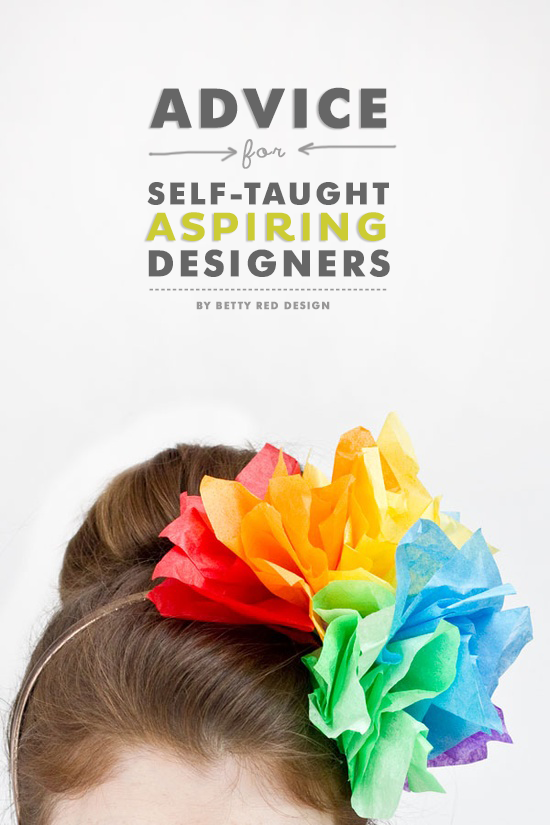
Nesha of Betty Red Design did a great job in her advice for aspiring self-taught designers. As I began my journey in design eight years ago, I would have loved to been able to read such great advice. There are so many great apps, tutorials, and resources available for aspiring designers today as compared to just a few years ago. Nesha did a job of thoroughly offering strong advice while adding much-needed encouragement for a tough field to break into.
I should have a post up this weekend featuring some work I’ve done this week. Have a great weekend!



Absolutely love your Links I Love segment. Thanks for introducing me to Buckets of Squash. I’m a fan of her design aesthetics. It kind of reminds me of my blog PartyOverHair.com. Lol Great designers think alike!
L.
@thelprovidence
PartyOverHair.com
L.’s latest post: Mark Your Calendar: For The Naturals
Isn’t she the best? You both have similar styles which is awesome. I’m glad I can inspire you 🙂
Hi Angel, thanks for the shout out! Your blog is gorgeous – I’ll be adding it to my Bloglovin account.
Sidra’s latest post: NYC Lower East Side Indian Engagement Shoot
No problem! Thank you for adding Sidra! Love your blog 🙂
I love these posts of yours. 🙂 Always so much goodness! And loads of inspiration… <3
Love it all! Especially the geometric bottle designs… I'm on a geometric craze right now, which is apparent by my new blog logo. Always fun! Love those watercolors too. <3
I hope you're having a fabulous weekend!
Latrina’s latest post: Mixtape no.2 & a new design!
Thank you so much Latrina! <3
Hi Angel!
Thanks so much for posting my mood-boards on your site! Loved all the other links you have on here too— especially the wine bottles. Those are awesome.
Thank you for your comment Rashi! I’m glad you enjoyed. 🙂
[…] guys should know how much I love Rashi of Bucket of Squash. Rashi is an amazing designer whose work just pleases my aesthetic tastes. […]