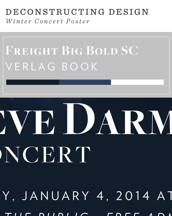
I often do a lot of smaller design projects that I never share here. This year, I want to capture the essence of all the work I’ve completed, even if it’s a small glimpse. In this new series, Deconstructing Design, I plan to share snapshot of some of my work and pull apart some of the elements utilized. Above, is a snapshot of a winter concert poster I designed for a local event. I’ve been the marketing lead for my church for almost the past three years and I always enjoy being able to experiment with the events we host. I’ve been looking to utilize Freight after learning how to up my type game. I am also in love with navy this month so I’ve been looking for any reasons to use it whenever I can.
Let me know your thoughts regarding this series and also, be sure to subscribe to the newsletter. I shared a fun mantra printable so be sure to subscribe to get in on the things I share via e-mail.

i LOVE this and can’t wait to see more of your projects!
Happy new year sweetie
Thank you Corina <3
Can we please just talk about how beautiful these two fonts are together? So bold but so simple and eye catching. I feel like the Verlag Book might look nice with some of the Didot weights. Thanks for sharing this! Love it.
Kolbi | Life With Kolbi
Verlag definitely pairs well with a lot of Didots! You’re spot on Kolbi. 🙂
I would love to see more of your design work and projects! You are so incredibly gifted and talented.
Thank you Amber <3 I'm flattered.
great way to showcase your work! i’m excited to see more 🙂 happy new year darlin’!
Thank you Tara!
lovely! I can’t wait to see more for the new series 🙂