TGIF! I’m not even sorry for the barrage of typography that’s coming your way. This week was extremely challenging but now that it’s Friday, I realized how much I accomplished. The site design for Studio-404 is completely finished and has been sent to development. I just finished a quick but fun project with Carmen of The Flair Exhcange, who I just met in the past few months through Sunshine Bloggers. We’re almost halfway complete with our latest client project which is a bit whimsical and definitely unique. I started my Creative Couples feature this week featuring Melissa & Nick. I have tons of other things knocked off my to-do list but it’s just funny how it all looks great today. If you would have asked me about my week on Wednesday, I don’t think I would have felt as confident. Anyway, enough of me and more of inspiration!
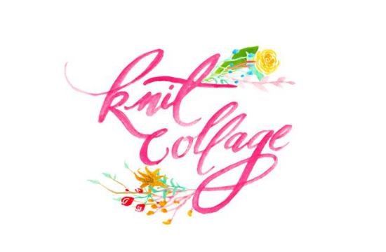
I am in love with this logo Meredith of Hazel Wonderland shared this week for Knit Collage. The colors are very vibrant which is perfect for these last few days of summer. The branding has so many fun floral elements which Meredith did a great job of putting together. I would definitely visit the blog to see more .
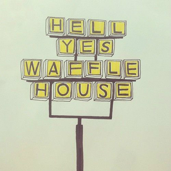
I’ve featured the work of Kristin Nohe here before but I couldn’t help but share this illustration she posted on her Tumblr blog this week. Waffle House is such an Atlanta staple and it’s pretty lame that it’s not as big of deal here in Florida. I mean, there is now a Waffle House at Turner Field. It’s serious business fellow Floridians!
Speaking of illustrators I’ve showcased here, Type Worship posted a fun interview with illustrator Mary Kate McDevitt. I could spend all day reading about the lives of other creatives. I love hearing where they got started and what they enjoy working on. It’s a great read so I encourage you to check it out if you have the time.
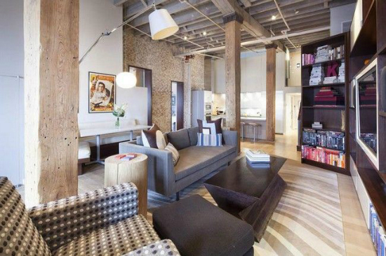
Can I just move to the city already? I would love to spend a day in this loft space in Tribeca. Reading Laura’s blog always makes me wish I was in NYC and looking at amazing (expensive) homes in the city doesn’t help.
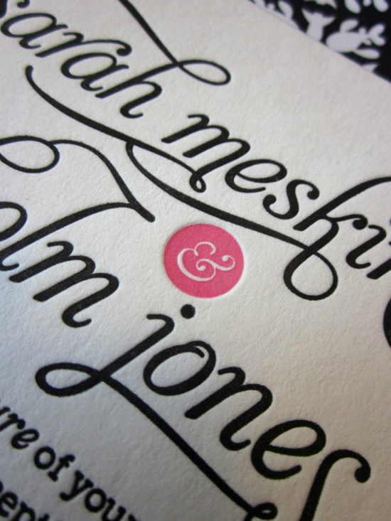
Typography details are my favorite part of wedding invitations. I would have never thought to pair Aphrodite Slim with Museo Slab but it works! This designer couple had an eye for type and they knew exactly how to execute their ideas.
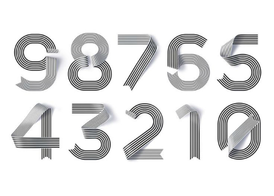
What’s not to love here? Type, stripes, and monochrome are all a great combination in my book. Shanghai designer Jiao Tong’s numerals look amazing. Also, how awesome is the ribbon effect? Love!
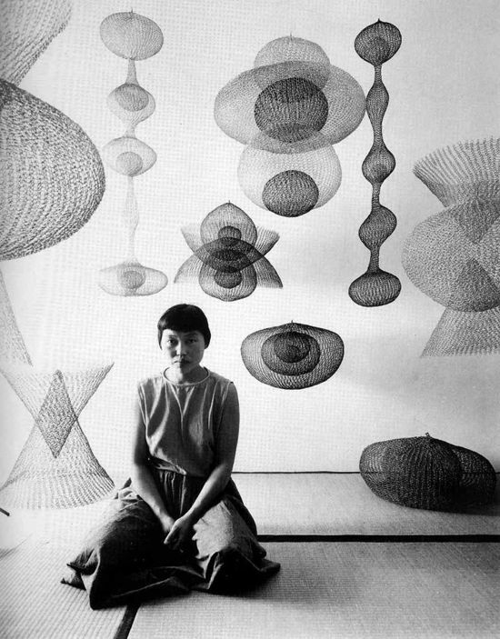
Jen of Honey Kennedy posted a great tribute showcasing the work of Ruth Asawa. Her wire sculptures are beyond amazing. It’s so great to share work by artists within other mediums from time to time.
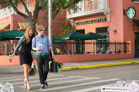
I know you are probably wondering how this ended up in the list this week but it’s amazing for several reasons. I’ve been trying to showcase Root Photography on the blog since I saw their work about three years ago. I was working with an event company and Nathan and Jensey shot their wedding so I instantly fell in love with their work. Fast forward to today, the husband-and-wife team shoot here in Celebration all of the time but there’s never been a shot at Starbucks. It was pretty neat to see these stylish roommates choose to highlight my favorite place in town in their awesome shoot. You have to check out the rest of the pictures. I want to be friends with these two.
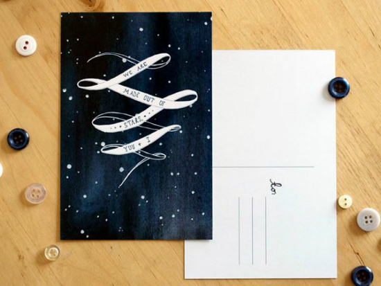
I was extremely inspired by this postcard by Meera Lee Patel featured on Oh So Beautiful Paper this week. Constellations and astronomy-themed stationery has been inspiring to me over the past few years and Meera is extremely talented.
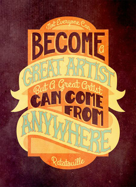
This is only a small snapshot of what you get when you combine great lettering artists with Pixar quotes. I’m not a big fan of Pixar but I do love great type. So if you are of fan of both, you’ll enjoy looking through the Pixar Typography Book.
If you’re into reading more from me, check out my answers to the Liebster Award post over on Sunshine Bloggers. I know I was nominated for a Liebster some time ago and by the time I remembered, months had passed so I hope this counts! I’m also overdue for a Blogging 101 post so check that out later today. Have a great weekend! I’ll be spending Sunday with the Sunshine Bloggers ladies and I can’t wait.



Great type pieces! And I saw that Tribeca loft this week too. Oh man, I’d love to live in the richest neighborhood in all of Manhattan. Maybe one day. lol Enjoy your weekend!
Laura
L. Providence’s latest post: taking two weeks.
Ah, that first one is just amazing!
Thanks for sharing Angel!
Corina Nika’s latest post: GP 07 / KYLA IS INSPIRED
[…] the industrial trend while still keeping a clean, modern kitchen. If you couldn’t tell, I am sort of obsessed with the industrial look right […]