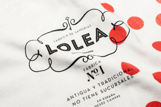
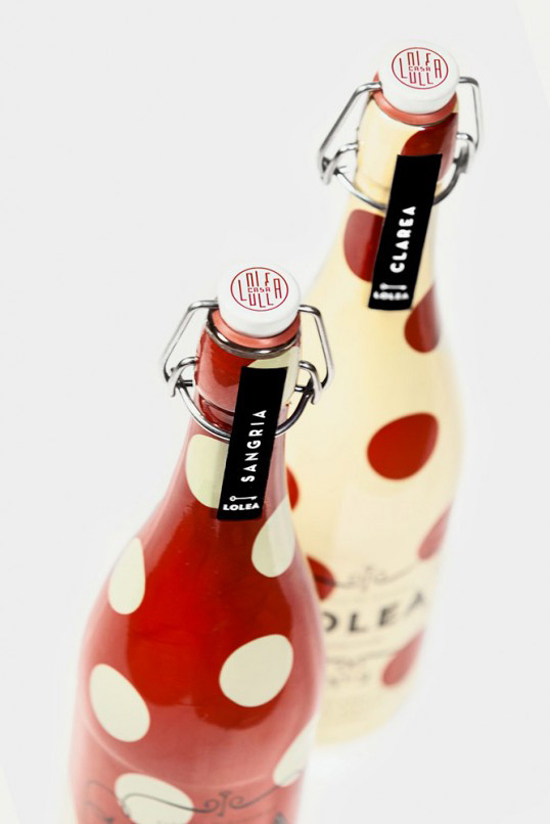
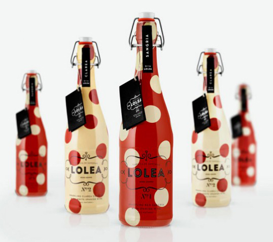
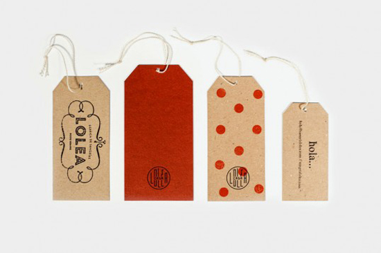
The following packaging and identity design by Estudio Versus features some of my favorite things: polka dots, great typography, and paper products. Of course, if I told you this was all about sangria, I’m sure you’d be even more excited. The design for Lolea, a company based in Spain, presents sangria in a new light with modern typography combined with retro elements. I don’t think I’ve ever seen polka dots on a bottle of sangria but Lolea makes it look amazing. 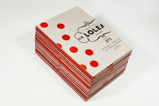
First Seen – Lovely Package


Oh, this is great! I love the polka dot bottles 🙂
Victoria | Oh So Pretty’s latest post: 2013
So, I totally love sangria, and would buy this in a heartbeat! Polka dots sure would make this bottle stand out on the shelf.Great find!
Kyla’s latest post: Putting On The Glitz
oooh, LOVE this. really nice find!
Sally’s latest post: designer | erin ellis