This week has been extremely busy! I’m in the middle of a few print projects that I’m very excited about and finishing some tweaks on the never-ending tea branding project. I am girl who loves a good slab-serif so I really am excited to share the newest Acumen branding by London-based design firm, johnson banks. Acumen, which is a non-profit organization focused on investing in companies, leaders, and ideas which are helping to change the way the world views poverty. Here’s a little bit more background:
Established in 2001, Acumen (previously Acumen Fund) is a non-profit organization that “raises charitable donations to invest in companies, leaders, and ideas that are changing the way the world tackles poverty.” Acumen invests in companies with a focus on operations in East Africa, West Africa, India, Pakistan or Latin America in the sectors of agriculture, energy, education, health, housing, or water and, most importantly, that they make a product or deliver a service that addresses a critical need for the poor. Over the weekend, Acumen shortened its name, introduced a new identity designed by London-based johnson banks, and launched a new website by briteweb. – Brand New
I don’t know how many more words I can use to describe this re-branding project. The colors are great and the execution is wonderful. Take a look below!

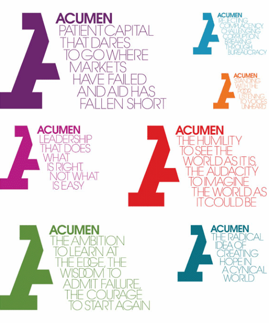
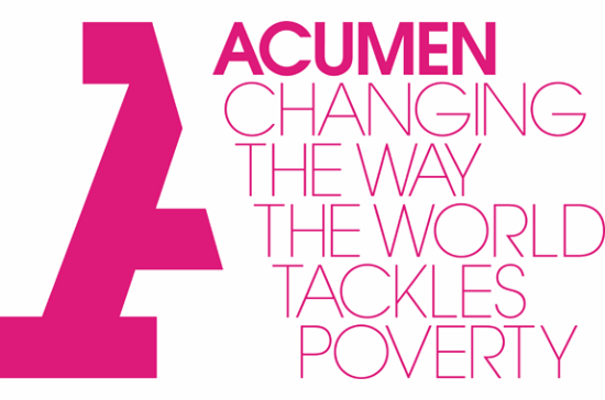
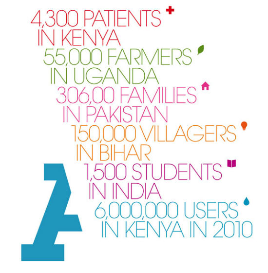





[…] gorgeous font family with slab serif, script, and ornament typefaces. I’m still in love with slab serifs this year which means I need more projects to use them on. Hope your Tuesday is […]
You’re diving deep into the world of branding and design with your excitement about the Acumen rebranding! It’s fantastic that you’re working on print projects and tweaking the tea branding, and the Acumen project is a great example of impactful, thoughtful design. The Acumen rebranding by johnson banks sounds like a perfect fit for the non-profit’s mission. I bet the slab-serif choices really make it stand out!