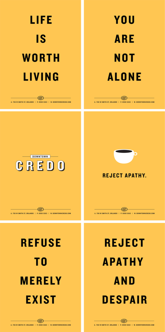
I’m allowed two branding posts in one week right? If not, I won’t apologize for posting this branding project by Glenn Thomas of The Fox and King. Glenn is an extremely talented designer, illustrator, and animator living in Melbourne. If you take some time to go through his projects posted on his portfolio, you definitely won’t leave uninspired. My favorite of Glenn’s many projects is the branding for a non-profit coffee shop. Branding a coffee shop is way up in my top-ten most-wanted branding projects. (Side note: I’m waiting final approval for that tea branding project I posted about way back when. Once it’s all finished, I’ll be sure to share it) Everything about the Downtown Credo branding speaks modern coffee shop. I hope you are inspired as much as I am.
All images copyright Glenn Thomas – The Fox and King | Dribbble | Twitter


Love this, most especially the color combo, what an interesting shade of Orange.
I love hearing about new coffee spots, if I were in FL, I’d totally go!
Celestine’s latest post: BE HAPPY /15: Get to Know Your Community
I love the simplicity of this design! The bold font is brilliant. Thanks for sharing this 🙂